Best Data Visualization Projects of 2023

Data continues on its upwards trajectory and with it comes the importance of visualization. Many charts were made in 2023. If I liked something, it was on FlowingData. These are my ten favorites from the year.
Alvin Chang, for The Pudding
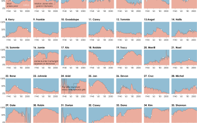
24 hours in an invisible epidemic
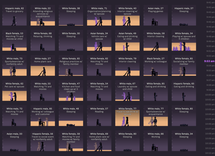
This was a standout for me. I mess with data from the American Time Use Survey pretty much every year and Alvin’s project still caught me off guard. [See the Project / On FlowingData]
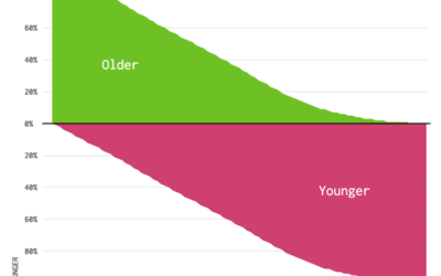
Lauren Leatherby, for The New York Times
How a Vast Demographic Shift Will Reshape the World
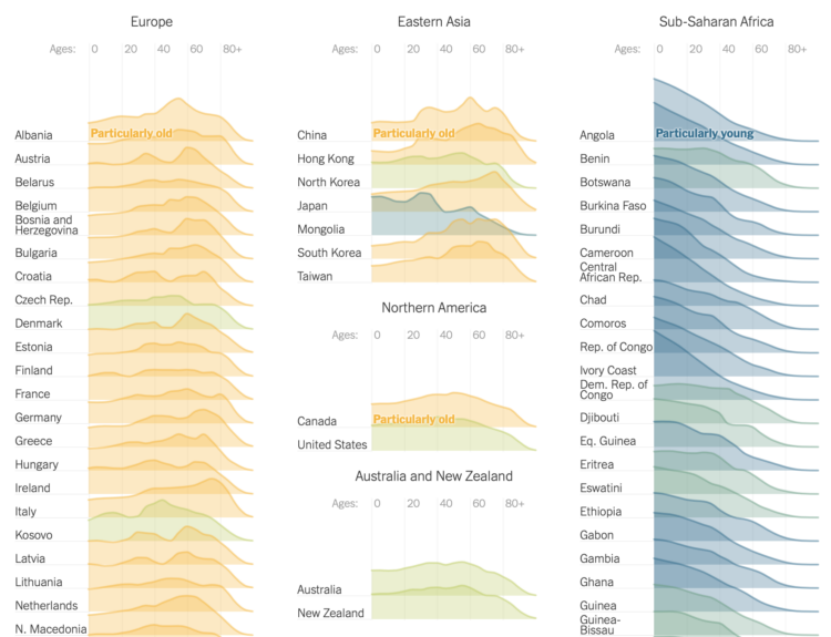
Population data. It’s another dataset we’ve seen many times, but I enjoyed the focus on age shifts from different angles. [See the Project / On FlowingData]
Leonardo Nicoletti and Dina Bass, for Bloomberg Technology
Humans are Biased. Generative AI is Even Worse
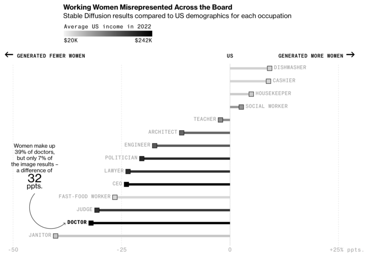
You’ve heard of AI. You’ve heard of bias. This project did a good job of connecting the two to the real world. [See the Project / On FlowingData]
Runner-up in the AI department — “How much will AI affect your job?” by Yan Wu and Sergio Peçanha for WP Opinion. [See the Project / On FlowingData]
Julian Fell, Ben Spraggon, and Matt Liddy, for ABC News
See your identity pieced together from stolen data
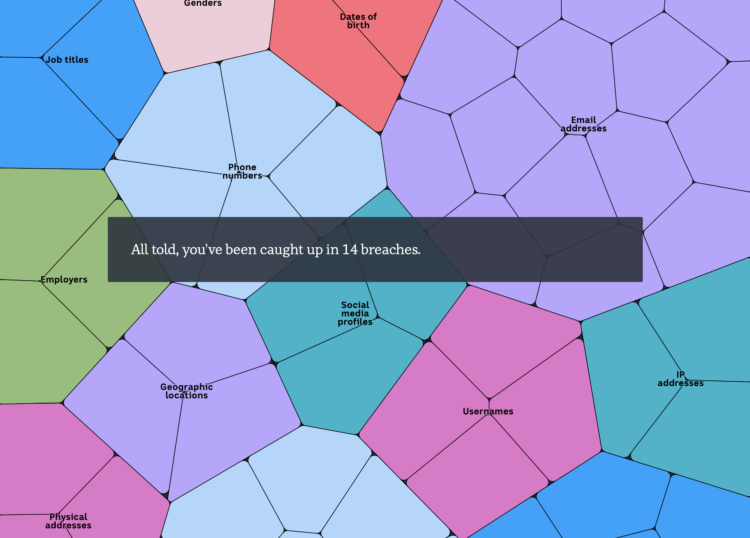
Enter an email address and see how it traces back to the many data breaches you probably never heard about. [See the Project / On FlowingData]
Julia Janicki, Gloria Dickie, Simon Scarr, Jitesh Chowdhury, and Catherine Tai, for Reuters
Collapse of insects
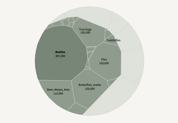
The insects on the screen totally add. [See the Project / On FlowingData]
The Overview Effect
The Locations of Star Trek and Other Sci-Fi in Real Space
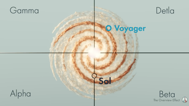
Deep dive into the real-life locations of fictional space? Sign me up. [See the Project / On FlowingData]
Alyssa Fowers, Shelly Tan, Luis Melgar, and Kevin Schaul, for The Washington Post
Are you middle class?
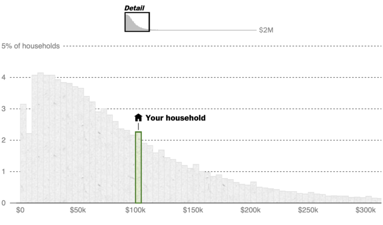
Enter household income. See where it lies. Mostly, I am jealous that I didn’t think of it first. [See the Project / On FlowingData]
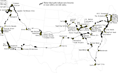
Christiaan Triebert, Blacki Migliozzi, Alexander Cardia, Muyi Xiao, and David Botti, for The New York Times
Fake Signals and American Insurance: How a Dark Fleet Moves Russian Oil

Tracking down an oil tanker through fake GPS location and slick transitions between map and photos. [See the Project / On FlowingData]
Anton Thomas
Wild World
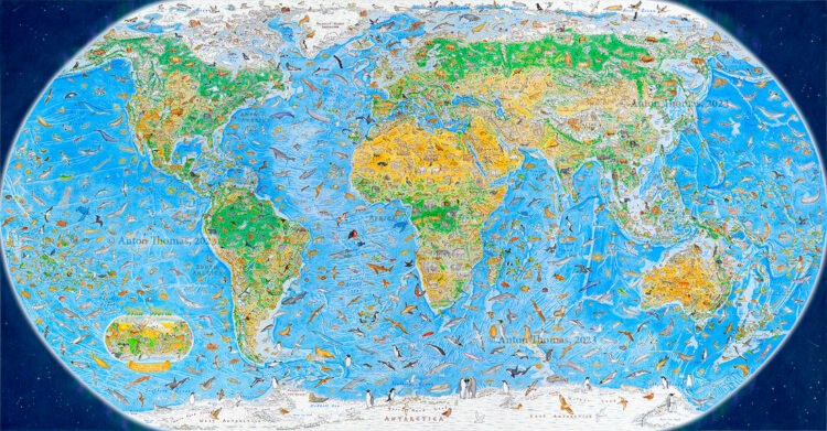
Three years in the making, an illustrated world map of 1,642 animals. [See the Project / On FlowingData]
Giorgia Lupi, for NYT Opinion
1,374 Days: My Life With Long Covid
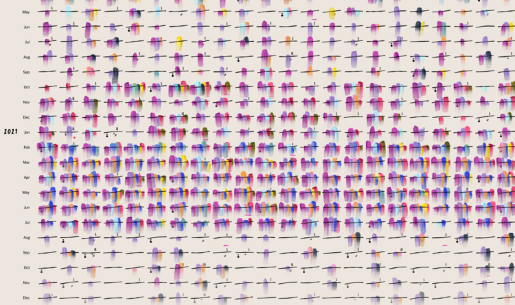
I associate Giorgia’s work to more playful themes, but she applied similar techniques to her records that she’s kept since getting long Covid. The results are moving. [See the Project / On FlowingData]
See the best of the best from previous years: 2008, 2009, 2010, 2011, 2013, 2014, 2015, 2016, 2017, 2018, 2019, 2020, 2021, 2022. (I still can’t remember why I skipped 2012, but I think I was distracted by a dissertation.)
Become a member. Support an independent site. Get extra visualization goodness.
See What You Get