
It’s been one year since my rambling post on creating effective visualization. It seems so long ago. What was I thinking? Since then, FlowingData has grown to 313 posts, 801 comments (plus tens of thousands of spam), and 2,600+ subscribers, and continues to slowly climb the ranks on Technorati.
It was exciting when FlowingData hit the 1,000-subscriber mark back in March and even more so when some really big blogs linked here and FlowingData was on the front page of del.icio.us. Who would have thought data visualization and statistics was so popular? I certainly didn’t know – which was why I started FlowingData in the first place.
Most Popular FlowingData Posts
I’ve featured a lot of great data visualization and statistics over the past year by some very intelligent and talented people. Here are the 10 most popular posts over FlowingData’s short one-year history.
- 17 Ways to Visualize the Twitter Universe
- Showing the Obama-Clinton Divide in Decision Tree Infographic
- 10 Largest Data Breaches Since 2000 – Millions Affected
- Ebb and Flow of Box Office Receipts Over Past 20 Years
- 21 Ways to Visualize and Explore Your Email Inbox
- Chart of the Day: A Breakdown of Facebook Applications
- Love, Hate, Think, Believe, Feel and Wish on Twitter
- 6 Influential Datasets That Changed the Way We Think
- Area Codes in Which Ludacris Claims to Have Hoes
- How to Learn Actionscript (Flash) for Data Visualization
Thank You
Thank you everyone for reading, linking, and suggesting topics. The blog wouldn’t be the same without you. We’re well on our way to reaching 5,000 subscribers. If you know someone else who’d be interested in FlowingData, please do pass the word along. I’ll super appreciate it.
Happy birthday, FlowingData!


 With the unveiling of the brand new
 Technicians are all about implementation. They have a strong programming background with experience in
  Data is priority to analyzers. Like technicians, aesthetics are not the greatest concern; rather, analyzers want to know the relationships between variables, find positive and negative trends, and are most likely to tell you that you should have used a different type of graph or chart for that dataset. Tools like
  Artists are obsessed with the final product – what the visualization will finally look like. They are the designers who are most likely to think long and hard about colors, visual indicators, and whether or not that square box should be moved up 2 pixels to the left. Programming is not a strong point, but if it is, it’s most likely in Processing. The weapon of choice though is the
  The outsider is the one with a complex data set but not quite sure what to do with it. Outsiders are the field experts who want to visualize their data but might not have the know-how to follow through. They can, however, provide
  Light bulbs are the idea people. They’ve got some programming, design, and analytical experience, but they’re not necessarily experts in all three areas. Because of all the experience, the brighter bulbs can usually handle a large data visualization project on their own (if they had the time). Knowing what’s possible and not possible, light bulbs lead projects and can delegate work across a team. It’s all about the big picture for the bulbs while the brightest are like the zen masters of data visualization.
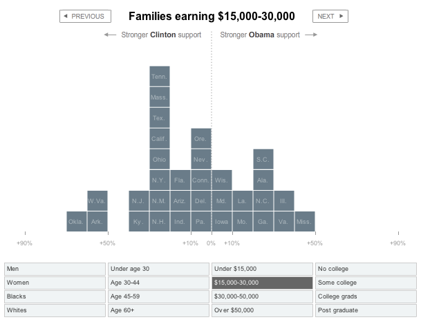
 Cory Doctorow from The Guardian writes about our
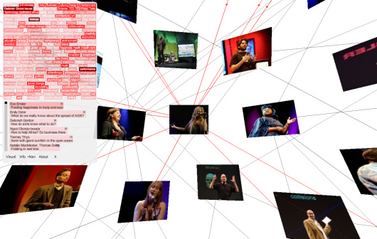
 Visualize This: The FlowingData Guide to Design, Visualization, and Statistics (2nd Edition)


