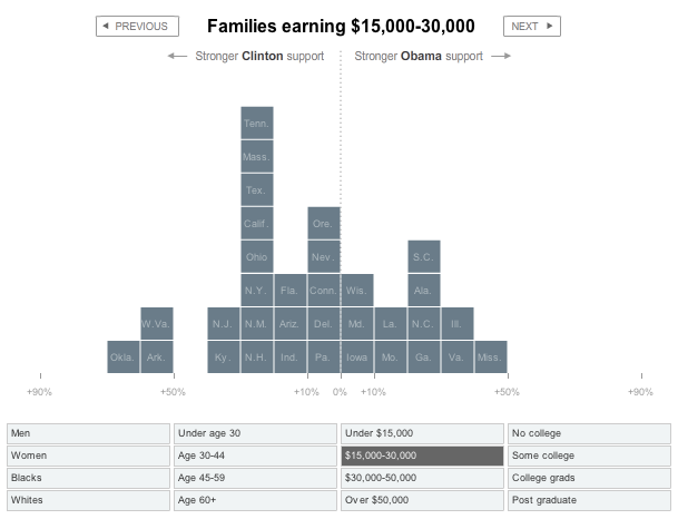
The above New York Times graphic shows where each candidate got his or her support from. The x-axis (horizontal) represents strength of support and the y-axis shows the number of states.
On the surface, it’s a stacked bar chart, but the animation as you browse the groups (e.g. under age 30, whites, blacks), makes things interesting. Highlight a state and watch it move left to right and right to left or just click on “blacks” and watch all the states shoot to the right in support of Obama. FlowingData readers will recognize the names of the skilled graphics editors who made the graphic – Shan Carter and Amanda Cox.
[Thanks, Chris]
 Visualize This: The FlowingData Guide to Design, Visualization, and Statistics (2nd Edition)
Very elegant. Reminds me of the Many Eyes block histogram.
@David: i think i just might see some similarities between the two.