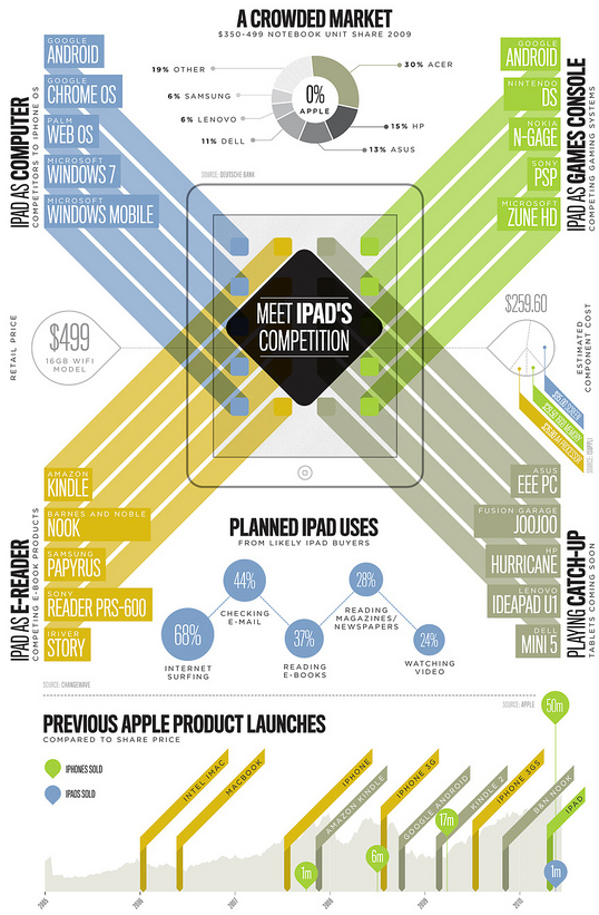
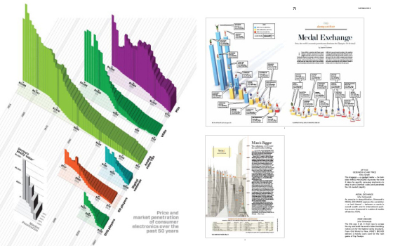
Light on the data, heavy on the aesthetics. Super pretty by Section Design. [via]
-
When asked to take off his hoodie during D8, Facebook CEO Mark Zuckerberg was incredibly reluctant and broke out into a serious sweat. After a bit of coaxing, however, Zuckerberg revealed a large insignia on the lining of his hoodie, representing Facebook’s supposed mission statement: making the world open and connected. Audrey Fukuman reproduced the graphic for SF Weekly, from stills and video.
What is its purpose? Only Facebook employees know for sure, but most likely it came out of a designer having some fun, and Facebook just rolling with it. Either that, or cult rituals in the ballpark in the middle of the night. It’s either/or, really. What do you think? [via]
-
Moritz Stefaner of Well-formed data gives thought to propositional density as it pertains to visualization. There are two kinds. The first is surface propositions, which are straightforward statements about what we see. The second is deep propositions. These are statements that aren’t so straightforward, like how we feel while looking at a graphic.

Moritz uses the FedEx logo as a simple example. First, the surface proposition:
“The FedEx logo type is purple” and “The FedEx logo type is set in a sans-serif font” are propositions, and because they describe salient, perceptible properties of the design, they are referred to as surface propositions.
Then there are deep propositions:
Now, the FedEx logo became famous for a perceptual trick: The white space between the E and the x cre ates an arrow. This arrow induces, by its semi otic read ing, a num ber of additional associations and readings of the design: “FedEx is on the go”, “FedEx is forward-thinking”, etc. Note that these propositions, unlike the surface propositions, are much harder to enumerate as they depend on the meaning that the observer ascribes to the arrow.
So how does this pertain to visualization? Oftentimes work is judged by graphical perception alone – how well does it show the trend or does it properly represent outliers? That’s just the tip of the iceberg though. We have yet to look closely at what’s underneath.
Read the rest on Well-formed data. It’s interesting to think about, even if you disagree with the argument.
-

Tactical Tech, the group that brought you Maps for Advocacy and Visualizing Information fo Advocacy, has taken it up a notch with their release of 10 tactics for turning information into action:
10 Tactics provides original and artful ways for rights advocates to capture attention and communicate a cause. It includes a 50-minute film documenting stories from around the world and a set of cards; with tools, tips and advice, for you to work through as you plan your own info-activism.
The 10 tactics to get people do stand up and do something useful are as follows (added emphasis by me):
- Mobilise people
- Witness and record
- Visualize your message
- Amplify personal stories
- Just add humour
- Manage your contacts
- Use complex data
- Use collective intelligence
- Let people ask the questions
- Investigate and expose
Unfortunately, the documentary portion isn’t available in its entirety online, so the below preview will have to suffice for now. You can host a screening with Tactical Tech to see the rest. There have been over 100 screenings in 45 countries so far.
Read More -
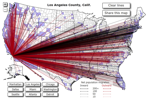
Jon Bruner of Forbes reports that more than 10 million Americans moved from one county to the other in 2008, based on data from the IRS. The above interactive map show these moves in and out of nine major cities. Red lines represent moves out of the city and black lines show the opposite. The less opaque a line, the less people.
The interaction is kind of clunky, and it’s hard to see all the movement, even when you zoom in, simply because there are so many lines. Further moves, say from California to Florida, get more visual dominance too, when it’s actually less than it looks, I think. Placing less emphasis on the lines, and coloring counties as you select the major cities might make this more clear. Nevertheless, it’s still an interesting view.
[Thanks, @jonbruner]
Update: Check out data.gov and look for ‘migration’ to get your hands on the data behind the map.
-
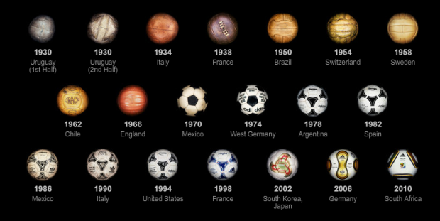
With the World Cup in full swing, the New York Times has been rolling out its World Cup-related graphics so you can stay on top of all the matches. They’ve got their live trackers, complemented with live blogging, and a map to find where to watch the game (in NY), based on what team you’re rooting for.
The best feature so far though is the evolution of the ball, from 1930 to present. It’s a series of photos of each ball from every World Cup. Can you really beat the classic ball from the 1970 Cup in Mexico?
Read More -
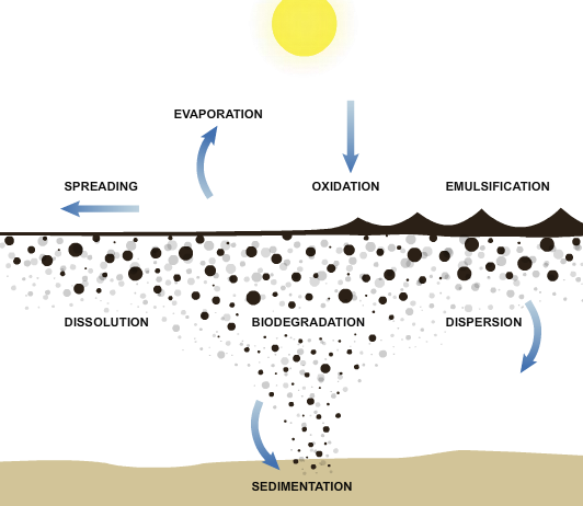
What exactly is going on with all the oil spewing into the Gulf, biologically speaking? MSNBC explains in a series of graphics:
The Deepwater Horizon oil spill has released millions of gallons of crude oil into the Gulf of Mexico, making it the most devastating oil spill in U.S. history. It is clear that the spilled oil will have a large impact on the Gulf coast for years to come, but what happens to the oil in the first hours, days and weeks as it interacts with the surrounding elements?
There are many physical and chemical processes, collectively known as weathering, that change the oil’s properties and behavior after it is spilled into the ocean.
It begins with the oil particles spreading, and over months and years, particles eventually sink to the ocean floor and micro-organisms feed on hydrocarbons in the spilled oil. After that, I like to think everyone refuses to buy anything BP-related and the company goes bye-bye.
[Thanks, Jonah]
-
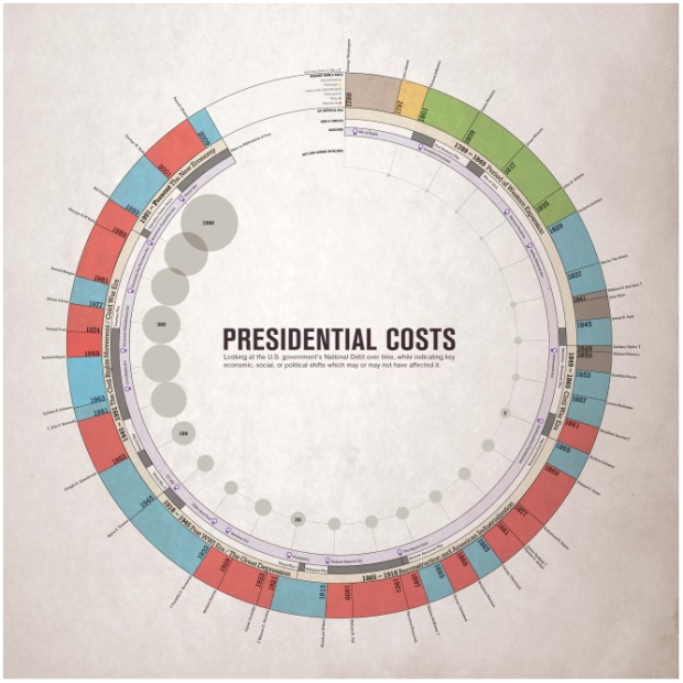
Presidential Costs by Rachel Mercer offers a look at the history of the United States:
The outer circle illustrates presidential periods, the governing party, and whether or not the President died in office. The first inner circle shows the “eras” in history that those time periods covered. The third inner circle shows key foreign conflicts and wars. The fourth inner circle (purple) shows key legislative acts (or series of bills) that were issued. Finally, the bubbles in the middle indicate the average national debt, as indicated every 8 years.
I like the look, but the average debt numbers do seem kind of iffy. I could be wrong though.
-
We saw math principles in nature. Now how about charts? Andy Woodruff does some sniffing around in Google Maps to find charts in rural landscapes. Above, you’ve got your polar area charts in Bolivia. It looks like an agricultural area. I have no idea how that kind of layout would be more efficient than squares though. Then again, I’m no farmer. Other chart types include pies, bars, and treemaps. Can you find anymore?
-
This is completely useless in the good sort of way. Twitter parade, by KDDI, takes your followers and throws a parade for you. You can also enter a keyword instead of a username. As the people march, their recent tweets are displayed.
Thanks for the giant statue with the top half of my head, guys. Truly, the honor is all mine.
[via datavisualization]
-
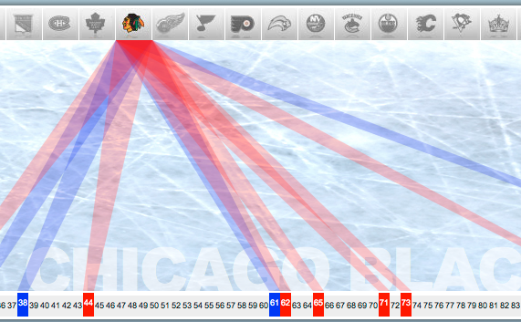
Speaking of sports most Americans know nothing about, Robby Macdonell visualizes NHL Stanley Cup competitors in his experiment with HTML5. The interactive shows winners and losers since 1927. Teams are shown up top and years are on the bottom. Mouse over stuff, and connecting lines show past appearances if you are looking at a team, or the winner and loser of a year, if you are looking at the bottom.
See Robby’s post for the full skinny on how he did it.
Congratulations to the Chicago Blackhawks in their recent win. You’ve done Obama proud.
[via the forums]
-
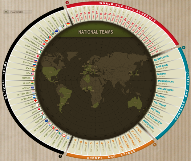
I was born in and live in the United States, so to me football is a bunch of big guys in full armor trying to tackle each other. To the rest of the world though, all eyes are on the World Cup, starting June 11. So this is for you, international readers (and maybe one or two Americans). Marca has an interactive World Cup schedule so you can make sure not to miss any important matches. Mouse over a date, a team, a group/stage, or cities/stadiums to focus on the matches you want.
[Thanks, Judi]
-
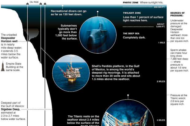
The Deepwater Horizon well is nearly a mile deep in water. It extends 3.5 miles. It’s hard to imagine these depths of the ocean though since most of us have never gone further than twenty feet below. The New York Times’ Bill Marsh provides some context. The Titanic rests 2.4 miles down, while in 1960, a U.S. Navy submersible descended to the deepest known ocean floor, about 7 miles into the darkness. [Thanks, Peter]
-
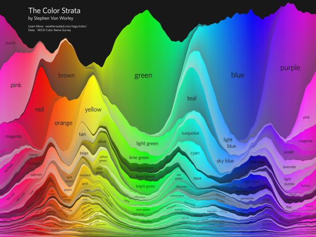
In another look at the data from xkcd’s color experiment, Stephen Von Worley looks at the common and not so common colors of the rainbow:
The Color Strata includes the 200 most common color names (excluding black-white-grayish tones), organized by hue horizontally and relative usage vertically, stacked by overall popularity, shaded representatively, and labeled where possible. Besides filtering spam, ignoring cruft, normalizing grey to gray, and correcting the most egregious misspellings (here’s looking at you, fuchsia), the results are otherwise unadulterated.
The results correspond nicely with Martin and Dolores Labs’ color wheels from a couple of years ago.
[Thanks, Stephen]
-
Maps on the major sites like Yahoo, Google, and Bing have a similar look. You’ve got your yellow roads, orange freeways, and green parks. Bing Destination Maps takes a different approach. Select your region of interest, and choose the style that you want. You have four choices: European, American, sketchy, and treasure map (above).
Read More -
A couple of weeks ago you saw Eric Fischer’s maps of Flickr photos in major cities. The inclination was to think of the maps as a representation of tourist hot spots. The more pictures taken in an area, the more people go there to visit. That’s not necessarily the case though. Tourists might flock to an area and might completely neglect another, while locals might avoid the touristy areas.
In Fischer’s second run of maps, he makes an educated guess about the splits between tourists and locals:
Blue points on the map are pictures taken by locals (people who have taken pictures in this city dated over a range of a month or more).
Red points are pictures taken by tourists (people who seem to be a local of a different city and who took pictures in this city for less than a month).
Yellow points are pictures where it can’t be determined whether or not the photographer was a tourist (because they haven’t taken pictures anywhere for over a month). They are probably tourists but might just not post many pictures at all.
See the full set on Flickr. It’s even better than the first. [via | thanks, Joe]
-
Note: The review copy I received is in French. Unfortunately, I only understand English. So this review is actually my impression of Data Flow: Design Graphique et Visualisation D’Informations as a picture book with titles, which in a way it kind of is anyways.
Last year, the first Data Flow was published, featuring the data graphics of some fine designers. You can read my review of it here. Basically, if you liked the first Data Flow and could use some more inspiration, you’ll probably like this second edition. The two are really similar in layout and in the way the graphics are split up. The title is exactly the same, save the 2.
Read More -
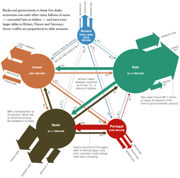
While the US has its own problems with debt somewhere in the range of $13 trillion, European countries have got some issues too. It seems like everyone owes something these days.
[Thanks, Tom]
-
Doug McCune maps San Francisco crime in 2009 as if it were elevation. Peaks and valleys emerge with the rolling terrains of crime. The above is the map for prostitution:
My favorite map is the one for prostitution (maybe “favorite” is the wrong choice of words there). Nearly all the arrests for prostitution in San Francisco occur along what I’m calling the “Mission Mountain Ridge”, which runs up Mission St between 24th and 16th. I love the way the mountain range casts a shadow over much of the city. There’s also a second peak in the Tenderloin (which I’m dubbing Mt. Loin).
I love how realistic the 3-dimensional models look. They could almost pass for clay figures. Doug notes that the series of maps are more an art piece than they are information visualization, but these would be a great complement to your standard choropleth.
-
In regards to the UK’s recent boom in open data, Simon Rogers of the Guardian, ponders data’s role in journalism, and the opportunities this new found information could bring:
The impact on journalism is expected to be great. The Chicago-based web developer and founder of the neighbourhood news site EveryBlock, Adrian Holovaty, says it’s going to be challenging but exciting for journalists. “As more governments open their data, journalists lose privileged status as gatekeepers of information – but the need for their work as curators and explainers increases. The more data that’s available in the world, the more essential it is for somebody to make sense of it.”
This need not only creates a fresh brand of news, but also a new type of journalist:
I once prided myself on my lack of maths knowledge. Now I find myself editing a datajournalism site, the Guardian’s datablog: a site where we use Google Spreadsheets to post key datasets. We make the data properly accessible, then encourage our users to take the numbers, produce graphics and applications and help us look for stories.
Priding yourself on a lack of know-how on how to deal with data is a little weird, but okay.
In any case, people always ask me how to get into information design, infographics, visualization etc. Journalism is one of those choices, and there’s a lot of opportunity there if you’ve got the skills.






 Visualize This: The FlowingData Guide to Design, Visualization, and Statistics (2nd Edition)


