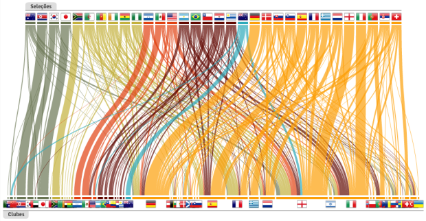
The World Cup is an event where countries from all over the world compete, but what about the teams themselves? Players may play for a single country, but many are ‘imported’ from elsewhere in the world as their day jobs are actually elsewhere. This isn’t a new thing, but teams have certainly become more multicultural over the years. Read More
-
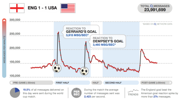
I love how major sporting events can captivate an entire country or region, especially when there’s the data to show the collective pulse. We saw it during the Canada-United States hockey gold medal match. Everyone flushed together. Similarly, O2, a UK mobile service provider, shows us texting volume during the World Cup and highlights the points of interest. England scores a goal and there’s a flood of text messages. Goooal. Read More
-
Buck, in collaboration with TakePart and An Inconvenient Truth director, Davis Guggenheim, describe the education crisis in America in motion graphics for upcoming documentary, Waiting for “Superman”. Watch the video below. It’s a more or less a run of education vitals, but it flows well and has a nice look and feel.
Plus, it’s an important subject we should know about. Maybe a new movement will get going once education gets the “inconvenient” treatment.
Read More -
The third installment of Pixar’s Toy Story is making a killing at the…
-
Can you believe it? FlowingData is three years old today. I’m in the middle of a cross-country move, so I can’t get into the number rundown like I usually do, but I just wanted to take this chance to thank all of you for reading. Thanks for sharing links with your friends and sending in suggestions. Every retweet, like, digg, and stumble helps FlowingData reach a wider audience.
It seems so long ago when I was just rambling to myself around here. Now there are 40k of you. Next year, 100k?
Thanks to all the sponsors too, past and present, who help keep the gears turning around here. I couldn’t have done it without you.
Happy birthday, FlowingData!
Grab a sticker and show your undying love for FD for everyone to see :).
-
Anyone can listen to music, but how can you see it? The Music Animation Machine plays music (ancient MIDI files) and displays it in real-time. On the vertical are notes and time runs on the horizontal. Here’s Debussy’s classic Clair de lune, otherwise known as that song from the Ocean’s 11 through 13 soundtrack, where they all gather at the fountain and give a nod of recognition to each other. Read More
-
For the most part, you go about your day-to-day with little knowledge of all the bits and networks you walk past or intersect with. Designer Timo Arnall visualizes these wireless networks of WiFi, bluetooth, etc. in the physical world (video below). It’s a simple idea. As we move through the landscapes, white dashed circles move around buildings with WiFi and people carrying mobile gadgets. Read More
-

After a few years of fighting the good fight, charting and data site Verifiable closes shop in August. The idea spawned during an Edward Tufte workshop and developed into an effort to provide a tool that people could come to for facts by the numbers. Read More
-
I think it took me a few months to beat Super Mario Brothers 3 on Nintendo. Follow the directions in this graphic, and you should be able to beat it in 11 minutes. It’d probably still take me a few months. My video game talents tapped out at Kaboom on Atari. [via]
-
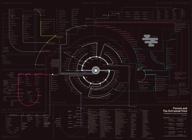
Ben Millen diagrams the reach of the iPhone in our everyday lives:
These are not maps in any conventional sense, but rather diagramatic representations of the interconnected space of technology, capital, instrumental value, exchange value, social and environmental impact that surround the device.
The tube map metaphor is a little worn, but this is subtle, so it’s not so bad. There are two maps. One covers the mechanics of the phone while the second is more about how consumers use the phone. The former is the more interesting one.
So who’s going to do the map for my 2004 Samsung flip? It takes a lickin’ but keeps on tickin’.
-
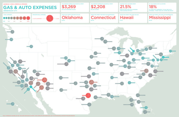
In a follow-up to their graphic on what America spends on food and drink, personal finance site Bundle, with the help of Nicholas Felton, looks at money spent on gas and auto expenses in major US cities:
The average household spent $5,477 on gas and auto expenses last year, according to Bundle data, an amount which accounts for about 14.5 percent of daily spending.* That’s more than we spend on groceries or utilities, and more than we spend on travel, entertainment, clothes and shoes, and hobbies — combined.
The sticking-out label thing doesn’t really do it for me. The coloring makes the graphic worthwhile though, and the scaled two-section pie charts are pretty good too. What’s going on down there in Austin?
-
The quantified self sounds great on paper. The task: keep track of important facets of your daily life. The result: gain a better understanding of your day-to-day and make better educated decisions, based on the numbers instead of false assumptions and shots in the dark. What’s not to like? Everyone wants to improve his or herself in some way.
To outsiders looking in though, tracking your life in data is ridiculous.
Who has the time to keep track of what you eat, when you sleep, and how many times you fart in the wind? To most people, data journaling (a.k.a. self-surveillance, lifetracking, lifestreaming, personal informatics) seems like a complete waste of time, and I don’t blame them — for now.
Read More -
We like to talk about the stories in data. They are the information and meaning in the numbers, and are meant to represent truth. Artist Kim Asendorf turns this around a bit and uses a series of made-up visualization pieces to tell a fictional story. It is the story of John.
John is a scientist working in a corrupt lab called Sumedicina in Durham, North Carolina. The lab is in the business of selling vaccines, which is all well and good, but the problem is that they’re the ones creating and spreading the viruses that their vaccines fight against. John is the lead scientist who creates these viruses.
His conscience gets the best of him though, and he destroys the highly dangerous virus they are are currently working on and then quits. Sumedicina is having none of it. John is on the run. This is his story in data.
-
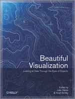
Continuing with the ‘Beautiful’ series, O’Reilly has released their newest one, Beautiful Visualization.
This book examines the methods of two dozen visualization experts who approach their projects from a variety of perspectives — as artists, designers, commentators, scientists, analysts, statisticians, and more. Together they demonstrate how visualization can help us make sense of the world.
Like others in the series (e.g. Beautiful Data, Beautiful Code), Beautiful Visualization is a compilation of essays from twelve people and groups who work in the field, and it’s a very mixed bag. Regular FD readers will recognize many of the names: Fernanda Viegas, Martin Wattenberg, Aaron Koblin, Robert Kosara, Nick Bilton, and Jer Thorp, among others.
Read More -
I know next to nothing about soccer (a.k.a. football), but I gotta admit this Brazil vs. Ivory Coast match is more exciting than I thought it’d be. I can’t say the same about the vuvuzelas though. In any case, to help neophytes like me, the New York Times graphics have helped a lot. Their most recent explains the mechanics of the free kick. They describe two approaches in the animated feature: the straight blast and the bend. Read More
-

Smallthought Systems, the group behind Dabble DB, the easy-to-use online database system and Trendly, the exploration tool built on top of Google Analytics data, was acquired by Twitter last week:
Avi, Ben, Luke and I will be moving down to San Francisco this fall to work in Twitter’s great downtown offices. We’ll certainly miss everyone we’re leaving behind, but at the same time we’re excited about a new adventure. One great consequence of this is that the four of us will finally all live and work out of the same city — that has never happened before!
On Smallthought’s side of the table, they’re joining a great company with a huge, unique, and exciting dataset i.e. billions of tweets. On Twitter’s side of the table, they’re getting a great team who knows data and how to help people make use of it. So it’s great news all around.
-
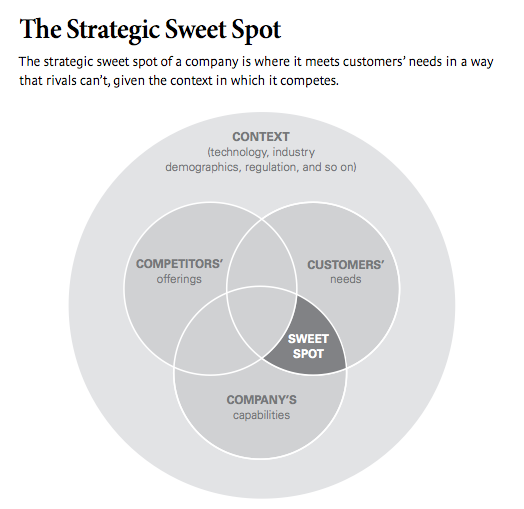
Gosh, it’s so easy. I’m going to be rich. Get the strategic sweet spot and the three ingredients down, and you’re set for life.
-
Since 2007, the Knight News Foundation has awarded millions of dollars in grants to fund “innovative ideas that develop platforms, tools and services to inform and transform community news, conversations and information distribution and visualization.” There were 12 grants awarded this year, and three of them deal with maps. The folks at Stamen scored the biggest grant at $400k for their project CityTracking:
To make municipal data easy to understand, CityTracking will allow users to create embeddable data visualizations that are appealing enough to spread virally and that are as easy to share as photos and videos. The dynamic interfaces will be appropriate to each data type, starting with crime and working through 311 calls for service, among others. The creators will use high design standards, making the visuals beautiful as well as useful.
That’s obviously something we’ll need to keep an eye on.
The other two mapping projects were GoMap Riga (Marcis Rubenis and Kristofs Blaus), which will place real-time local news on maps and Tilemapping (Development Seed), which will be a tool to help journalists make maps more easily.
Broken record, yes I am, but data is gonna be big I tells ya. Big.
See the quick ten-second pitches from all twelve winners below. I’m intrigued by The Cartoonist. They’re going to use cartoon-like games to get engaged readers and get them involved in the news.
Read More -
This is hilarious and uber creative advertising. If I wore glasses, I’d totally buy from these guys.
Read More -
I love the Apple logo and all, but my Macbook really needed some pizazz, and what says pizazz more than a FlowingData sticker? Nothing. Honest to goodness, I feel like a new man, and now you can too.
Read More








 Visualize This: The FlowingData Guide to Design, Visualization, and Statistics (2nd Edition)


