How to: make a scatterplot with a smooth fitted line
Oftentimes, you’ll want to fit a line to a bunch of data points. This tutorial will show you how to do that quickly and easily using open-source software, R.
Maybe you have observations over time or it might be two variables that are possibly related. In either case, a scatter plot just might not be enough to see something useful. A fitted line can let you see a trend or relationship more easily.
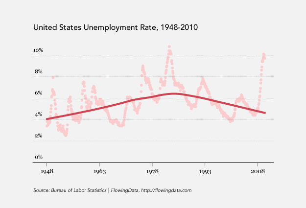
As an example, we’ll take a look at monthly unemployment data, from 1948 to February this year, according to the Bureau of Labor Statistics.
What LOESS is
First, let’s briefly go over what we’re actually doing with this loess thing. LOESS stands for locally weighted scatterplot smoothing. It was developed [pdf] in 1988 by William Cleveland and Susan Devlin, and it’s a way to fit a curve to a dataset.
If we plot unemployment without any lines or anything fancy, it looks like this:
Dot plot showing unemployment over time
Most of us are familiar with fitting just a plain old straight line. The end result is a slope and an intercept. You know the whole y=mx + b equation back from middle school?
Scatterplot with a linear fit, y = mx + b
So without going into the nitty-gritty, the above fit looks at all the data and then fits a line. Loess however, moves along the dataset, and looks at chunks at a time, fitting a bunch of smaller lines that connect to make one smooth line.
Alright, enough background. On to the how-to.
Step 0. Download R
You’ve already done this, right? If not, you can download it for Windows, Mac, or Linux. Don’t let the out-dated site full you. You can get a lot done with the free software, and it’ll be a simple one-click install for most.
Step 1. Load the data
Like I said, I got the data from the Bureau of Labor Statistics. You can download it here in CSV format if you like, but we’ll load it directly into R with the following:
unemployment <- read.csv("http://datasets.flowingdata.com/unemployment-rate-1948-2010.csv", sep=",")
You’re basically telling R to load data in the unemployment variable from the given URL, and columns are separated by commas.
Once it’s loaded, take a brief look by typing unemployment[1:10,]. Your screen will look something like this:
As usual, you load your data in R before you start anything else
There are four columns, but we’re actually just going to use that last one: Value.
Step 2. Time to plot
Yup, it’s already time to make the scatterplot with fitted curve:
scatter.smooth(x=1:length(unemployment$Value), y=unemployment$Value)
Since we’re only looking at unemployment, the x-axis is just a sequence from 1 to the total number of observations. Here’s what the above line will give you.
Fit a LOESS curve to the dots
Not bad, right? Two lines of code, and you’ve already got your plot. We can do a little better though. Let’s fix it up a bit.
Step 3. Modify axis limits
It’s usually a good idea to start your values axis at zero if you can. The above graph doesn’t start at zero, so let’s fix that using the ylim argument to make it go from 0 to 11.
scatter.smooth(x=1:length(unemployment$Value), y=unemployment$Value, ylim=c(0,11))
Update the axes to start at zero
That’s a little better. Now let’s do something about the color.
Step 4. Modify colors
I want the curve to stand out some more. Everything blends together as it is now. We’ll use the col argument to change the dots to light gray:
scatter.smooth(x=1:length(unemployment$Value), y=unemployment$Value, ylim=c(0,11), col="#CCCCCC")
Make the fitted the line the point of interest and put dots in the background
Step 5. Save as PDF and do whatever
So at this point, you can fuss around with arguments to tweak. Just type ?scatter.smooth to read documentation on the function. As many of you know though, I like to take it into Adobe Illustrator at this point. This just happens to be what works for me. There are lots of ways to edit PDF files.
Anyways, after some color changes, and label cleanup, we’re done.
Title, color, cite, and fonts
Tada. And it only took two lines of code. How about that? Give it a try for yourself, and happy graphing.
For more examples, guidance, and all-around data goodness like this, pre-order Visualize This, the upcoming FlowingData book.
Made possible by FlowingData members.
Become a member to support an independent site and learn to make great charts.
About the Author
Nathan Yau is a statistician who works primarily with visualization. He earned his PhD in statistics from UCLA, is the author of two best-selling books — Data Points and Visualize This — and runs FlowingData. Introvert. Likes food. Likes beer.
The danger with smoothers is that in throwing away the noise you also throw away the interesting variation in the data.
In this example, the interesting thing about unemployment, brought out clearly by the scatter plot, is that it is highly spiky and cyclical. The loess curve with the default degree of smoothing smooths away this cyclicity.
I would have preferred either a loess with less smoothing (controllable by varying the parameter ‘span’ in R) or, even better, a plot of the autocorrelation and partial autocorrelation functions, to summarise this series.
I have to disagree. The purpose of loess here is not to capture all the cyclical nature of the data, but rather to help you visualize and explain the secular trend.
You are right that, for modeling the data, this level of smoothing is not going to help, and for that you do want to take care of autocorrelation in this time series.
I find loess extremely helpful for making initial modeling choice, such as when to add polynomials or whether I can get away with just linear functions of the data. For illustrative purposes, the unemployment data is well chosen because it is easy to compare the local regression to the actual data, but lots of data just look like a huge blob of points. In such cases, loess really fits the bill.
The bigger issue I have with this is brought up peripherally by Jyotirmoy. The point of dataviz is to increase understanding of the real world. Utilizing smoothing functions when the user doesn’t understand the mathematics behind them is the exact opposite of understanding – its making pretty things out of complicated ones for no reason other than aesthetics.
How does that graph increase understanding? It does not. There is no reason that trend line says anything more about the data than a loess function with less smoothing, or for that matter a linear function. This blog is usually good at not falling into that trap, but not here.
Couldn’t disagree here and with Jyotirmoy more. The cyclical nature of unemployment is exactly what obscures drawing conclusions about the long-term structure of the economy from unemployment data. The smoothing function allows that, and in fact shows something interesting: the decline in unemployment starts not in the “Morning in America” 1980s but in 1978. The smoothing is not merely aesthetic; removing the noise from the data uncovers a long-term trend.
Note to self: look at graph again before posting about it from memory.
with this dataset, it’s not as useful as in other cases, yes, but the point of this tutorial was just to teach how to fit a curve.
with datasets where the peaks and valleys aren’t so easy to spot, the observations aren’t at regular intervals, and the values are more scattered then the curve grows in value.
then it gets even better when you start doing a lot of them like in this matrix layout, for example:
http://www.fort.usgs.gov/BRDScience/images/LearnR10-05-37.jpg
My impression was that the graph here was oversmoothed. I generally run loess with a series of different points in the moving regression, to see what features of the data persist over a number of computed curves.
I built myself an Excel add-in to handle LOESS, and I’ve made it available free to the world: http://peltiertech.com/WordPress/loess-utility-awesome-update/. Let me know what you all think.
ggplot(df,aes(x,y))+geom_point()+geom_smooth()
ggplot(unemployment, aes(x=1:length(Value), y=Value)) + geom_point() + geom_smooth()
since it’s mostly a non-R audience here, i like to side-step installing packages when i can. thanks, though. i’m sure hadley appreciates it too.
speaking of which, you can sidestep R altogether with this online ggplot implementation:
https://flowingdata.com/2009/12/22/build-statistical-graphics-online-with-ggplot2/
Thanks Mark. I really should have put in the extra effort to produce code that actually works.
Nice post by the way Nathan!
Best,
Vincent
Not to get too Andrew Gelman-y on you Nathan, but why the choice of ticks in the x-axis? 15 year increments from 1948–2008.
laziness. even increments are always best, so i thought 15 years would work. it didn’t quite, but i needed to sleep :). looking at it now, i would’ve started at 1950 and then done 10-year increments.
For anyone using Excel, I’ve built a nice little LOESS add-in. I built it for my own use, so you know it’s good :-)
I describe a recent update to the add-in LOESS Utility – Awesome Update.
[Removed]
Or… if you want to stay opensource use Inkscape instead of Illustrator! Also, it is much more intuitive to use IMHO!
I have to agree with this, I’ve been using Inkscape for years to finish up graphs & illustrations. Feature-rich, flexible, and your documents are saved in an *open* SVG format.
maybe i should give inkscape a try :). to be fair, illustrator also lets you save in .ai, .svg, and .pdf formats, along with the usual image formats.
I second what RK said… I’d love to hear how you moved from the R output to the spiffed up final product.
I’ve only been subscribed to your website for a couple week, but these tutorial articles are fantastic. I’d second the request for an Illustrator walkthrough showing the basics that you tweak.
How’s about STL?
And to dcbs: “Utilizing smoothing functions when the user doesn’t understand the mathematics behind them is the exact opposite of understanding – its making pretty things out of complicated ones for no reason other than aesthetics.”
You’ve got to be kidding me.
I’m sorry Mike – but flame war says what?
I think Nathan’s explanation that this was for the purpose of a tutorial make a lot of sense (although I worry about giving people the tools to use smoothing functions without at least linking to the underlying mathematics), and its clear that he at least understands what hes talking about. But I can’t quite figure out what you’re trying to get across here. Are you arguing for doing dataviz without understanding the basic statistical relationships behind what is been shown? Help me out.
yeah, let’s try to keep it at a gentle smoke :).
i do provide a brief background on loess and link to more information about it, if that counts for anything. i don’t think the general users need to know _exactly_ how it’s done for it to be useful though. As long as the curve is there as a supplement and not a replacement, i think it adds to the understanding. again, this dataset wasn’t the best example, but there are still plenty of decent applications.
pollster’s use of it for obama’s approval ratings is another good example:
http://www.pollster.com/polls/us/jobapproval-presobama-health.php
Nathan’s tutorial here is very good, hands on without too much detail. If people understand it’s a moving regression, that’s most of what they really need. That and don’t remove the original data, because that serves as a sanity check.
If you wish to avoid Illustrator all together then you could do something like this after you get your data. It’s a few more lines of code but hopefully it illustrates the abilities of the built in plotting.
x = 1:length(unemployment$Value)
y = unemployment$Value
plot(x, y, ylim=c(0,11), col=”gray”, axes = FALSE, xlab = ‘Year’, ylab = ”)
axis(1, c(1, (1:4)*15*12), labels = c(‘1948’, ‘1963’, ‘1978’, ‘1993’, ‘2008’), cex.axis = 0.8, font = 3)
axis(2, seq(0,10,2), labels = FALSE)
labels = paste(seq(0,10,2), ‘%’, sep = ”)
text(-40, seq(0,10,2), labels = labels, cex =0.8, pos = 2, xpd = TRUE)
text(-130, 12, labels = ‘United States Unemployment Rate, 1948-2010’, xpd = TRUE, pos = 4)
abline(h=seq(0,10,2), col=”lightgray”, lty=”dotted”)
l <- loess(y~x)
lines(x, predict(l), lwd = 3)
#NOTE: to get the same line as the author change the loess parameters to the scatter.smooth default l <- loess(y~x, span = 2/3, degree = 0)
rats… to get an output even closer to the authors use this…
unemployment <- read.csv("http://datasets.flowingdata.com/unemployment-rate-1948-2010.csv", sep=",")
x = 1:length(unemployment$Value)
y = unemployment$Value
plot(x, y, ylim=c(0,11), col="gray", axes = FALSE, xlab = '', ylab = '')
axis(1, c(1, (1:4)*15*12), labels = c('1948', '1963', '1978', '1993', '2008'), cex.axis = 0.8, font = 3)
axis(2, seq(0,10,2), labels = FALSE)
labels = paste(seq(0,10,2), '%', sep = '')
text(-40, seq(0,10,2), labels = labels, cex =0.8, pos = 2, xpd = TRUE)
text(-130, 12, labels = 'United States Unemployment Rate, 1948-2010', xpd = TRUE, pos = 4)
abline(h=seq(0,10,2), col="lightgray", lty="dotted")
l <- loess(y~x)
lines(x, predict(l), lwd = 3)
text(-130, -3, labels = 'Source:Bureau of Labor Statistics | FlowingData, https://flowingdata.com', cex = 0.5, font = 3, pos = 4, xpd = TRUE)
@John – nice. getting there :)
thanks… that second one was what I had planned to paste but I picked up the wrong thing
A nice post would one that starts a discussion about when you need to break into Illustrator/Inkscape to make your point. I’m with John that you can get pretty far in R for making your graph publication ready, so when do you need that extra bit of polish that a drawing tools will provide? (didn’t Tufte say something about needing one tool that can count and one tools that can see).
I have a problem with the trend line. Looking at the monthly values, I notice a substantial rise after 2008, consistent with news reports of our economy.
Your trend line does not respond to the increase in unemployment starting around 2008, rather it continues a decline.
I have reproduced your chart, however, my loess trend line shows the appropriate increase after 2008.
Not sure why the discrepancy.
The exact line you get will be sensitive to the parameters you feed into loess (the size of the local regression window).
If nothing else, though, Nathan’s chart accentuates how out of wack the decrease in employment is since 2008—way more than structural.
Kelly –
I agree. Using the algorithm based on the NIST documentation, I could not duplicate Nathan’s smoothing. With a large enough span (>=66%) my fit doesn’t curve upwards and its general shape is similar, but it doesn’t sink as low as Nathan’s does at the end.
Or you could use Rapidminer 5.0 and their time series operators. You could build a nonlinear trend line using Support Vector Machines or a standard Neural Net for this time series data.
Pingback: Data Visualization Resources - Combining and Filtering Time Series and Static Data Sets in EX Dashboards
Pingback: Notional Slurry » links for 2010-03-30
This is probably the wrong place to post this question but how do I write the values of the fitted curve into a text file?
Thanks,
instead of scatter.smooth, use loess.smooth (with the same variables). that’ll show you the x and y values of the curve. Like this:
p <- loess.smooth(x=1:length(unemployment$Value), y=unemployment$Value) So if you type 'p$x' that'll give you the x-values. After that, read up on write.table() to write to a text file: http://pbil.univ-lyon1.fr/library/base/html/write.table.html