In regards to the UK’s recent boom in open data, Simon Rogers of the Guardian, ponders data’s role in journalism, and the opportunities this new found information could bring:
The impact on journalism is expected to be great. The Chicago-based web developer and founder of the neighbourhood news site EveryBlock, Adrian Holovaty, says it’s going to be challenging but exciting for journalists. “As more governments open their data, journalists lose privileged status as gatekeepers of information – but the need for their work as curators and explainers increases. The more data that’s available in the world, the more essential it is for somebody to make sense of it.”
This need not only creates a fresh brand of news, but also a new type of journalist:
I once prided myself on my lack of maths knowledge. Now I find myself editing a datajournalism site, the Guardian’s datablog: a site where we use Google Spreadsheets to post key datasets. We make the data properly accessible, then encourage our users to take the numbers, produce graphics and applications and help us look for stories.
Priding yourself on a lack of know-how on how to deal with data is a little weird, but okay.
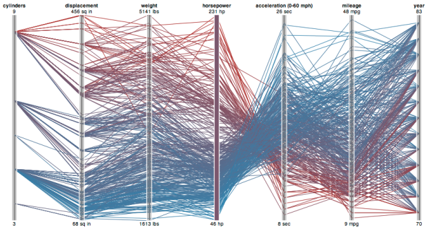
In any case, people always ask me how to get into information design, infographics, visualization etc. Journalism is one of those choices, and there’s a lot of opportunity there if you’ve got the skills.


 Visualize This: The FlowingData Guide to Design, Visualization, and Statistics (2nd Edition)


