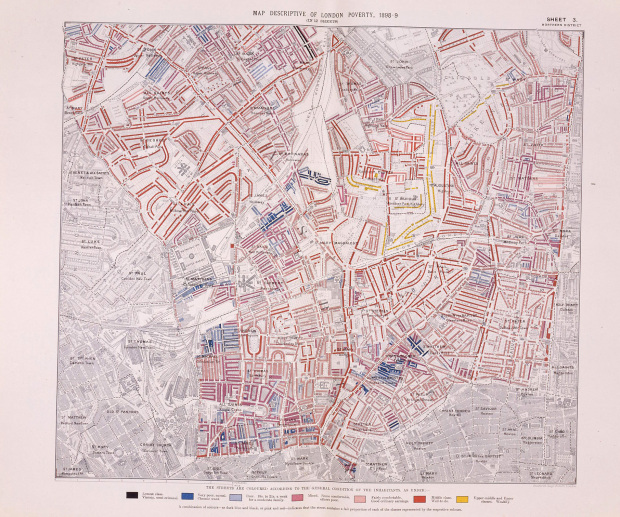
Alice Rawsthorn for The New York Times reports on Charles Booth’s London poverty maps, from the late 1800s, currently on display at the Museum of London. During a time when people saw rich and poor living separately, Booth’s map showed the contrary:
Mr. Booth had set out to discover how many people were living in poverty, to determine why and what could be done to help them. As well as proving that there was much more poverty in London than the official statistics suggested, his research revealed the nuances of an increasingly complex city with different degrees of hardship, where the rich often lived alongside the poor.
Of course, no visualization-related piece is complete without a little bit of data overload melodrama and a hat tip to Processing:
As the data crisis worsens, finding new ways to make sense of this tsunami of information and to illustrate it clearly becomes ever more urgent. One solution is data visualization, a new visual language now being developed by information designers. Using sophisticated programming languages, like Processing, they are distilling colossal quantities of baffling data into seductive digital animations — or visualizations — many of which then change in real time to reflect what is actually happening.
Ah, that hit the spot.
[via]
 Visualize This: The FlowingData Guide to Design, Visualization, and Statistics (2nd Edition)
Pingback: Human Rights Maps (98): Poverty in Late 19th Century London, and the Link to Crime | P.a.p.-Blog, Human Rights Etc.