On the Media’s episode last week was on data, namely personal data collection, journalism, and two cautionary tales. I haven’t listened to it yet, but I have a feeling it’s going to be a good listen. Part one on personal data embedded below to kick things off. [via]
-
The New York Times, citing a number of bits from a recent McKinsey report on big data, reports:
One hurdle is a talent and skills gap. The United States alone, McKinsey projects, will need 140,000 to 190,000 more people with “deep analytical” skills, typically experts in statistical methods and data-analysis technologies.
Additionally:
McKinsey says the nation will also need 1.5 million more data-literate managers, whether retrained or hired. The report points to the need for a sweeping change in business to adapt a new way of managing and making decisions that relies more on data analysis. Managers, according to the McKinsey researchers, must grasp the principles of data analytics and be able to ask the right questions.
I’ve said it before, but if digging into data is your idea of fun, there’s a whole mess of excitement and adventure headed your way. There are lots of opportunities already out there in marketing, journalism, tech, the Web, government, and pretty much everywhere you look. And more importantly, there are lots of opportunities that you can make for yourself. This is a great time for data heads.
-
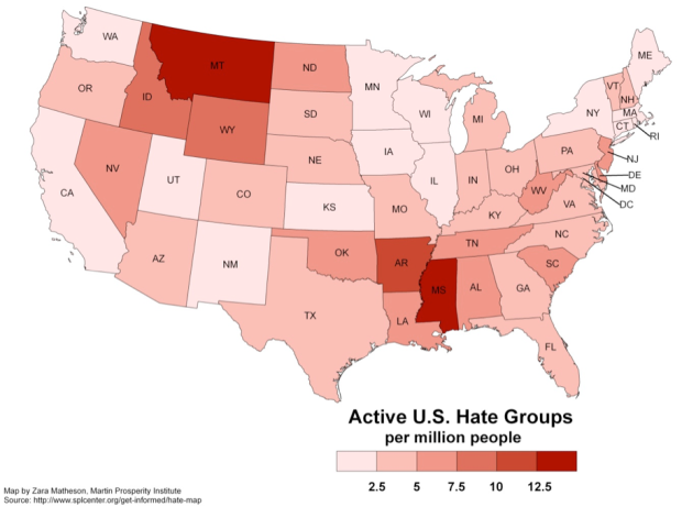
Richard Florida for The Atlantic takes a closer look at hate groups in the United States:
Since 2000, the number of organized hate groups — from white nationalists, neo-Nazis and racist skinheads to border vigilantes and black separatist organizations — has climbed by more than 50 percent, according to the Southern Poverty Law Center (SPLC). Their rise has been fueled by growing anxiety over jobs, immigration, racial and ethnic diversity, the election of Barack Obama as America’s first black president, and the lingering economic crisis. Most of them merely espouse violent theories; some of them are stock-piling weapons and actively planning attacks.
The map provides a basic state-by-state view of hate groups per capita. Montana and Mississippi have the highest rates. Straightforward stuff. The interesting part, however, is how the rate correlates to other factors, such as support for John McCain. The greater the support for McCain, the more hate groups per capita a state tends to have.
Read More -

The title just about says it all:
The Photopic Sky Survey is a 5,000 megapixel photograph of the entire night sky stitched together from 37,440 exposures. Large in size and scope, it portrays a world far beyond the one beneath our feet and reveals our familiar Milky Way with unfamiliar clarity. When we look upon this image, we are in fact peering back in time, as much of the light—having traveled such vast distances—predates civilization itself.
Play around with the super high-resolution image, get the desktop wallpaper, or get the print.
-
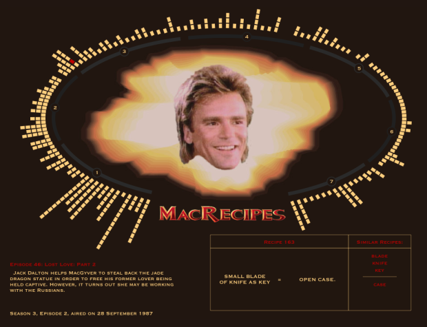
Oh. My. God. Fathom Information Design compiles every recipe from the show MacGyver:
Have you ever wondered in how many different episodes MacGyver has made an arc welder (answer: 3 times in episodes 6, 52, and 87)? Or perhaps you forgot about your favorite episode (season 1, episode 12) when Mac escapes via a casket that transforms into a jetski. And how many times has Mac made a diversion? In order to placate all of your MacGyver-related curiosities, we offer you MacRecipes.
There is a column for each episode, and each square represents a recipe for how to get out of trouble. Want to make a parasail? Just get a wind tunnel fan, wire, and tent material. Need to create a diversion to get out of a bind? Matches and rum. You can also browse recipes by ingredient, such as those that use rope or a paper clip.
I loved MacGyver growing up. His mullet holds a special place in my heart where all you need is imagination and some know-how to get you to where you need to go. I was one of the many to start wielding a trusty Swiss Army knife that my parents got me. I still have it, actually. Still useful. The whole series is on Netflix Instant in case you’re interested.
-
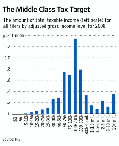
The argument behind this graph in The Wall Street Journal is that the middle class has most of the money and ties into a larger argument about who should be taxed what. There is after all a spike in the middle. Is that really the case though? Sound off in the comments.
(Cheat sheet: Jonathan Chait explains what’s going on and Kevin Drum improves the graph to show more truth, although his graph can be improved, too. Grab the data here [Excel spreadsheet] from the IRS, and give it a go.)
[Wall Street Journal via @joandimicco]
-
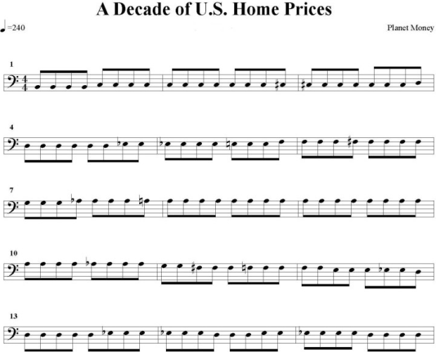
Planet Money, a radio show on NPR covering the global economy, loves data, but graphs don’t work out so well when your listeners can’t see them. So in this experiment, the show tried converting data from the Case-Shiller Home Price Index (below), to musical notes (above) and then recruited Julliard baritone Timothy McDevitt to sing them.
Read More -
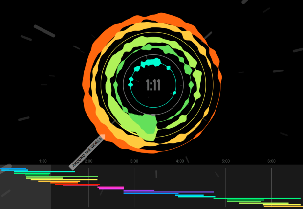
Mashups, the art of mixing multiple songs into one continuous song, is a subtle art. When a mashup is done well, you often can’t hear all of the different songs merging into one, because it’s so fluid. Cameron Adams, aka The Man in Blue, visualizes his own mashup Definitive Daft Punk, to show just what goes into the piece.
Read More -

For the statistical nerd in you or for the child you are raising as one, Nausicaa Distribution on Etsy sells handmade gifts inspired by statistical distributions. Above shows the dastardly gang of five evil distribution plushies: Weibull, Cauchy, Poisson, Gumbel, and Erlang. Judging by their moustaches, you better watch out when they’re around.
Read More -
Ben Fry, co-creator of Processing and head of Fathom Design, talks data visualization with O’Reilly Radar editor Mac Slocum. When asked about the concern over visualization and analysis getting into amateur hands:
I think it’s kind of funny… The same argument has been made with any technological leap since the beginning of time. Books printed in mass had a similar reaction. The internet came along and everybody could post things on the internet and wouldn’t that be the end of the world… The important thing is to focus on the literacy aspect of it. The more that people are doing the work — it all kind of goes to improve the conversation of what’s good, bad useful and what’s not.
When asked how he sees visualization developing over the next couple of years:
I think the real thing that’s going to change is that we’re going to start understanding that visualization isn’t this sort of monolithic thing… I like to look at it a lot like writing. You have novels and poetry and haikus. You know there’s lots of different types of writing and styles of writing — and I think the same thing happens in visualization… some things are tools for analysis and some things are purely for entertainment, and there’s not so much a spectrum as different ways of addressing it.
Watch the short eight-minute interview below. There are some other interesting soundbites in there. I especially like the tidbit at the end about snippy discussions within the visualization sphere. Similar sentiments in a recent Q&A with Moritz Stefaner.
Read More -
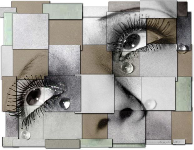
When you think art reproduction, you probably think of something that looks almost identical to the original piece, but as Martin Wattenberg and Fernanda Viegas show in The Art of Reproduction, factors such as color and size can vary a lot:
Curious just how far reproductions stray from each other, we began an investigation… For a set of famous artworks, we downloaded all the plausible copies we could find. Then we wrote software to reconstruct each artwork as a mosaic, a patchwork quilt where each patch comes from an individual copy.
The above is a mosaic of reproductions of 21 Tears by Man Ray, and as you can see, the colors across reproductions span grayscale to green.
Here’s the reproduction for 22 Saints and Angels by Caravaggio. Again, notice the difference in shades. Edges aren’t straight because different reproductions crop the original at different points.

See the full gallery here.
-
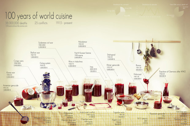
Rather than bars, bubbles, and dots, Clara Kayser-Bril, Nicolas Kayser-Bril, and Marion Kotlarski use jars, bottles, and bowls of fake blood to show deaths from 25 major conflicts in 100 years of world cuisine.
Ten casualties. Ten million casualties. Our understanding of conflicts is often nothing more than a handful of digits, the more precise, the less meaningful. The anchor’s tone remains the same when talking about major wars or isolated outbursts of violence. The horror lays hidden beneath the rigidity of numbers. Figures give us knowledge, not meaning.
We wanted to put a picture on these digits. A shocking, gory picture, like the reality of war. We wanted to give context, like a scale on which we could visualize each conflict next to the others.
The idea is straightforward. More blood = more deaths during the corresponding conflict. What do you think—does the medium make the data more meaningful?
The graphic is also available in print.
-
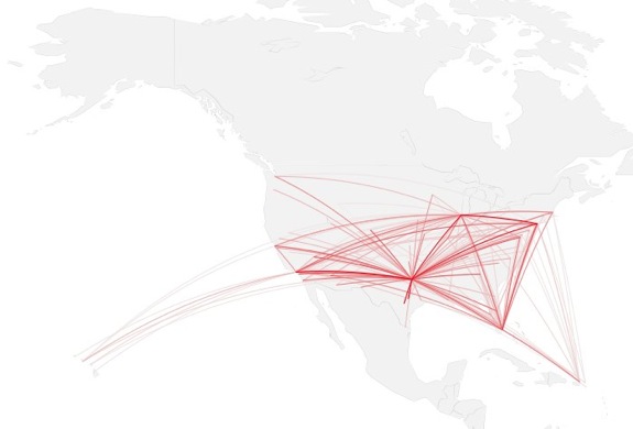
How to map connections with great circles
There are various ways to visualize connections, but one of the most intuitive and straightforward ways is to actually connect entities or objects with lines. And when it comes to geographic connections, great circles are a nice way to do this.
-
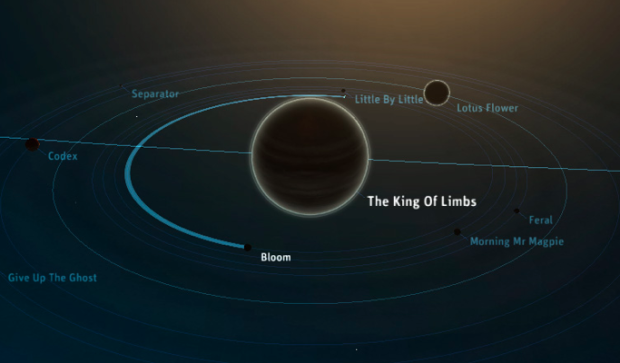
Planetary, the iPad app for music exploration by Bloom, has hit the ground running. Out only a few days now, Planetary is already number four on the list of top free apps. Ben Cerveny, the president of Bloom, chats on Press:Here about the app, visualization as UI, and where they go next in the video below.
Read More -
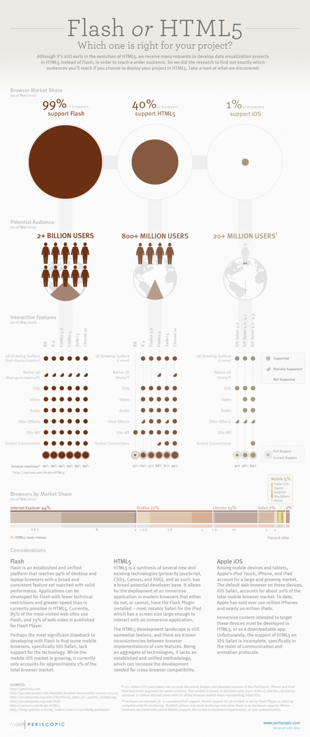
Design firm Periscopic takes a look at the Flash versus HTML5 debate and some considerations you should make if you’re deciding which one to use in your projects. The main conclusions: Flash lets you reach the widest audience with the drawback of not working on some mobile devices; HTML5 is still developing.
Which one are you gonna pick for your next web project?
[Periscopic | Thanks, Kim]
-
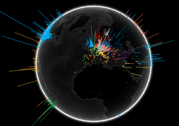
To show off their new toy that is WebGL, a 3D graphics API for JavaScript, the Google Data Arts Team maps global search volume by language:
The Search Globe visualizes searches from one day, and shows the language of the majority of queries in an area in different colors. You’ll see a bright landscape of queries across Europe, and parts of Asia for instance, but unfortunately we see many fewer searches from parts of the world lacking Internet access—and often electricity as well—like Africa. We hope that as the Internet continues to become more accessible over time and people continue to ask questions, we’ll see this globe shine brightly everywhere.
We’ve seen this sort of view before, but the interesting thing is that this runs native in the browser (and will probably send your fan whirling). Rotate and zoom in to your heart’s content.
Read More -
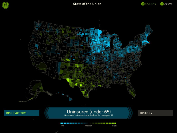
Stats of the Union, the new Fathom-produced iPad app, maps the status of health in America. Browse, pan, zoom, and explore through a number of demographics and breakdowns.
Read More -

Designer David Wicks compares rainfall against water consumption in his thesis project Drawing Water:
Drawing Water is a constructed landscape shaped by the relationship between where water falls and where it’s consumed within the United States. It builds images to expose the reality that water is channeled, pumped, and siphoned to locations far from where it falls. Although the paths are imagined, Drawing Water is based on real data and it reveals a clear truth about water resources and use.
The placement of each line represents a rainfall measurement, and the length and end placement is based on urban consumption. Lines pulled farther from its source change to black. The data comes from two sources: USGS for water consumption and NOAA/NWS for rainfall data provided.
Read More -
My many thanks to the FlowingData sponsors who help keep this growing blog running. They help you make sense of and communicate with data. Check ’em out:
InstantAtlas — Enables information analysts and researchers to create highly-interactive online reporting solutions that combine statistics and map data to improve data visualization, enhance communication, and engage people in more informed decision making.
Tableau Software — Combines data exploration and visual analytics in an easy-to-use data analysis tool you can quickly master. It makes data analysis easy and fun. Customers are working 5 to 20 times faster using Tableau.
Column Five Media — Whether you are a startup that is just beginning to get the word out about your product, or a Fortune 500 company looking to be more social, they can help you create exciting visual content – and then ensure that people actually see it.
IDV Solutions Visual Fusion — Business intelligence software for building focused apps that unite data from virtually any data source in a visual, interactive context for better insight and understanding.
Want to sponsor FlowingData? Contact me at [email protected] for more details.
-
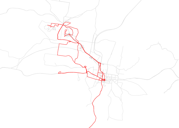
FInding himself in a new town, with a new job, Tim Clark started tracking his location on August 24, 2010, and ended 200 days later on March 13, 2011. Every time he stepped out, he turned on his GPS logger, and then would tag that trip with information about what it was for or what happened. Atlas of the Habitual is the result.
Read More
Recently for Members
Second Edition
 Visualize This: The FlowingData Guide to Design, Visualization, and Statistics (2nd Edition)
 Visualize This: The FlowingData Guide to Design, Visualization, and Statistics (2nd Edition)
New tools, refined process.
Browse by Chart Type See All →


