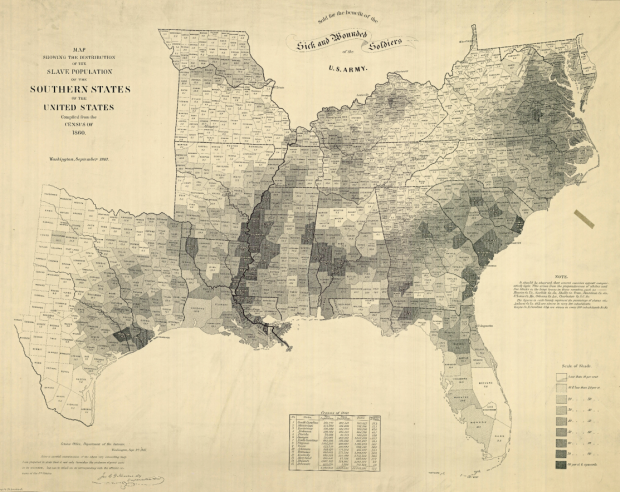
In 1864, drawing on the most recent 1860 Census data, the United States Coast Survey issued this choropleth map depicting counties with relatively high slave populations. President Lincoln was seen looking over the map so often that it was included in Francis Bicknell Carpenter’s painting “President Lincoln Reading the Emancipation Proclamation to His Cabinet.”
Carpenter spent the first six months of 1864 in the White House preparing the portrait, and on more than one occasion found Lincoln poring over the map. Though the president had abundant maps at his disposal, only this one allowed him to focus on the Confederacy’s greatest asset: its labor system. After January 1, 1863—when the Emancipation Proclamation became law—the president could use the map to follow Union troops as they liberated slaves and destabilized the rebellion.
How’s that for a powerful map?
[New York Times | Thanks, Justin]
 Visualize This: The FlowingData Guide to Design, Visualization, and Statistics (2nd Edition)
Like too many resources at The New York Times, the editors rendered this map and its portions to be unprintable. Look at it while you can, for when the editors tire of displaying it – or deem the space it occupies in storage to be needed for something else they will remove it. Either The New York Times permits copying and storage of its resources for personal use or it lets us peak at its data as stingily as would the National Security Agency. It offers no explanation for its differing treatment of the news.
What are you on about? There’s a downloadable PDF link right at the NYT page if you just click the small version of the map.
And since when is the New York Times obligated to provide public digital archives of every piece of content they ever published?
That’s not a bad attitude to have in general. You sometimes don’t know when resources currently available will be gone. Just don’t act indignant when it disappears if you were getting it for free.
I appreciate that Nathan uses a image that he keeps locally to his blog. (In case the day comes that the NYT removes theirs.)
I’m with Jeff on this one. And NYT is usually pretty good about keeping things online. I don’t remember ever hitting a broken link.
Pingback: 1860 Slavery Map « Jared Bramblett
“Sold for the benefit of sick and wounded soldiers of the U.S. Army.”
Even back then, information designers realized they were performing a service in demand, whether the general populous realized they needed easy access to information or not.
Pingback: Old map shows slavery in the United States « Three Fish Limit
Reminds me of this: http://bigthink.com/ideas/21383
One of the very cool issues here is “representing data historically.” Nathan; could you post more frequent (inspirational!) examples of “data representation” from the “old days” or even ancient times :)
I liked this!
I will consider it :)
Pingback: Do the wheels of economic activity really need so much grease to spin? « interact with wordupresearch
Your title is incorrect. This is a map of slavery in the “southern” states. Where are the maps of northern slave states? There was as much, if not more. It’s a perfect example of bias in the presentation of historical data.
I’d like to see a map of indians murdered and misplaced by Lincoln in his lifetime. Any takers?
Stoker: “Where are the maps of northern slave states? There was as much, if not more.”
Wrong, much as it may grieve your little neo-Confederate heart. According to the 1860 Census, there were no slaves in any state other than the “Southern” states shown on this map. There had been slaves in some other states, but all had been freed by 1860.
Incidentally, in its “Declaration of Causes” for secession, South Carolina complained that the Republican Party “has announced that the South shall be excluded from the common territory…” – that is to say, had declared its intention to prohibit slavery in the Territories. For South Carolina, then, “slavery” and “the South” were synonymous. Who are we today to disagree?
This map is from NOAA’s new Civil War collection, where there are more than 400 documents available to peruse and download. Check it out: http://oceanservice.noaa.gov/news/features/nov10/ocs-civil-war.html
When I view any data [infographics/maps] I always start by asking myself several questions:
Why is this data being presented to me?
Where did it come from?
Who put it together?
What are they leaving out?
I find that all data is skewed and biased to some degree. By their nature, infographics/maps have to be. Fortunately there is a growing trend to present “open sourced” data that allows the user to study and develope their own conclusions. This definitely wasn’t the trend during the period of time this map was created.
So this map is interesting to me because of the info that has been left out; in particular, the overall view of slave trade in the US during that time period. Lincoln focused specifically on the states he was attacking and overlooked quite a bit. While northern states weren’t necessarily holding slaves, they were definitely still trading slaves. Presenting open sourced data would have brought to light these and other attrocities that were still occuring [and continued to occur for quite some time] in his own back yard. This would have distracted the viewer and diluted the agenda he was pushing.
Licoln was also busy scalping indians.
It’s also of interest that questioning maps such as these bring about responses from the likes Mr. Rostrom. Name calling and generalizations quickly ensue. Why is that? Makes me wonder what there is to be afraid…
Pingback: Ian Laurenzi » Blog Archive » Tufte of the 1860s
Pingback: Old map shows slavery in the United States | Henry C. Alphin Jr. | Discursive Philosophical Thought
This is great and all, but what we really need now is a NEW map that shows sword ownership per capita in the United States. Because apparently, sword ownership is a leading indicator of wacko, and this infographic (or data visualization, or whatever you want to call it … where’s Tufte when you need him?) would be community service in its purest form.
http://www.slate.com/id/2279458/
FlowingData, you’re our only hope!
Pingback: Map of the unites states | GoldenPhotos