
It’s Friday. You might need this vintage-looking guide on how to play beer pong by Mel Marcelo. Remember not to use a lawnmower, a skull, or a toaster, and you should be okay. Safety first.
It’s Friday. You might need this vintage-looking guide on how to play beer pong by Mel Marcelo. Remember not to use a lawnmower, a skull, or a toaster, and you should be okay. Safety first.
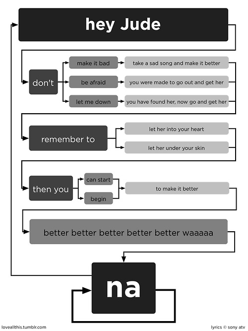
What day is it? Flowchart Friday of course. Old but new to me. Based on the Total Eclipse of the Heart flowchart, this one takes on Hey Jude. Don’t get stuck on an infinite loop of na na na na na na na na na…
[Love All This via Laughing Squid | Thanks, John]

Lockheed Martin’s Space Fence, expected to be in initial operation in 2015, will track the junk floating in space:
Space Fence is envisioned as a network of ground-based S-band radars that will detect, track, measure and catalog thousands of objects in low-Earth orbit. Expected to begin initial operation in 2015, the system will replace the existing Air Force Space Surveillance System, or VHF Fence, which has been in service since the early 1960s. A leader in S-band radar development, Lockheed Martin’s high-powered radar systems will find and follow the course of thousands of pieces of space debris to an accuracy of just meters.
They provide this video (below) to explain the concept, of which I’m pretty sure most of is fake, but let’s pretend it’s real. It’s more exciting that way.
Read More
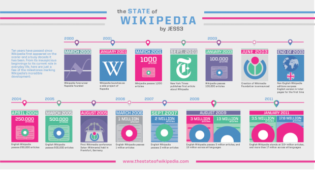
In their most recent video (below) to their “State of…” series, JESS3 takes a look at the State of Wikipedia:
The State of Wikipedia not only explores the rich history and inner-workings of the web-based encyclopedia, but it’s also a celebration of its 10th anniversary. With more than 17 million articles in over 270 languages, Wikipedia has undoubtedly become one of the most visited and relied upon sites on the web today.
It’s really light on the data and kind of fluffy, but Jimmy Wales narrates, so it’s worth it to watch just for that. For some reason I expected him to have a grittier voice. It must be the beard.
Read More

According to 2009 numbers reported by the Federal Bureau of Investigation, DC, Louisiana,…

Starbucks recently announced their next size up from 591-milliliter Venti: the Trenta. It’s 916 milliliters, which happens to be slightly more than the average capacity of the human stomach, as illustrated by Andrew Barr for The National Post.
I don’t know why everyone’s getting their panties in a bundle though. If it’s too big for you, then don’t buy it. Besides, 7-Eleven has Starbucks beat with their line of Big Gulp drinks ranging from 0.59 to 1.9 liters.
I’m thirsty.
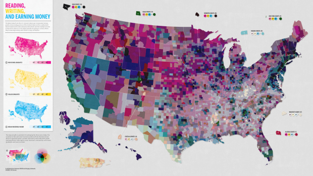
This map, a collaboration between Good and Gregory Hubacek, shows three metrics from the most recent American Community Survey by the US Census: high school graduates, college graduates, and median household income. The goal was to see if there’s a correlation between education and income. Does it work?
Read More
Data is rarely in the format you want it. Dan Nguyen, for ProPublica, provides a thorough guide on how to scrape data from Flash, HTML, and PDF. [via @JanWillemTulp]
Focus too hard on individual points, and ignore what’s around, and you too might fall in the metaphorical fountain. Yes, this is my excuse for posting this hilarious video, and I’m sticking to it.
Read More
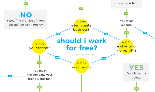
Designer Jessica Hische gets her flowchart on to help you decide whether you should work on that project for free. In short, if the client is not your mom or a friend you owe big, they better pay up. Love the blunt honesty from Hische, who I’m sure gets all sorts of odd offers. See full flowchart here.
[Jessica Hische via @MacDivaONA]

Nick Foster has some fun with t-shirt classification after cleaning out his closet:
I have a T-shirt problem: after years of buying them, my house is now full. Whilst recently trying to tidy up the situation I realised that I was subconsciously categorising them.
Ten types are identified, although half of my shirts probably belong in the above three. I’m a bum. But I have golden voice.
[sleepinginmyhead via kottke]
According to polls from the Pew Research Center, the Internet gained on Television as the public’s primary news source in 2010. Poll results are shown in their graph below.

The graph isn’t too bad, but it’s kind of busy and could use some design. Can we do better? I think so. Here’s the data as a CSV file. Get your graph on, and link to your efforts in the comments below.
Read More
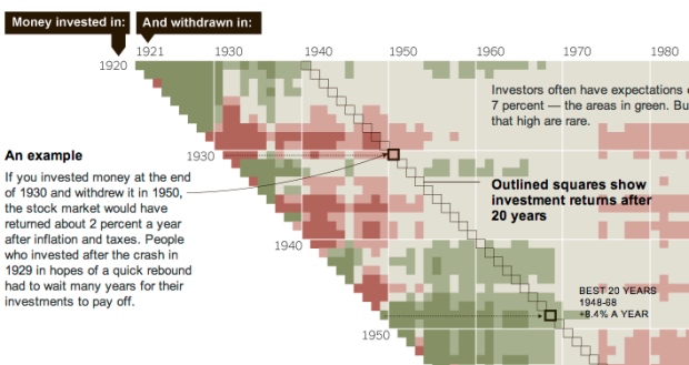
When you invest in stocks, it’s not just what you invest in, but also when you put the money in and when you get it out. The New York Times explains with this grid diagram:
This chart at right shows annualized returns for the S.& P. 500 for every starting year and every ending year since 1920 — nearly 4,000 combinations in all. Read across the chart to see how money invested in a given year performed, depending on when it was withdrawn.
Darker red represents greater loss while darker green represents the greater gains. Tan color indicates more modest gains.
The method probably isn’t new, but it’s the first time I’ve seen it. I like it. I’ve only seen those “what if” calculators where you enter a value to see how it would’ve paid off. That only lets you see one scenario at a time. This type of chart lets you see multiple time spans at once.
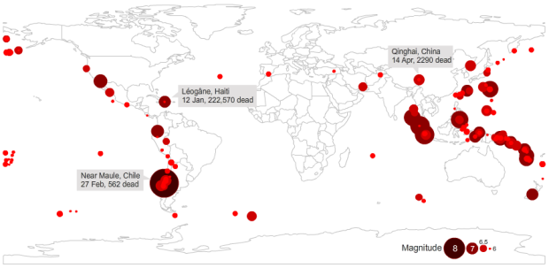
Haiti’s earthquake in 2010 was by far the most devastating in a long time. There were an estimated 222,570 casualties as a result. However, as Peter Aldhous shows in this graphic, the Haiti quake was not the most powerful.
Read More
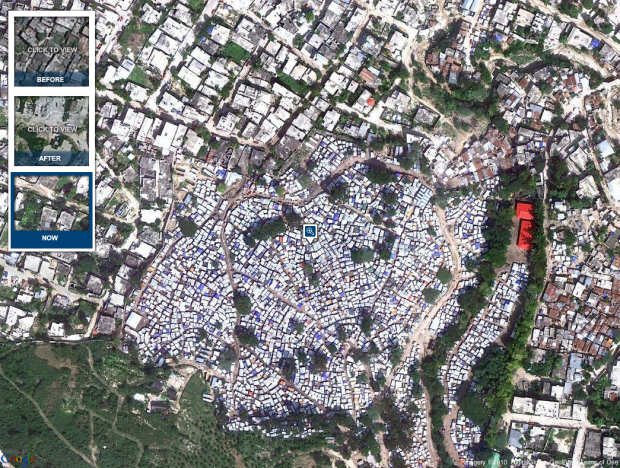
In memory of the devastating earthquake that hit Haiti one year ago on January 12, 2010, the New York Times shows aerial photos of Port-au-Prince from GeoEye and Google in this interactive. See views form before the earthquake, a few days after, and now.
Read More
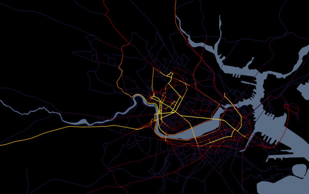
Cartographer Andy Woodruff documents all the places he goes, resulting in the pretty map above.
Read More
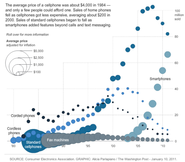
New gadgets, from Web-connected TVs, to smartphones, to Fax machines, always seem to start expensive and then decrease in price a few months later. We all know this. But by how much? Alicia Parlapiano of The Washington Post takes a look in this interactive. It shows units sold by year for different gadgets. Bubble size indicates average price.
Poor tape player. The Consumer Electronics Association didn’t even bother tracking its sales after 2005.
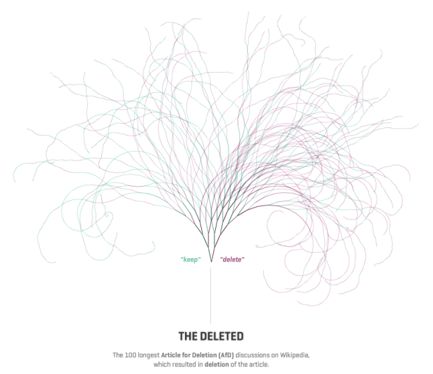
Fact is not always clear cut. Sometimes fact is driven by opinion. People might have conflicting points of view or maybe the truth is simply unknown. We can see this via Wikipedia, where anyone can edit and create documents. Sometimes people propose that articles should be taken down, and if the proposal is approved, people can discuss. Dario Taraborelli, Giovanni Luca Ciampaglia, and Moritz Stefaner have a look at the most active of these discussions.
Read More
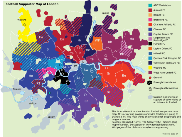
Map of London colored by what team the majority supports. Not much of a soccer… ahem, sorry, football fan. Accurate? [QPRdotorg via We Love Datavis]


 Visualize This: The FlowingData Guide to Design, Visualization, and Statistics
Available now.