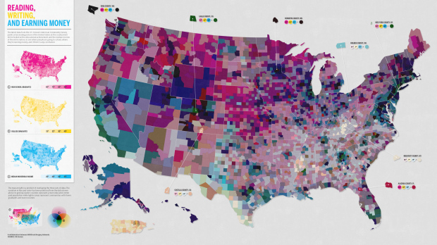
This map, a collaboration between Good and Gregory Hubacek, shows three metrics from the most recent American Community Survey by the US Census: high school graduates, college graduates, and median household income. The goal was to see if there’s a correlation between education and income. Does it work?
On the left you see the individual maps for each metric. The map on the right is a combination of all three so that each county is a mixture of three colors. A county with an orange hue, for example, is one with relatively more high school and college graduates but lower median income.
My first reaction was, gosh, that’s a lot of colors for my brain to process. But is there useful information to glean from map? What’s going on in the light pink and grayish areas in the southeast? What’s with all the green on the California coast?
While the map definitely couldn’t replace a more conventional X-Y plot or an actual regression analysis, could it at least be a supplement? Would it have worked better using just college graduates and median income? Sound off in the comments.
Here are some of the rumblings from Twitter:
@moritz_stefaner: “Could have been a good idea – but it wasn’t. This must be the most complicated chloropleth [sic] map I have seen to date.”
@infosthetics: “@moritz_stefaner Don’t agree. You can find original insights, as article mentioned. It’s overwhelming. But it does not make false claims.”
@eagereyes: “A skilled designer may be able to decode the colors, but takes a lot of effort. Also ignores data dependencies.”
@awoodruff: “Wow, definitely a tough one to understand.”
@the_skua: “single-handedly one of the worst multi-variate maps ever? Nobody graduates from high school in California?”
@flinklabs: “why must a dataviz must [sic] require no thinking? Long term engagement vs the blip. not that the viz in question is not problematic…”
 Visualize This: The FlowingData Guide to Design, Visualization, and Statistics (2nd Edition)
Hi Nathan, rather than retype my thoughts on this, here’s my take along with some interesting comments:
http://www.visualisingdata.com/index.php/2011/01/discussing-are-the-richest-americans-also-the-best-educated/
The goal was to investigate a correlation between education and income. I think that would be better done with a few simple scatter plots.
The map might reveals a another correlation between geographical location and a ‘sum’ of the reading, writing and earning money.
Yes indeed as Andy details.
My question tends towards whether data visualisations should be immediately understandable or require some detailed thinking for more complex topics? Ideally less thinking than a non visual representation..
Ben cerveny’s recent points on the similarities of interaction design between data viz and casual games are very relevant here.
Well at a glance it looks pretty neat. Then I looked at the legend(s) and thought you have 7 possible combinations but that didn’t seem right. Based on the gradations how many possible combinations are possible? 125? (5x5x5) or somewhere near there, impossible to use as is, maybe an interactive version would be effective.
Some areas appear darker than should be, as compared to source layers, which may lead to false conclusions. And the graphic won’t work for color blindness.
As David said above, some sort of interaction or showing subsets could make the thing usable.
Not an expert nor a designer here, bit I find it really interesting. The question it answers, if I’m right is ‘how do these variables correlate in different parts of the US?.
Might be a bit plane just to add them up, but its definitely an interesting piece of work.
pretty difficult for color-blind folks like myself… just not getting the 3 dimensions of color here.
A good idea, that unfortunately, could not be implemented in a useful manner. Not blaming the creators for this (though GOOD sometimes does crazy things), because I don’t think anyone could make it work.
Tufte’s head just exploded at the site of that.
Yeah, no. Overlaid primary colors are not psychologically separable. Changing one dimension affects your perception of the other. You can usually get away with two psychologically separable features on a 2-D plane, such as hue and texture, but that’s about it. Three might be better off separately graphed (“small multiples”), or with an interactive chart of some sort.
http://www.google.com/search?q=psychologically+separable+integral
Giving this some further thought. In addition to Tufte, Stephen Few may be feeling some discomfort. I noticed how small Alaska was, then realized there are a few other things floating out by Alaska. My visual memory tells me one is probably P.R., last I knew it was in the Atlantic and a bit smaller. Then to the northwest of Alaska there’s something, I have no idea what it is but am guessing a gaggle of territories. The biggest problem is that of area/density, vast areas vs vast numbers of people very much distorts what you can discern from this. Would be great to get the dataset and try it out in Tableau. :-D
it’s difficult to be a college graduate unless you’ve already graduated from high school (or equivalent). Why aren’t two colors (median years of school attained and income) sufficient?
If you switch to median years of school attained, you could lose the relative values of college and high-school graduates. For example, if you have one area with relatively many college graduates & relatively few high-school graduates, and another area with relatively few college grads & relatively many high-school grads, they might have the same median years of school attained, but different socioeconomic profiles.
But the map’s failure to normalize the 3 individual color scales [see comments on this below] makes it really hard to see if there are such differences around the country.
For instance, a city like San Francisco might have relatively many college grads and relatively few high-school grads, whereas working-class cities might have more high-school grads and fewer college grads.
I am curious if the author had considered standardizing median household income. Cost of living varies widely from state to state.
Sorry, but mapping three-dimensional quantitative values by using color hues is simply no good idea (as already stated here and on ‘visualizing data’ blog).
If I understand the data correctly the interesting correlation is between education and income. So it could be reasonable to connect high school and college graduates e.g. in showing the percentage of ‘no college or high school’ / ‘college’ / ‘high school’ in order to express the state of education. @Anna I guess this could work as well.
The mean income could then simply be represented by saturation or similar..
In opposition to other commenters I would still argue for the use of a map. The spatial distribution of this relationship may be interesting though it’s not easy to create a good map representation of this on county level.
I agree with comments who state that “education” should be reduced to a single variable here.
But I think it’s interesting to see if a 3-color map could be (more) readable (for non color-blind people, of course). I would suggest 2 things to the author.
First, the number of combinations used is too many (125). 4 colors per scale would easily reduce it by a factor 2 (64) without loosing much information.
Second, the map looks very magenta. Is there an interesting information there? It seems not : by looking the 3 maps separately, it looks like there is not the same percentage of counties in the top magenta as in the top yellow or cyan. Therefore a straigthforward improvement would be to normalize the 3 scales by using percentiles (25% of counties in the most saturated color for each color, etc)
I’d be curious to see if it works better…
Yes! Your point about the lack of normalization for the 3 scales is exactly right. It’s almost impossible to get any reliable information from the colors on the map [except white, black, and gray] without referring to the 3 component maps and mentally diffracting the combined map to decode what it means. The point of visualizations is to get things more intuitively and avoid difficult mental deconstructions. A big oversight.
put me down with the people who thought an interactive version might be effective. as it is, it’s too confusing to take in all the variations of color. being able to take off one layer at a time for an area of concern might make it more comprehensible.
more entertaining, at least.
I find it pretty straightforward to understand but get the criticism that it’s useless for the color blind. Within seconds of looking at the full size image I was on the hunt for orange (“underpaid”) and blue (“overpaid”) areas of the nation. I also wonder what’s going on in the green areas. More college degrees than high school degrees?
I agree with Dustin above that it appears as if they omitted normalizing the income (over cost of living) and therefore making the graph rather useless. Everyone knows that a dollar in rural areas is worth a multiple of what it’s worth in NYC. Non surprise the big central states come out purple.
What some might forget is that this infographic was not meant for the expert statistician or decision maker, nor does it even pretend to be. One can argue whether the general public should be only exposed to super-efficient and highly-optimized information graphics, but I would doubt any normal person would feel inclined to spent time, let alone explore, such a graph to discover any insight.
With the massive amount of utterly useless infographics appearing online nowadays it is incredibly remarkable that this infographic stands out and attracted such wide attention and discussion. One should pause for a second and consider why.
PS. Love the constructive discussion on this page!
PPS. The “article” mentioned in my tweet, quoted above, points to a post over at FastCo Design. See:
http://www.fastcodesign.com/1663036/infographic-of-the-day-do-smarter-people-make-more-money
Andrew raises an interesting, perhaps separate discussion point about the utility of many infographics/visualisations nowadays that are seemingly deployed as marketing tools, creating word of mouth, referrals, publicity etc.
Its probably not necessarily the intention behind this piece given that its presenting information about census data (think its more trying out a novel display approach) but many graphics that ‘do the rounds’ these days clearly have been developed with an aesthetic purpose of being liked, shared and to put bums on seats above communicating some information subject effectively.
Agreed, refreshingly constructive discussion with every comment adding to the debate.
It’s even more important to make sure the graphic doesn’t suggest erroneous conclusions if the audience is the general public. The general public doesn’t know that you need to normalize for income, so if the graphic doesn’t do it and explain it, then they’ll fall back on stereotypes for understanding. Since like you said, they’re not going to spend the time to probe it.
GOOD is fairly high profile, so I think that explains the focus.
Agreed. There are many examples of complex visualizations esp. infographics that cannot be interpreted ‘at first sight’ but at least are not misleading which is abolutely OK.
As a reader in the more “Average Joe” demographic (i.e. I’m not a statistician or designer or whatever), it took me all of 2 second to see that this map is too confusing. The individual seem mostly fine, but stacking 3 variables into a single shade of color tells me absolutely nothing. Furthermore, this map is hell if you’re colorblind! I can’t draw any conclusions from that color without using my color picker extension and looking at RGB values.
Making the map interactive would probably help. As it stands, though, it’s pretty but pointless. Look at the breakdown for Breathitt County, KY color, then look at the breakdown for Costilla County, CO. ‘Nuff said.
I agree with many of the complaints above, but I think one shouldn’t dismiss the general idea because of this one example.
– a better color model may make this better. color blindness will reduce readability for some, but another choice of colors, and another combining method (additive rather than subtractive) may display better.
– two kinds of education variables seems weird so maybe other variables will show interesting patterns. (low highschool grad rate can go a long with high college degree rate for two reasons (if you make it past HS you almost always graduate college, or large out-of-state population that moves there with higher degrees).
This should be retried with other kinds of data and colors before the idea is put away.
This could make for a really neat interactive flash graphic. But showing this many dimensions on paper seems kind of onerous. It also forces the audience to have to THINK for a second how the primary colors mix.
Start with a flat, clean colorless map with state boundaries drawn. Have the ability to filter by education. Have the ability to focus on an individual state.
Select a state, map zooms in. Use a color gradient to represent the level of education (lightest=lowest, darkest=highest). Then show employment on the 3rd dimension by county, with a rotatable and transparent map. User should have the ability to select an individual county, making it more opaque, and a table is updated with corresponding stats, while increasing the transparency of the surrounding counties. The user is inclined to select either really light counties or really dark counties, and they can see if those are the most raised or most lowered counties for themselves.
…if only I knew how to develop in flash : /
I actually like the map, although I didn’t think that right away. I don’t think it is too confusing to be useful, but maybe too confusing for many people’s taste. It does a pretty good job communicating three distinct attributes for all the counties across the whole U.S., which is no easy feat. They did a great job with the interpretative graphics along the left hand side, but maybe they could have gone even further, emphasizing the mixing of the three hues and better illustrating the resulting colors, including the range of lightness values that can occur – which they kind of get at by fading out the edges of the three overlapping circles of different hues, but that doesn’t really show the variation well enough.
The called-out counties on the map are very helpful and bring the reader further into the details which is where the map works (not considering the data issues brought up, like normalization). What doesn’t work as well is the initial overall reading of the map (and certainly the colorblindness issue). Not sure there would be a way to improve the initial reading and appearance of the map given the goal to convey three distinct variables. It would be a different map if an overall understanding from these three variables were immediately comprehensible.
“The goal was to see if there’s a correlation between education and income. Does it work?”
If that was the goal, I think the answer is “no, because this map is the wrong tool for the job”.
Put simply: “what color tells me where the proposition is true?” white? black? if I’m interpreting the data correctly, we’ve got five different gray scale colors for true, and everything that has a hue is false?
Also, I’m really not fond of the mapping to counties – in particular, it’s really difficult for me to believe there is any useful truth in the sharp edges between large counties in the south west.
In addition, I strongly suspect that the wrong colors have been chosen – that the eyes perceptions of these colors “lies” about the underlying data. I think a few of the earlier comments raise precisely this concern.
I don’t think this map is done right or that it is a good idea to begin with.
the intent is to show the relationship between income and education.
my 1st issue is that out of the 3 variables high school graduates is much less meaningful than the other 2 although it adds a layer of complexity. now you may have pulled it off with 2 vars but encoding 3 vars in color is too much, the brain doesn’t work like this and cannot decode the map like photoshop can isolate R from G from B.
what’s interesting with this data is outliers and they are hard to find in the map. it may be easier with a scatterplot or even with bar charts with a selection of the counties.
I think that the map is beautiful and I love the idea of the simple colors overlaid on one another to show the correlation between the different form of information. But to read the final diagram you still have to refer to the three base maps to understand what the combined hue means, thereby defeating the purpose of the overlay.
I’d be interested in how this looks when mapped using the CIELAB colorspace, which was designed to allow for perceptually-linear three-axiscolor blending. The problem with CMY(k) is that the response curve isn’t linear to the color values input, so something that’s light in cyan with medium magenta looks vastly different (unintuitvely) than something medium in cyan with medium magenta.
See here for details on LAB space: http://en.wikipedia.org/wiki/Lab_color_space
I like it – a lot.
California being green as opposed to NY being purple makes quite a statement, as does Missisippi (sp?) being white.
For an Aussie who is not so familiar with the USA, it gives very interesting insights, and I only looked at it for 60 seconds.
In my book that is success for a viz.
It is easy to criticise.
I thought I would try and add to what had been done by GOOD & Greg Hubacek by building something myself. The interactive report file I built is available on GoogleDocs. Comments welcome. improvements welcome. Doing it better yourself even more welcome.
Maybe I am adding, maybe not – but at least I’m doing something :-)
Visualizing factors via CYM seems logical, straight-forward, even elegant but results in an incomprehensible disaster. There is so much variation it is impossible to understand despite the random sampling highlights.
Well I loved it! It has shortcomings, but I still overall love it. It took me a minute to think about how the colors play out, but once I did, trends really stood out to me. A few shortcomings are I think that you need to have experienced RGB color scaling, I agree it would be better interactively to actually break down numbers, and a bit of color rescaling might make it more visually attractive. As it is, I think it is quantitative data being displayed with qualitative geographic trends.
What I loved though are things like: Large cities are the darkest (high all three); the Midwest is pinker (probably due to farming life (low income, less college)); the South is paler (lower all three… (no surprise there, I’m from Alabama)); Eagle county, CO is green (Vail, Breckenridge, Ski resorts, etc probably because it is a larger group of college level people moving there (this is why I think the two educations are important)); areas around coastal Texas and North Alaska are bluer (my guess… oil companies pay well but require less education), and the two most populous East and West coast regions are around darker green patches. Sorry, if you disagree, but I was excited.
Color-theory-in-cartography expert Cindy Brewer recommended a similar trivariate color scheme in an influential 1994 book chapter: http://twitpic.com/3rfw9z. I think her legend design (with a clearly classed scheme) helps interpretation, although some individual color pairs are a bit difficult to discriminate for the color vision impaired (like myself). In my opinion, the biggest failure of the GOOD map is the legend (is a continuous scheme? is it classed like the three univariate maps? wouldn’t the composite create a smoother gradient at the Venn diagram intersections?). Nothing wrong with testing out new symbolization ideas, though…
Multivariate maps are always difficult to design and read (I’m glad to see the reference to Cynthia Brewer’s published attempts). We’re essentially looking at 5-dimensions worth of data here (2 spatial dimensions to create the horizontal plane and 3 data dimensions). There’s several issues that make this map challenging to read in “2 seconds”.
The authors used the CMY(K) subtractive color model for print (high levels of cyan, magenta and yellow = black), but we’re looking at it using our RGB-type computer monitors (high levels of red, green and blue = white). So, while the “blackish” and “whitish” counties stand out, the intermediate colors may not have been translated from CMY(K) to RGB correctly. @Darkphibre made a similar point and, I think, offers a useful suggestion.
Perceptual differences between tones organized along a scale (like those in each legend) do not always occur in the map space because dark areas can exist next to light areas (unlike in the legend); the simultaneous contrasts that occur in the map make the dark tones appear darker and the light tones appear lighter than we perceive them to be in the legend. So, we have to concentrate harder to “read” them correctly.
@Anna Schorer and @Pablo suggest the two education axes should be combined into one because, and I paraphrase here, college graduates need to have attended high school before getting into college. I believe, however, these axes reflect “educational attainment” and not “I have a diploma/degree” status. The US Census Bureau usually collects “highest level of educational attainment data”, so counties symbolized with magenta fills are counties where there’s a large percentage a people that stopped formal education after getting a high-school diploma (many such counties occur in agricultural regions). The authors should clarify the difference and, if possible, use the same language the US Census Bureau uses.
sd
In fact to decide whether there is a typology in the data you need a scattergram if you study the US as a whole. If you want whether there are regions with special profiles than you need a map.
The first map shown mirrors the raw data and is useless for analysis.
A good map is not one that shows all the data but one that the reader can grasp.
A mpa is, by definition, a generalisation and not a data dump.
without turning the map into an interactive 3d map, I can’t think of a way to portray all that info…
with a 3d map, I would make each county a bar that rose up higher to represent income, extended lower to represent college graduation, and was colored with some changing gradient of color to represent high school graduation. this would mean many counties would be obscured, so, make the whole thing semi-transparent, or shift-able to semi-transparent.
As long as Timmy is getting a drink from the data firehose… why not?
now get some wizard to code that so you can manipulate it in a flashy web graphic. ;D