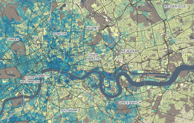
DataShine Census provides a detailed view into United Kingdom 2011 census data. Population, housing, income, commute, and other variables are available.
The DataShine mapping platform is an output from an ESRC Future Research Leaders Project entitled “Big Open Data: Mining and Synthesis”. The overall project seeks promote and develop the use of large and open datasets amongst the social science community. A key part of this initiative is the visualisation of these data in new and informative ways to inspire new uses and generate insights. Phase one has been to create the mapping platform with data from the 2011 Census. The next phases will work on important issues such as representing the uncertainty inherent in many population datasets and also developing tools that will enable the synthesis of data across multiple sources.
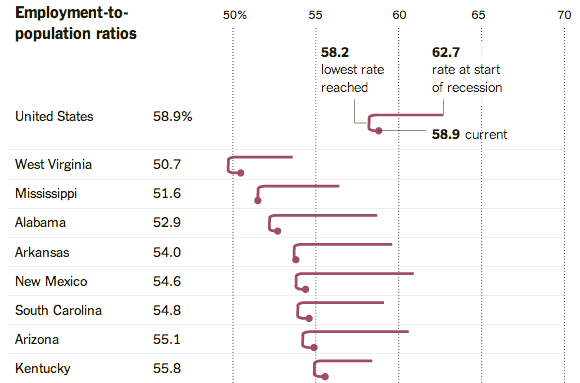
They’re off to a good start.

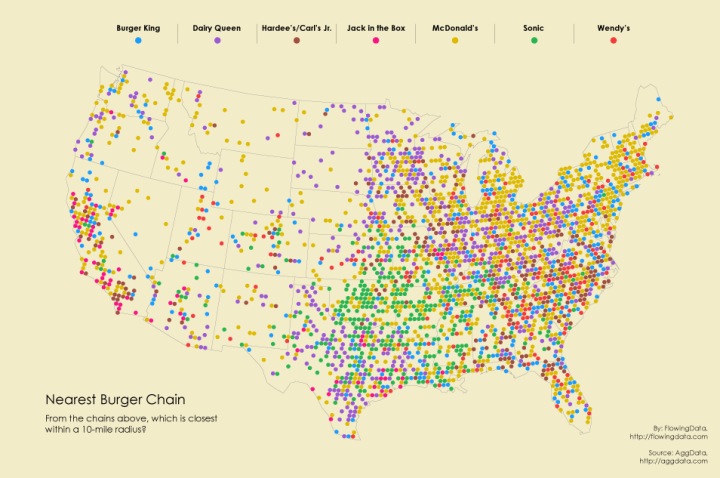


 Visualize This: The FlowingData Guide to Design, Visualization, and Statistics (2nd Edition)


