Kevin Wu made a straightforward interactive that lets you see IMDB television ratings over time, per episode and by season.
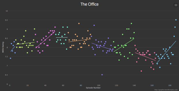
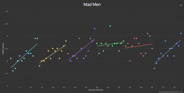
Graph TV is a visualization tool which graphs tv show ratings by episode. Each season is assigned a different color and linear regressions are calculated for each season as well as for the entire series. Each point on the graph displays the episode title, rating, and other data. The data points are clickable and will open its IMDb entry. The graphs are also exportable for offline use.
The chart above shows ratings for The Office, and as you can see, the trend lines are weak a lot of the time. Fitted curves would probably work better for the noise, but then you have a show like Mad Men. It seems to rise in goodness as a season progresses (at least for seasons 1, 2, 3, and 5).
See also Happy Days, where the shark-jumping episode isn’t obvious (although the season probably is), Prison Break, where it seems obvious why it was cancelled, and The Daily Show and its steady rise.
 Visualize This: The FlowingData Guide to Design, Visualization, and Statistics (2nd Edition)