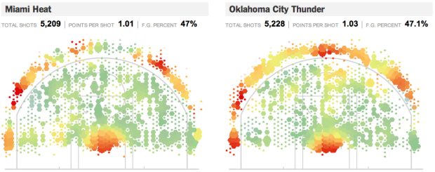
Remember geographer Kirk Goldsberry’s analysis of shot efficiency on the basketball court? Jeremy White, Joe Ward, and Matthew Ericson give it the New York Times treatment in this interactive version for this season’s finals teams, the Miami Heat and Oklahoma City Thunder. Like Goldsberry’s maps, the shooting area of the basketball court is treated as the region of interest where bin size represents shot frequency and color represents efficiency. Roll over the regions to see the exact numbers.
The fun part is with the breakdowns though, and they clearly had some fun with exploding faces for the individual players. Compare Lebron James to Kevin Durant or Dwyane Wade to Russell Westbrook. I like how James Harden is either three-point or in the paint with little in between, whereas Westbrook is all over the court.

You can also see the charts for shot type: three-pointers, mid-range, and close range.
A lot of the time interaction is just added for the heck of it, but this treatment makes Goldsberry’s maps more easily digestible in a smaller space.
P.S. Looking forward to OKC beating the Heat in six.
[Thanks, Long]
 Visualize This: The FlowingData Guide to Design, Visualization, and Statistics (2nd Edition)
On the Shot Efficiency graph, it would be interesting to include filters for left-handed vs. right-handed players. The oddly high frequency at the 10:00-angle doesn’t seem to have a corresponding counterpart at the 2:00-angle. Would be curious to know if left-handers prefer to shoot from the 2:00 position.
These are a lot of fun though maybe more complex than needed given the information they present. I don’t find the detailed stats available on hover to be that useful and limiting by shot distance isn’t all that interesting except that you get a different cut at the summary stats. I wonder how much value is really added by going interactive with this.
This is a really cool graphic. I care next to nothing about basketball, but I found myself exploring the data…
A couple details:
I wonder if the NYTimes is revealing something about Shane Battier that this player doesn’t even know about himself. He clearly loves to shoot for 3-point shots from the two sides of the basket. Looking at the number of attempts, he tries both sides nearly equally, or perhaps slightly more from the left. But he’s far more successful from the right. You’d think if he knew this he’d work to put himself on the right as often as possible.
Also I think there’s a bug in the visualization. 0 points per shot is plotted as red in at least some (all?) cases.
Tim, maybe it’d make sense to reflect the plot for lefties before summing for the team? I suppose not, since they are going to be more often guarded by opposite-handed players, while right-handed players (righties?) most often would be guarded by same-handed players. I’m assuming here that basketball isn’t terribly skewed relative to the general population with respect to handedness.
I’d love to sit in and listen to a coach go over this data with his players.
Awesome visual – but would be nicer if it shrank the size of each chart so could see complete set on a single screen – making it easier to compare and pick out variations.
Maybe I missed it but couldnt find how he actually accumulated the data on each position – that in itself would be fascinating.
As pointed out by Hig, some red points have zero points (also blue/green hexagons showing many points). Either the hover-over stats or the visualization is wrong. Applies to the size of hexagons too – found 2 adjacent hexagons which are about the same size but one gives 13 attempts whilst the other 136! Perhaps some spatial smoothing has been applied to the data to get it to look ‘nicer’?
If I did not know much about basketball at first glance, I would think these two players are taking many 1-point shots from the three-point line. What I think the points per shot tat is really trying to conveying is that for every two shots taken, they make one, which averages out at 1 point per attempt. However, the FG percent already presents that data so that points per shot stat are unnecessarily confusing. How about distribution between 3 point shots/ 2 point shots and free-throws?
okc in 6? all that data, and you still got it wrong!
:)