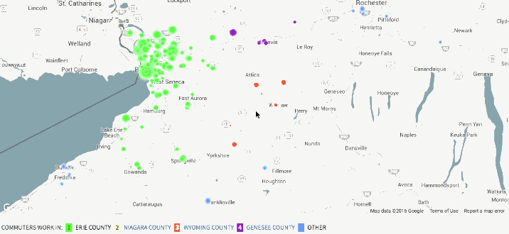
• Membership
  • Newsletter
  • Projects
  • Learning
  • About
  • Member Login
  • Data Underload  /  emergency room, health

    Why People Visit the Emergency Room

    These are the top 250 products that people injure themselves on or with in a year.

    Read More
  • Galaxy of cover songs

    February 8, 2016

    Topic

    Data Art  /  Interactive Things, music

    A fun one from Interactive Things that shows cover songs with a galaxy metaphor:

    The panorama view shows the 50 top songs as individual planetary systems with the original work as the sun. Each planet represents a version of the song and it’s appearance indicates characteristics including genre, popularity, tempo, valence, energy, and speechiness. The radius of its orbit around the sun shows the years between the publication dates. This view allows you to compare the structure and density of the constellation of different songs from a high-level perspective.

  • Taxi ride volume during Super Bowl key moments

    February 5, 2016

    Topic

    Statistical Visualization  /  Super Bowl, taxi

    A high percentage of Americans are glued to the television or party sample platter during the Super Bowl each year, which is especially obvious if you go anywhere without a television during this time. Todd Schneider for the Upshot looks at this phenomenon through the lens of New York taxi rides per minute.

    Taxi activity’s lowest level in New York coincided with the climactic moment of the game, just as Malcolm Butler intercepted Russell Wilson at 9:59 p.m. to secure the 28-24 victory for the Patriots. New England called a timeout after Butler’s interception, but many Super Bowl party guests apparently didn’t wait around to watch Tom Brady take a knee before they hailed cabs.

    Fun. Although nothing beats the Canadian toilet flushing symphony during the Olympic gold medal hockey game of 2010. [Thanks, Todd]

  • Wind prediction and potential power

    February 4, 2016

    Topic

    Maps  /  Moritz Stefaner, uncertainty, weather, wind

    As we use up current energy resources, it grows more important to look to alternative energy sources. Wind is one potential area, but the problem is that one has to know where it’s windy enough — now and in the future — to justify the cost of building the structures to harness the energy. It’s freakin’ wind, and variability is all over the place.

    Project Ukko is an effort to make wind research predictions accessible to those who need such information. The visualization component by Moritz Stefaner, in collaboration with Future Everything and BSC, shows a number of wind factors around the world.
    Read More

  • Campaign Finance API moves to ProPublica

    February 3, 2016

    Topic

    Data Sources  /  election, government, ProPublica

    Back in 2008, the New York Times rolled out a campaign finance API so that you could easily access data based on Federal Election Commission filings. (If you’ve tried grabbing data direct from the source, you know this is a pain.) ProPublica took the reins a few days ago as we lead up to this year’s elections.

    Like millions around the world, you’re probably like, “What the what? I thought the FEC released their own API recently!” They did. But:

    One big difference is timeliness: the FEC API is updated nightly, while ours will be updated throughout each day. For many users of campaign finance data, that distinction may not be a big deal, but on filing days, when thousands of filings are submitted to the FEC, timeliness can matter a lot. Another is the source data: the FEC considers electronic filings to be “unofficial” in the sense that data from them is then brought into agency databases before being published as bulk data. The FEC API publishes data only from those official tables, while the ProPublica API has data from both the official tables and the raw electronic filings.

    I’d trust the ProPublica one more for now.

  • Catalog of criminal justice data

    February 3, 2016

    Topic

    Data Sources  /  crime, Sunlight Foundation

    There’s a lot of data on criminal justice — prison populations, crime rates, police policies, etc — but it can be hard to find, because it’s scattered across and deep within thousands of local sites. Hall of Justice from the Sunlight Foundations is an effort to catalog a significant portion of reports and datasets.

    While not comprehensive, Hall of Justice contains nearly 10,000 datasets and research documents from all 50 states, the District of Columbia, U.S. territories and the federal government. The data was collected between September 2014 and October 2015. We have tagged datasets so that users can search across the inventory for broad topics, ranging from death in custody to domestic violence to prison population. The inventory incorporates government as well as academic data.

    Dealing with those pesky government PDF files is up to you. At least there’s an app for that.

  • Role of empathy in visualization

    February 3, 2016

    Topic

    Design  /  empathy, Kim Rees, Mushon Zer-Aviv

    On the PolicyViz podcast, Kim Rees of Periscopic and Mushon Zer-Aviv of Shual Design Studio discuss whether or not empathy plays a role in visualization. Stuff on this topic tends to be annoyingly dismissive or hand-wavy, but this is a good chat worth listening to.

    There’s a little bit of swearing, so maybe put on headphones if you’re in an area where that is frowned upon.

  • Small multiples for NBA game differentials

    February 2, 2016

    Topic

    Statistical Visualization  /  basketball

    Adam Pearce charted minute-by-minute point differentials for NBA games during the 2014-15 season.

    To squeeze distribution in, I had to make a couple of trade offs. Instead of being able to encode point differentials with vertical position like I did with my Golden State’s win streak chart, I used color for point difference and saved vertical position for distribution. Since there have been more score differences (GSW was beating by MEM 52 at one point) than can be usefully encoded as unique colors, I bucketed the score differences into 7 colors.

    Nifty.

    And go Warriors.

  • Game: Guess the correlation

    February 1, 2016

    Topic

    Statistics  /  correlation, game

    Guess the Correlation is a straightforward game where you do just that, and it’s surprisingly fun. You get a scatterplot and you guess the correlation coefficient. That’s it. If you’re off by too much, you lose a life, and if you’re almost spot on, you gain a life. If you’re somewhat right, you get a coin. Bonus points for streaks of correct guesses.

    Have at it.

  • Sum of life’s parts

    January 29, 2016

    Topic

    Data Art  /  life expectancy, time use

    What if you relived life’s activities in big clumps? Thirty years of sleeping in one go. Five months sitting on the toilet. Based on David Eagleman’s Sum: Forty Tales from the Afterlives, this short film by Temujin Doran imagines such a life. Watch to the end.

    [via Brain Pickings]

  • Same source, different styles →

    January 28, 2016

    Topic

    Infographics  /  comics

    Jaakko Seppälä drew ten comic characters, each in its original style and in the style of the other nine. It’s like the same source material can be shown and seen in different ways, communicating different moods and themes. Imagine that.

    See all 10.

  • Satellite time-lapse of Earth

    January 27, 2016

    Topic

    Maps  /  globe, satellite

    Charlie Loyd, who works with satellite imagery at Mapbox, put together a 12-second time-lapse of Earth using a day of data from Japan’s weather satellite Himawari-8. The experiment is called Glittering Blue. Derek Watkins used the data to similar effect last year, but Glittering Blue is bigger and at high resolution making it all the more mesmerizing.

  • Amanda Cox is new editor of The Upshot

    January 26, 2016

    Topic

    News  /  Amanda Cox, Upshot

    The Upshot, the data analysis-centric site from the New York Times, has a new editor, and her name is Amanda Cox.

    I have asked Amanda to take on this job because she is the best person to lift The Upshot to new heights. But I also want to note an underlying message in her appointment. Visual journalism – graphics, interactives, photography, video, virtual reality – is a growing part of our report, and it’s an area where we excel. In the future, visual journalists, and those, like Amanda, whose background spans both words and visuals, are a crucial part of the future leadership of The Times.

    So great and well-deserved.

    If you read FlowingData, you’ve seen her work, but if not, here’s a refresher.

  • Playing with fonts using neural networks

    January 26, 2016

    Topic

    Statistics  /  font, neural networks

    Erik Bernhardsson downloaded 50,000 fonts and then threw them to the neural networks to see what sort of letters a model might come up with.

    These are all characters drawn from the test set, so the network hasn’t seen any of them during training. All we’re telling the network is (a) what font it is (b) what character it is. The model has seen other characters of the same font during training, so what it does is to infer from those training examples to the unseen test examples.

    I especially like the part where you can see a spectrum of generated fonts through varying parameters.

  • Missing 11th of the month

    January 25, 2016

    Topic

    Statistics  /  calendar, xkcd

    David Hagan looked closer at why the 11th of the month appeared to be missing in books. As with many modern curiosities, it began with an xkcd comic.

    First I confirmed that the 11th is actually interesting. There are 31 days and one of them has to be smallest. Maybe the 11th isn’t an outlier; it’s just on the smaller end and our eyes are picking up on a pattern that doesn’t exist. To confirm this is real, I compared actual numbers, not text size. The Ngrams database returns the total number times a phrase is mentioned in a given year normalized by the total number of books published that year. The database only goes up to the year 2008, so it is presumably unchanged from when Randall queried it in 2012.

  • Page 184 of 392
  • <
  • 1
  • ...
  • 181
  • 182
  • 183
  • 184
  • 185
  • 186
  • ...
  • 392
  • >

Analyze, visualize, and communicate data usefully, beyond the defaults.

Become a member →

Recently for Members

May 8, 2025
When the data is not what it seems

May 1, 2025
Finding the Right Charts

April 24, 2025
Visualization Tools, Datasets, and Resources – April 2025 Roundup

April 17, 2025
Breaking Out of Chart Software Defaults

April 15, 2025
Line Chart with Decorative Neon Accents

Browse by Chart Type See All →

Variable Width Bar Chart Bump Chart Baseline Chart Streamgraph Treemap Pictogram Choropleth Map Connected Scatter Plot Heatmap Venn Diagram

Browse By Topic

  • Visualization

    Seeing data

  • Maps

    Seeing geographic data

  • Infographics

    Explaining data

  • Networks

    Connecting data

  • Statistics

    Analyzing data

  • Software

    Working with data

  • Sources

    Getting data

  • Design

    Making data readable

Get the Book

Visualize This: The FlowingData Guide to Design, Visualization, and Statistics

Available now.

Order: Amazon / Bookshop

Made by FlowingData

  • The Process

  • Data Underload

  • Chart Everything

  • Guides

  • Books

  • Shop

  • About
  • Contact
  • Newsletter
  • LinkedIn
  • Instagram
  • Bluesky
  • RSS
Copyright © 2007-Present FlowingData. All rights reserved.