Many people think of visualization as a plug-in tool that spits out something to look at. Microsoft Excel comes to mind. Some think of visualization as just that final chart to put on a presentation slide. However, there’s always a backstory about how it was made, who made it, why it was made, and most importantly, how the data came about. This is often more important than the finished product.
Artist Jer Thorp wrote about this a while back — about how visualization is a process. More recently, Jake Porway, the director of DataKind, wrote more about the process and how it ties into more rigorous analyses.
When data visualization is used simply to show alluring infographics about whether people like Coke or Pepsi better, the stakes of persuasion like this are low. But when they are used as arguments for or against public policy, the misuse of data visualization to persuade can have drastic consequences. Data visualization without rigorous analysis is at best just rhetoric and, at worse, incredibly harmful.
You need that analysis to figure out what you actually see in a visualization.
For those who make data graphics, this means picking and prodding at the data before you throw up a graph. For example, mean and median can mean a lot of things for a distribution. For those on the consumption side, this means questioning each graphic you see and don’t take every at face value. The bars and lines are usually much more squishy than they appear on the screen.
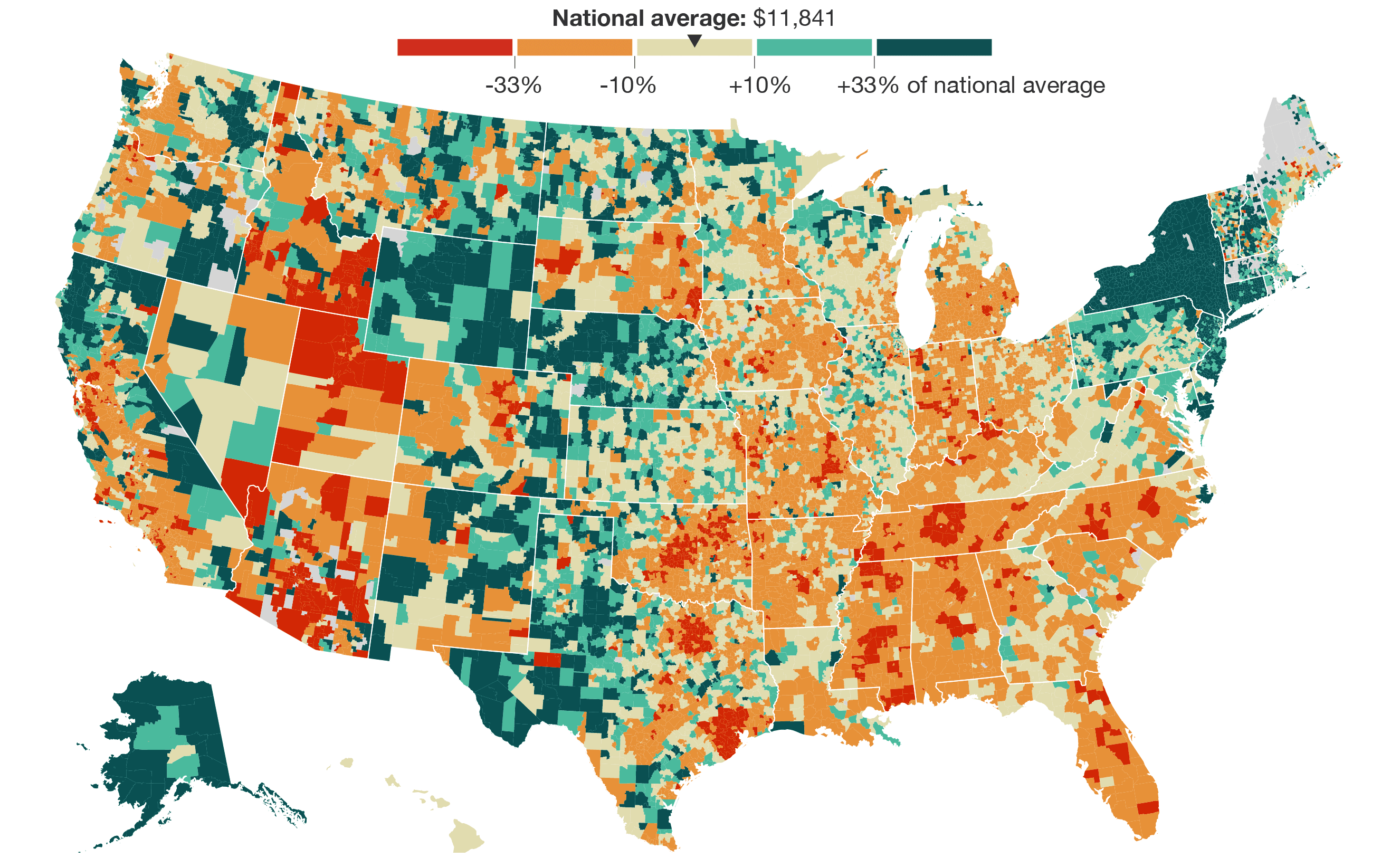

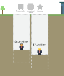 The tax plans of Ted Cruz and Donald Trump might seem fine if you don’t think about the actual values. Tax cuts. Less government spending. But then it gets tricky when you look at what they’re actually proposing. Alvin Chang for Vox provides a

 Visualize This: The FlowingData Guide to Design, Visualization, and Statistics (2nd Edition)


