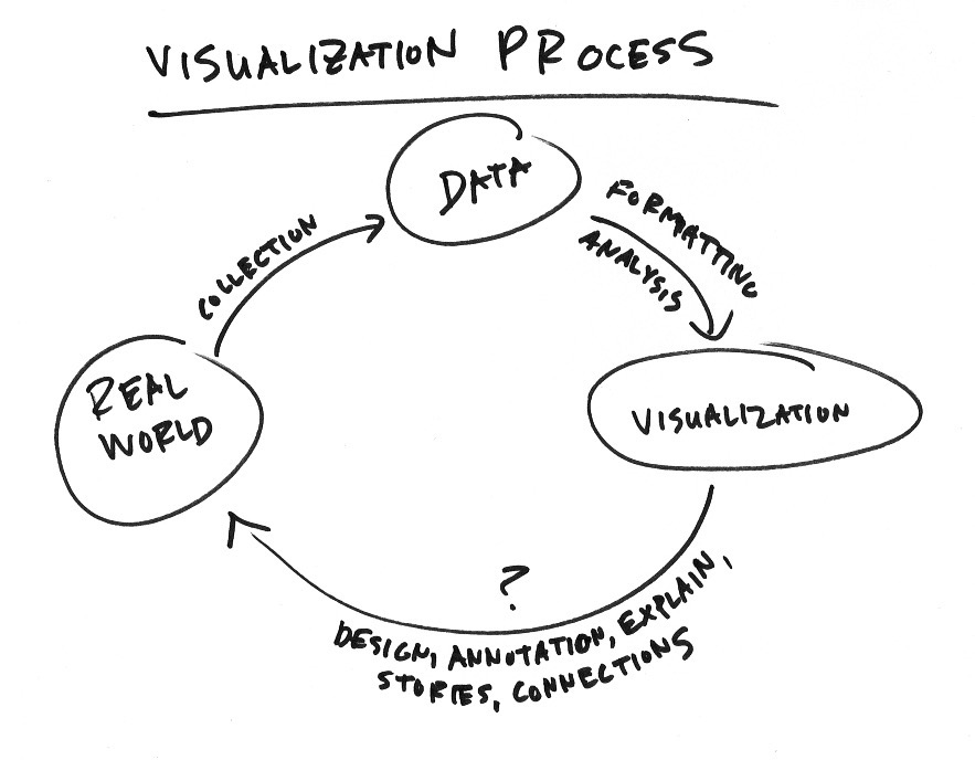
There is visualization in practice and there is visualization in theory and research. Each should inform the other, but it typically doesn’t happen that way. Kennedy Elliot, a graphics editor at the Washington Post, provides a rundown of one branch from the research side of things: human perception. There are quite a few studies.
-
Despite what commentators and sports analysts might have you think, picking great players in a sports draft is full of uncertainty. A player might be great in college, but the skills might not transfer to the professional level. Someone might be decent in college but end up great later.
The Washington Post delves into the uncertainties throughout the history of the NFL (the United States’ professional football league). Select your team and see how they have fared over the years.
Thumbs up for the handwriting aesthetic used with the annotations.
-
The Traveling Salesman Problem is a popular puzzle that asks for the shortest route between a set of points such that you visit each point once and end up back where you started. The problem is trivial for a few points, but it gets tricky as you add more. Here are are a few of the strategies in action.
See also this interactive simulation.
Or, you can try using genetic algorithms. [via kottke]
-
The Year that Music Died from Polygraph is an animated timeline that shows the Billboard top 5 songs since 1956, all the while playing the top song during a given week.
The visualization itself is fairly straightforward, but I like how everything shifts so smoothly. Artist thumbnails move up and down matching their position on the music chart, the number one songs play without sounding jerky, and a counter on the right keeps track of total weeks at number one per artist. [via Waxy]
-
Drawing Lines and Segments in R
Show connections and changes over time with start and end points.
-
Taking over an old New York Times project, ProPublica re-launches Represent, which offers an app and an API to see what your local lawmakers have been doing on your behalf.
Represent will show details of votes and bills and provide a way for you to follow the activities of your elected representatives and understand how they fit into the broader world of American politics. For example, we’ll show you how often a member of the House or Senate votes against a majority of her party colleagues, or the kinds of bills each lawmaker sponsors and cosponsors. We have pages detailing every vote, every bill and every member, with details about each. On the homepage we’ll display significant votes in the House and Senate.
If we’ve learned anything from this current election season, it’s that we should pay attention, stay educated, and vote accordingly.
-
-
Wrapping up their week-long School Money project, NPR asks: Is there a better way to pay For America’s schools? The story leads with the chart above, which shows per student spending by district and state. Each dot represents a district, and each column represents a state. States are sorted by per student median spending.
Read More -
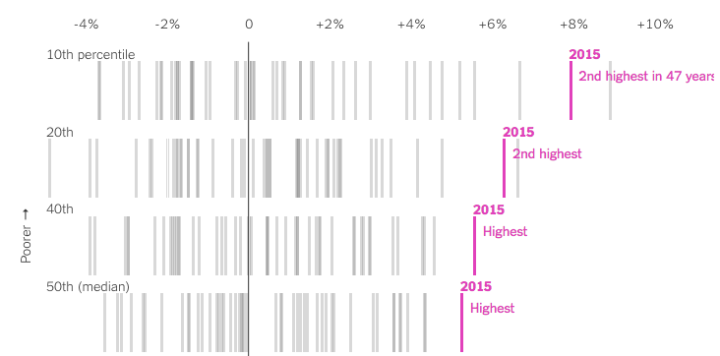
The Upshot highlights research from the Stanford Center for Education Policy Analysis that looks into the relationship between a child’s parents’ socioeconomic status and their educational attainment. Researchers focused on test scores per school district in the United States.
Read More -
Using functional magnetic resonance imaging, researchers monitored brain activity in seven people while the subjects listened to two hours of stories from the Moth Radio Hour. The researchers then used that data to map words to parts of the brain. An interactive viewer by Alexander Huth lets you see what words lit up parts of the brain for one of the subjects.
Colors represent semantic categories such as numeric, social, and violent. Just click on a part of the brain to see which words most associated with an area (or a voxel they’re called). Pan, zoom, and rotate for various angles. [via @wattenberg]
-
From the Open Data Institute, an interactive looking at diet data made available by Department for Environment, Food and Rural Affairs. “The British diet has undergone a transformation in the last half-century. Traditional staples such as eggs, potatoes and butter have gradually given way to more exotic or convenient foods such as aubergines, olive oil and stir-fry packs.”
The above is just an overview. You can see detailed breakdowns for meat, fish, vegetables, and more. You can also sort by time series characteristics, such as biggest rise, biggest fall, and most steady. Poor ox liver didn’t even see it coming.
-
We’ve seen maps for global shipping routes before, but this project — Ship Map — by Kiln and the UCL Energy Institute makes the exploration more interactive and explanatory.
Read More -
Our daily lives are full of bias. We make assumptions about how the world works, why complex systems do what they do, and how precise measurements really are. That leads to a skewed view and sometimes misinformed decisions. Lena Groeger for Propublica describes how information graphics might play a role in providing a more accurate picture, in the particular the ones that engage readers with data.
You may have noticed by now that in some of these graphics, what we realize is not just something about ourselves (wow, I’m terrible at the stock market) but something about others (wow, it’s pretty hard to live on minimum wage). In a way these “you do it” graphics are like digital empathy tools. When we’re forced to make a decision or do something we don’t normally have to do, we get a glimpse into what it might be like to be another person. I believe we can take the idea much farther.
This is one of my fascinations with data these days. “Overall” comes to mind a lot when I think of statistics. Overall trend. Overall pattern. Aggregation. That’s hard for the everyday person or casual reader to grasp onto sometimes. But, if they see where they’re positioned in some amalgamation of data, that’s a good baseline to riff off of.
-
Drawing Circles and Ellipses in R
Whether you use circles as visual encodings or as a way to highlight areas of a plot, there are functions at your disposal.
-
Mapping slavery from a historical perspective is a challenge, because many old maps and estimates are at the county level. Boundaries changed and counting methods changed, which provides for variation over time and geography. Cartographer Bill Rankin tries to find balance between accuracy and readability in a set of maps that show slavery in a grid layout from 1790 to 1870.
Read More -
Daniel Smilkov and Shan Carter at Google put together this interactive learner for how a neural network works. In case you’re unfamiliar with the method:
It’s a technique for building a computer program that learns from data. It is based very loosely on how we think the human brain works. First, a collection of software “neurons” are created and connected together, allowing them to send messages to each other. Next, the network is asked to solve a problem, which it attempts to do over and over, each time strengthening the connections that lead to success and diminishing those that lead to failure.
I took one course on neural networks in college and poked around at those parameters for hours for various homework assignments and projects. I was basically a monkey pushing at buttons to see what images I could produce. I wish I had something like this to mess around with, so I could actually see the process.
-
This is the trend line from Google Trends for “Well that escalated quickly.” I know there’s a perfectly good reason for the sudden rise, but I prefer not to know. [via @HPS_Vanessa]
Read More -
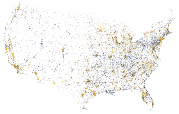
NPR is running a series on spending and school districts and all its complexities with government funding and whether or not more money even helps. They start with a map that shows the differences in spending per student in primary and unified school districts. Dollars are “adjusted for regional differences in cost of living, using the NCES Comparable Wage Index 2013.”
As you scroll down the story, an interactive map pans to the geographic area you’re most likely located in. It’s a small thing that we’ve been seeing more of lately. Since users are most likely to zoom in to their own area to compare, might as well try to do it for them. I like it.
-
Articles about stay-at-home dads and parents with even work loads might make it seem like dads are putting in a lot of hours in the household these days. Are they? How do they compare to moms’ work hours?