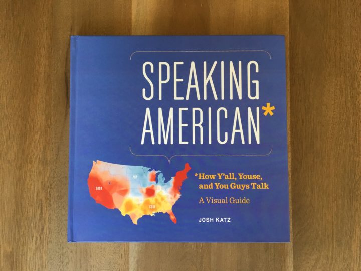
Alicia Parlapiano and Adam Pearce for the New York Times elegantly show a handful of percentages in this quick scroller. Nice, simple guidance through the values.
-
Time-lapse from space by NASA:
On July 20, 2015, NASA released to the world the first image of the sunlit side of Earth captured by the space agency’s EPIC camera on NOAA’s DSCOVR satellite. The camera has now recorded a full year of life on Earth from its orbit at Lagrange point 1, approximately 1 million miles from Earth, where it is balanced between the gravity of our home planet and the sun.
I don’t care how many time-lapse videos from space I’ve seen already. I will always want more. [via kottke]
-
Researchers modeled continental drift, going back 240 million years ago, on the scale of millimeters per year. It starts really slow and as if the supports give way to the separating pressure, there’s a relative burst of movement.
The full paper is in Nature, and the interactive version, which is a bit rough around the edges, can be found here. Select the time, rotate the planet around, and press play to watch the continents break apart.
-
You’re going to see probability values mentioned a lot these next few months. Many people will misinterpret. But not you.
-
Photographic evidence.
When they say
"The camera adds 10 pounds"
they're not kidding.
Here's the effect with different camera lenses: pic.twitter.com/xmwbsflVKd— Jim Zub (@JimZub) July 26, 2016
-
Every four years, campaign finance data from the Federal Election Commission peeks its head out into the light of importance. Committees and officials must report significant contributions to campaigns, which in turn provides a view into who is on who’s side. The weird thing is that the data was oddly tough to access for an everyday user, which is why third-party APIs and news orgs were and still are the primary place to go for information.
There’s a new FEC site in beta now though. A collaboration between the FEC and 18F, it’s a lot better than undocumented files only accessible via FTP. Search, browse, and download data for a candidate or contributor.
-
You’re likely familiar with the state grid map form used these days. Instead of using geographic boundaries, you place states in a grid layout, giving an equal-sized cell to each state so that they all get the same visual weight. The Wall Street Journal combined it with a time series for each state in their field guide to shifting states.
The country is more than just red states and blue states. Some former battlegrounds have moved to the sidelines. Other once reliably Republican or Democratic states have come into play as the composition of their electorates change.
Red means more Republican than the national popular vote, and blue means more Democrat.
The slow, animated load makes the map. It reminds me of the New York Times’ “wind” map from the previous election. Life-like.
-
As we delve deeper into election season, politicians will spit out more and more statistics to lend some factitude to their talking points. Some are real, and others will be less real. David Spiegelhalter for the Guardian provides a nine-point guide on how to sift out the latter.
On estimates and margin of error:
Next time you hear a politician boasting that unemployment has dropped by 30,000 over the previous quarter, just remember that this is an estimate based on a survey. And that estimate has a margin of error of +/- 80,000, meaning that unemployment may well have gone down, but it may have gone up – the best we can say is that it hasn’t changed very much, but that hardly makes a speech. And to be fair, the politician probably has no idea that this is an estimate and not a head count.
Ah, that makes me feel so warm and fuzzy inside.
-
Speaking of virtual reality visualization, this Nasdaq roller coaster by Roger Kenny and Ana Asnes Becker for the Wall Street Journal is quite the ride. The underlying data is just the index’s price/earnings ratio over time, but you get to experience the climbs and dips as if you were to ride on top of the time series track.
Weeeeeee, bubble burst.
-
More of an experiment, this VR map, by the Google Trends Lab in collaboration with Pitch Interactive, shows what people asked about Brexit leading up to the vote. It’s basic data-wise, but you can see potential for more details and get a feel for how virtual reality data visualization might work.
And besides, I’ll accept any excuse these days to bust out the Google Cardboard. Even if it’s basic visually, it’s easy to see how this point of view might bring you closer to the data.
See also the details on what the makers learned from the experiment.
-
A nanosecond is a billionth of a second, but we’re not very good with really big or tiny numbers. So, Grace Hopper, the inventor of “the first compiler for a computer programming language”, explains to some eager, young minds with a piece of wire.
-
Nuclear is still the most common, but there are millions of households in the United States with a different family structure.
-
You might think piecing together satellite imagery is a straightforward task of lining up latitude and longitude points. But if you think that, you haven’t actually worked with these things. David Yanofsky, part of the Quartz Things Team, describes how he processes satellite images for one coherent image and how you can to.
He starts at downloading the data, moves into stitching together a mosaic, and then adjusting the color so that everything is smooth and continuous.
-
Pokemon is everywhere these days. I think it’s just something the world really needs right now. I know very little about the universe, but I do like it when people analyze fictional worlds and characters. Joshua Kunst grabbed a data dump about all the Pokemon (seriously, I don’t even know if I’m referring to them/it/thing correctly) and clustered them algorithmically. The t-Distributed Stochastic Neighbor Embedding (t-SNE) algorithm to be specific.
-
How to Make Square Pie Charts in R
Instead of traditional pie charts that rely on angles and arc lengths to show parts of a whole, try this easier-to-read version.
-
Many hate pie charts. Others love them. I think they’re useful but have limitations. Most of these are just feelings though, maybe accompanied by an Edward Tufte quote. We need facts. Robert Kosara and Drew Skau provide some in their recent studies on how we read pie charts. There appears to be a good chance people don’t read the things correctly.
But I found Kosara’s follow-up more interesting. He dug up a paper that he and his student Caroline Ziemkiewicz wrote a few years ago on square pie charts. Instead of filling a circle to represent proportion, the square pie chart fills a — wait for it — square.
Read More -
As an introduction to a series on gun deaths in America, FiveThirtyEight uses a straightforward grid view to show the breakdowns. Each square represents a single gun death, and as you click through, the squares are colored to show various groups. For example, the above represents gun deaths from homicide in blue, about half of which are young men and two-thirds of that subgroup are black.
Sometimes it’s more useful to break the data down to its elements.
-
Ben Orlin of Math With Bad Drawings explains the pitfalls of using summary statistics — mean, median, and mode — to make decisions in life. Aggregates like these are meant as wideout overviews. Look deeper for details.
-
Road trips are fun, but it can be hard to enjoy yourself when you end up in a place during its hottest or coldest day of the year. Wouldn’t it be nice to travel across the country and have nice weather every single day? This road trip is for you.
Read More -
R has found its way into a good number of news groups who do data journalism. Andrew Flowers for FiveThirtyEight talks about how they use the statistical computing language throughout their workflow.
R is used in every step of the data journalism process: for cleaning and processing data, for exploratory graphing and statistical analysis, for models deploying in real time as and to create publishable data visualizations. We write R code to underpin several of our popular interactives, as well, like the Facebook Primary and our historical Elo ratings of NBA and NFL teams. Heck, we’ve even styled a custom ggplot2 theme. We even use R code on long-term investigative projects.