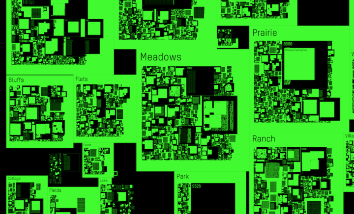
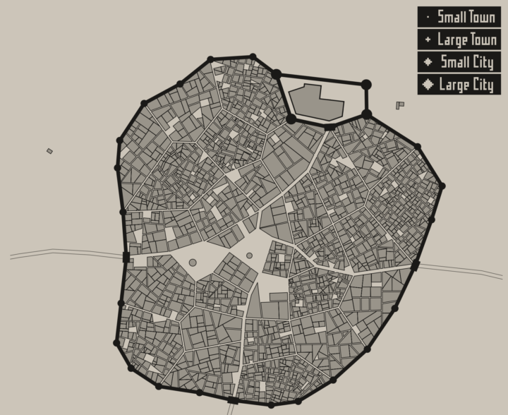
• Membership
  • Newsletter
  • Projects
  • Learning
  • About
  • Member Login
  • Peaks and valleys of presidential support

    November 9, 2016

    Topic

    Maps  /  election, Washington Post

    This is some fine map work by Lazaro Gamio and Dan Keating for the Washington Post. It shows total votes and margin of victory for each county with a peaks and valleys metaphor. Taller means more votes, and wider means greater margin. The Post rotated the United States map so that the east coast is on top and the west coast is on the bottom, which allows for scrollability and provides more space horizontally to show margins.

    Nice.

  • Randomness of scientific impact

    November 9, 2016

    Topic

    Statistical Visualization  /  randomness, science

    A group of researchers wondered if there was a trend or predictability for when a scientist’s most impactful work came about. It’s random.
    Read More

  • Together

    November 9, 2016

    Topic

    Sketchbook

    Here we go.

  • Textured SVG patterns in JavaScript

    November 8, 2016

    Topic

    Coding  /  fills, JavaScript, patterns

    In case you didn’t get the memo, pattern fills are back and so hot right now. In the category of new-to-me, Textures.js by Riccardo Scalco is a JavaScript library that makes adding lines and dots in place of boring solid colors a trivial task.

  • Nuclear war is on the ballot

    November 7, 2016

    Topic

    Infographics  /  election, nuclear

    [arve url=”https://youtu.be/Fqo5xPDCts8″]

    Neil Halloran, creator of the interactive World War II documentary focused on deaths, is working on another focused on the cost of nuclear war. With the election tomorrow, Halloran pushed out an “election cut” to highlight what’s at stake. Very scary.

  • Newspaper endorsements since 1980

    November 7, 2016

    Topic

    Data Sources  /  election, endorsement, newspaper

    Noah Veltman put together a history of newspapers’ presidential endorsements since 1980 for about 100 publications. There’s a simple table showing Republican, Democrat, or other endorsement over the years, and you can download the data too.

  • Majority minorities

    November 5, 2016

    Topic

    Sketchbook  /  animation, population, R, race

    We saw the changing percentage of white people in the United States and how whites are not the majority in a lot of places. Who is the majority in these areas? Here’s a breakdown for the main three races that make up majorities.
    Read More

  • Percentage of white people

    November 4, 2016

    Topic

    Sketchbook  /  animation, population, race

    Below is the estimated percentage of white population in the United States from 1970 to 2010, based on data from the Census Bureau and made more accessible by NHGIS. I like the evaporative quality coming up in the southwest.

    white-people

    Mostly though, this is just me trying out a new toy, and the form fascinates me at the moment.

    Members: I’m working on a set of tutorials for how to make these. There are a few steps involved, so I’m breaking it down to make it more digestible. Part 1 is here.

  • All the ways to map election results

    November 3, 2016

    Topic

    Maps  /  election, New York Times

    Every election, there’s a slew of election maps that come in all shapes and sizes. The maps have evolved with the web, the amount of data available, and the level of reader interest, and it’s about finding a balance between the new and what works. To see the evolution, you can look to The New York Times portfolio over the decades. The Upshot has the rundown.

  • Data Underload  /  America, population

    Two Centuries of Population, Animated

    A visual history of a growing United States.

    Read More
  • Impact of Obamacare in maps

    November 1, 2016

    Topic

    Maps  /  insurance, Upshot

    It’s been three years since the Affordable Health Care Act. Margot Sanger-Katz and Quoctrung Bui for The Upshot look at how this changed the percentage of those who were uninsured in this country. In some places the percentages didn’t change much, but in many others, there are much fewer uninsured.

  • Sentiment analysis on Trump and Clinton faces during debate

    October 31, 2016

    Topic

    Statistics  /  election, sentiment, vision

    For anyone who watched the presidential debates, I think it was fairly obvious what emotion each candidate projected at various moments. However, a group of graduate students from Columbia University applied computer vision and sentiment analysis to get a more quantitative gauge. Because, sure, why not. Sarah Slobin for Quartz explains the results.

  • Vintage cartography and geography documentary, from 1961

    October 28, 2016

    Topic

    Maps  /  cartography, documentary

    This is too good not to watch. It’s a 1961 documentary on cartography and geography from the United States Air Force. Watch in all its vintage glory below.(You might want to turn down the volume during the first half minute.)

    [via @mapdragons]

  • Visualizing the U.S.-Mexican border

    October 27, 2016

    Topic

    Maps  /  border, satellite, wall

    There’s been a lot of talk about building a wall at the U.S.-Mexican border lately. Seems straightforward enough, right? Just put some bricks up and be done with it. Well, it’s not really that easy, just from a logistics standpoint. Nevermind the politics. Josh Begley for the Intercept grabbed satellite images for the 1,954 miles of boundary line and then strung together the 200,000 images in a time-lapse to show the scale of what “build that wall” means.

  • Adjusting map data with Mapshaper

    October 26, 2016

    Topic

    Apps  /  mapping, shapefile

    Map making is a finicky challenge where oftentimes your map data — points, lines, and polygons — must align just right with your external data that exists as a CSV file or related. Mapshaper is an online tool that helps you massage your geographic data to where it needs to be.

    The online application has been around for a while, but I only recently used it, and it’s kind of magical. It’s one of those things where you half expect the whole thing to fail, and then when it seems to be working you still expect there to be some wrinkle that makes using the tool a pain. Not so with Mapshaper.

  • R graph gallery

    October 25, 2016

    Topic

    Coding  /  R

    One of best ways to learn visualization in any given software is to look at examples and apply to your own data. The R graph gallery helps you with the first part providing plenty of examples and the code snippets to make them. It’s still relatively new, but it should prove useful as it grows (hopefully). [via Revolutions]

  • Ad spending for Clinton and Trump

    October 24, 2016

    Topic

    Statistical Visualization  /  election, New York Times, spending, streamgraph

    Adam Pearce for the New York Times charted ad spending for Clinton and Trump, starting 20 weeks out from the election up to present. I like the John McCain, Mitt Romney, and Barack Obama spends as a point of reference.

  • Transitioning Map, Part 1: Mapping Irregular Data with Interpolation in R

    Rarely do you have evenly-spaced data across an entire geographic space. Here is a way to fill in the gaps.

  • Trump bar chart baselines are the worst baselines. Sad.

    October 21, 2016

    Topic

    Ugly Charts  /  baseline, election, Washington Post

    The Donald Trump campaign has a habit of highlighting poll results with a bar chart that just shows the top portion. The bottom baseline fades away somewhere or the values follow a random scale. They’re supposed to start at zero.

    John Muyskens for the Washington Post highlights the campaign’s bar chart usage, and why it’s problematic. Sometimes if the bars were placed correctly, the results would show more favorable for Trump. The bar charts are just decorative, basically.

  • Interactive charts in R

    October 21, 2016

    Topic

    Coding  /  interactive, R

    Interactive charts in R are still so-so, but if you don’t mind giving up some flexibility and just want something quick without having to learn a new language, there are a handful of options. RStudio highlights the highcharter package, which is a wrapper around the JavaScript-based Highcharts.

    So the story goes that Torstein Hønsi, the founder and Chief Product Officer of Highcharts. was looking for a simple charting tool for updating his homepage with snow depth measurements from Vikjafjellet, the local mountain where his family keeps a cabin. Frustrated with the common flash plug-ins, and other proprietary solutions available at the time, he decided to build a standards-based solution of his own and then, of course, share it.

    Write R. Get an interactive chart to export.

    While we’re at it, you might also be interested in the R wrapper for Plotly, which is another JavaScript charting library, and htmlwidgets, which lets you work with JavaScript libraries within R (and highcharter makes use of).

  • Page 171 of 392
  • <
  • 1
  • ...
  • 168
  • 169
  • 170
  • 171
  • 172
  • 173
  • ...
  • 392
  • >

Analyze, visualize, and communicate data usefully, beyond the defaults.

Become a member →

Recently for Members

May 8, 2025
When the data is not what it seems

May 1, 2025
Finding the Right Charts

April 24, 2025
Visualization Tools, Datasets, and Resources – April 2025 Roundup

April 17, 2025
Breaking Out of Chart Software Defaults

April 15, 2025
Line Chart with Decorative Neon Accents

Browse by Chart Type See All →

Area Chart Line Map Spiral Chart Glyph Chart Density Plot Strip Plot Scatter Plot Stacked Area Chart Bar Chart Grid Map

Browse By Topic

  • Visualization

    Seeing data

  • Maps

    Seeing geographic data

  • Infographics

    Explaining data

  • Networks

    Connecting data

  • Statistics

    Analyzing data

  • Software

    Working with data

  • Sources

    Getting data

  • Design

    Making data readable

Get the Book

Visualize This: The FlowingData Guide to Design, Visualization, and Statistics

Available now.

Order: Amazon / Bookshop

Made by FlowingData

  • The Process

  • Data Underload

  • Chart Everything

  • Guides

  • Books

  • Shop

  • About
  • Contact
  • Newsletter
  • LinkedIn
  • Instagram
  • Bluesky
  • RSS
Copyright © 2007-Present FlowingData. All rights reserved.