
Welcome to the new members-only newsletter: The Process. In this first update, a certain data graphics expert seems to really dislike R, which prompts a look into the visualization tools we use and what one might get out of a bigger toolbox.
Welcome to the new members-only newsletter: The Process. In this first update, a certain data graphics expert seems to really dislike R, which prompts a look into the visualization tools we use and what one might get out of a bigger toolbox.

I’m happy to introduce an in-depth, process-focused newsletter for FlowingData members. It’s called The Process. If you’re already a member, you should receive the first issue soon. It’ll be weekly on Thursdays. It’ll be about the how and why of visualization. It’s a benefit in addition to tutorials, courses, etc. Basically, nothing changes, except that you get more now.
If you’re not a member yet, I’d love for you to join. Find out all the benefits of membership here.
A big part of FlowingData is the what of data and visualization. I highlight the interesting work of others and publish my own projects. This all continues too.
However, with The Process I’ll talk more about the practical side of designing data graphics. That means tools, design choices, limitations, analysis, and everything else involved in visualizing data. My hope is that it gives me a chance to broaden my scope past the tutorials and courses, which tend to stick around R and JavaScript, while still providing a practical point of view.
I’m sure the newsletter evolves over time, but I’m excited to see how it develops. I think it will force me to learn new things about visualization and think more critically about the field. I want more depth. I hope you’ll join me.
As the field grows and needs develop throughout companies, specialization in data science is a natural next step. Elena Grewal, head of data science at Airbnb, describes their three main tracks and further specialization within each.
We decided to restructure data science along three tracks. These described what we were looking for and are areas we want to attract talent.
The Analytics track is ideal for those who are skilled at asking a great question, exploring cuts of the data in a revealing way, automating analysis through dashboards and visualizations, and driving changes in the business as a result of recommendations. The Algorithms track would be the home for those with expertise in machine learning, passionate about creating business value by infusing data in our product and processes. And the Inference track would be perfect for our statisticians, economists, and social scientists using statistics to improve our decision making and measure the impact of our work.
Sounds about right.
I’m curious what statistics and data science look like ten or twenty years from now. As each becomes more like the other, do the two fields converge into one, or do they collide and differentiate themselves as much as possible? I guess the former.
Oliver Roeder for FiveThirtyEight:
FiveThirtyEight has obtained nearly 3 million tweets from accounts associated with the Internet Research Agency. To our knowledge, it’s the fullest empirical record to date of Russian trolls’ actions on social media, showing a relentless and systematic onslaught. In concert with the researchers who first pulled the tweets, FiveThirtyEight is uploading them to GitHub so that others can explore the data for themselves.
The data set is the work of two professors at Clemson University: Darren Linvill and Patrick Warren. Using advanced social media tracking software, they pulled the tweets from thousands of accounts that Twitter has acknowledged as being associated with the IRA. The professors shared their data with FiveThirtyEight in the hope that other researchers, and the broader public, will explore it and share what they find. “So far it’s only had two brains looking at it,” Linvill said of their trove of tweets. “More brains might find God-knows-what.”
How amazing would it be if this weren’t a thing and Twitter released this data themselves? Or better yet, what if Twitter released their own report based on research conducted by their own data scientists? No one knows how trolls use Twitter better than Twitter.
Of course, that’s not happening any time soon. So until then, download the data here.
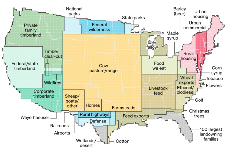
Dave Merrill and Lauren Leatherby for Bloomberg visualized land use for the conterminous United States using a pixel-like grid map:
The 48 contiguous states alone are a 1.9 billion-acre jigsaw puzzle of cities, farms, forests and pastures that Americans use to feed themselves, power their economy and extract value for business and pleasure.
Using surveys, satellite images and categorizations from various government agencies, the U.S. Department of Agriculture divides the U.S. into six major types of land. The data can’t be pinpointed to a city block—each square on the map represents 250,000 acres of land. But piecing the data together state-by-state can give a general sense of how U.S. land is used.
The above map is the full aggregate, but be sure to click through to see the comparisons across categories. Using a scrollytelling format, the graphics are a hybrid of grid maps and square pie charts. States serve as a point of reference. They’re the banana for scale. I like it.
There’s been some disagreement about who wrote “In My Life” by The Beatles, so researchers did what any normal person does and tried to model the songs of Paul McCartney and John Lennon:
Mark Glickman, senior lecturer in statistics at Harvard University, and Jason Brown, Professor of Mathematics at Dalhousie University, created a computer model which broke down Lennon and McCartney songs into 149 different components to determine the musical fingerprints of each songwriter.
McCartney says he wrote the music for the song, but Glickman and Brown give that claim a less than 1 in 50 chance.
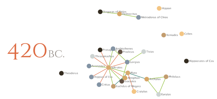
Maximilian Noichl visualized the relationships between philosophers from 600 B.C. to 160 B.C.:
The Sociology of Philosophies is a fascinating book by Randall Collins, in which he attempts to lay out a global history of philosophy in terms of interpersonal relations between philosophers. These connections are layed out in the form of graphs. This my attempt to visualize a bit of that data, depicting 440 years of western ancient philosophy.
Green represents a relationship between master and pupil, and the red-ish color represents a more contentious relationship. The rest are less concrete. Dang, Sokrates.
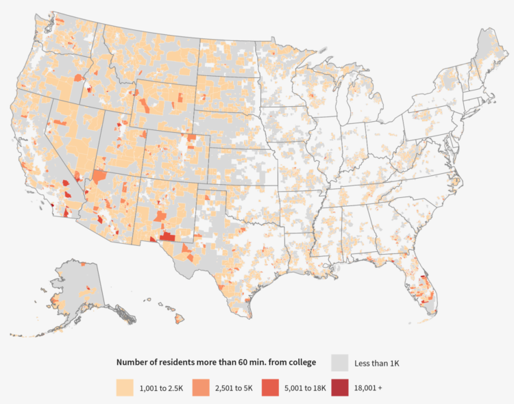
The Chronicle of Higher Education looked for education deserts — places where people aren’t within driving range of a college or university — with a combination of Census data, school locations, and driving times. They found that about 3.5 percent of the adult population (11.2 million) lived in education deserts.
There are a lot of caveats to consider, such as not all adults go to or want to go to college and many students move away from home for school. So it’s hard to say how useful the 3.5 percent figure is. Nevertheless, it’s an interesting view of what isn’t there and the scrollytelling format lends well to working through the analysis steps.
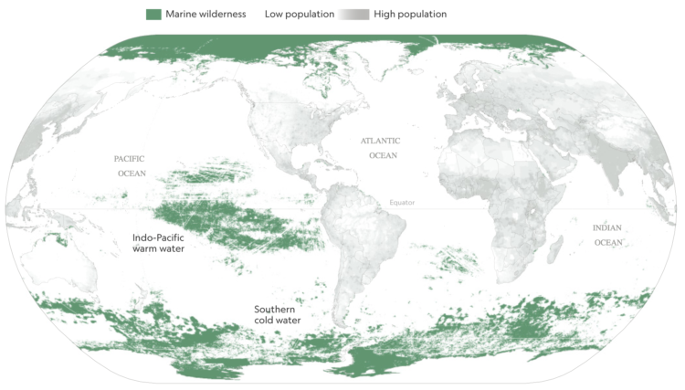
Researchers recently published estimates for the amount of area undisturbed by humans — marine wilderness — left on the planet. Kennedy Elliot for National Geographic mapped the results.
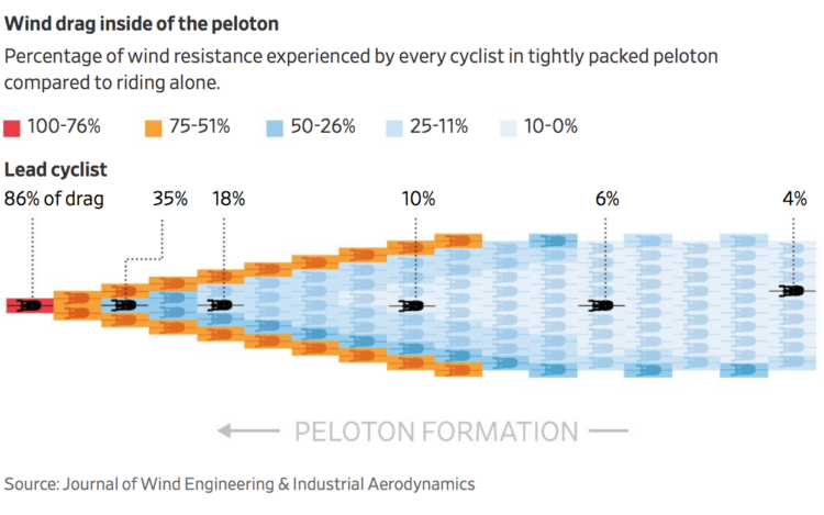
When cyclists ride in that big pack during a race — the peloton — the ones that aren’t leading get to ride with a reduced wind resistance. Researchers found out the magnitude of the reduction.
Joshua Robinson for The Wall Street Journal:
According to a new study published in the Journal of Wind Engineering and Industrial Aerodynamics, riders in the belly of a peloton are exposed to 95% less drag than they would experience riding alone. Which explains the sensation all riders describe of being sucked along by the bunch while barely having to pedal.
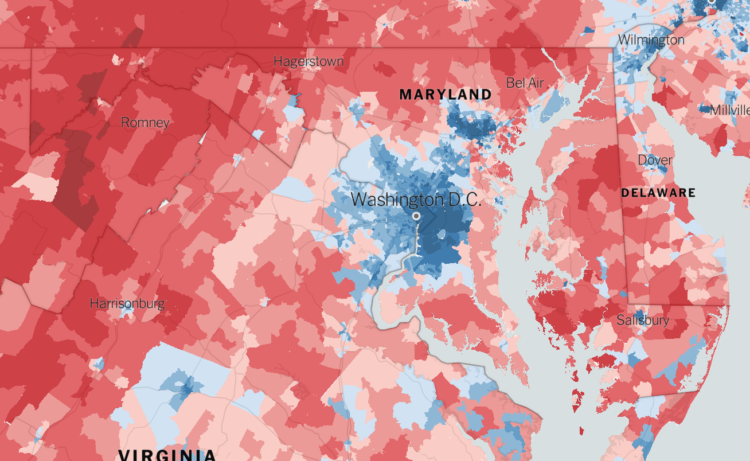
The Upshot returns to 2016 election results mapped at the precinct level. Because you know, we all want to experience the data as many times as we can before 2020.
There’s an interesting twist though. You can randomly view “one-sided places”, where the area voted mostly the same, and “voter islands”, where the area is surrounded by opposite-voting precincts. These are made more compelling by the granular data and ease of interaction, largely made possible by Mapbox.
There’s also a 3-D view in case you want to pretend you’re looking at an election game board.

When you want to focus on the magnitude of differences between low and high values, use visual cues that highlight distance.
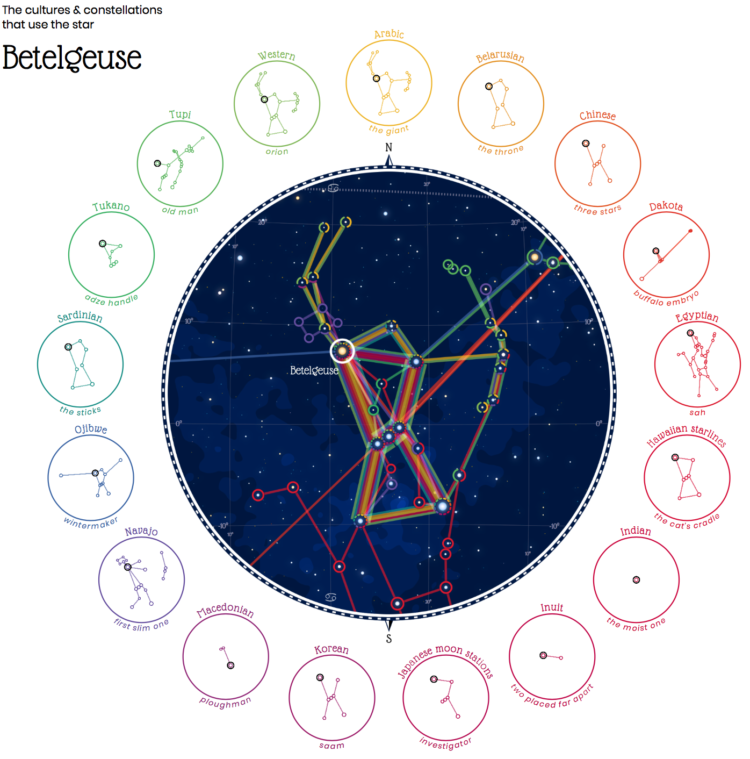
Cultures have formed different stories and pieced together different constellations from the stars, even though everyone are looking at the same thing in the sky. Nadieh Bremer visualized constellations across these cultures that share the same star.
Let’s compare 28 different “sky cultures” to see differences and similarities in the shapes they’ve seen in the night sky. Ranging from the so-called “Modern” or Western constellations, to Chinese, Maori and even a few shapes from historical cultures such as the Aztecs.
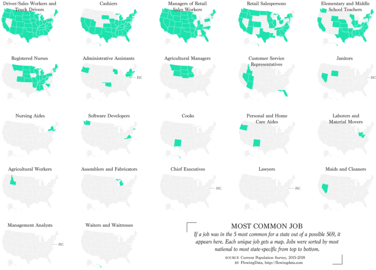
Instead of looking at only the most common job in each state, I found the top five for a slightly wider view.
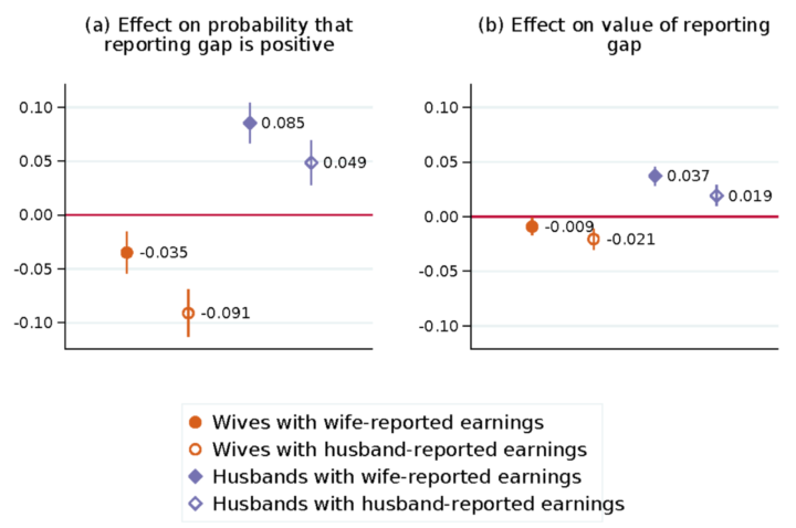
Marta Murray-Close and Misty L. Heggeness for the Census Bureau compared income responses from the Current Population Survey against income tax reports. The former can be fudged, whereas the latter is accurate by law. The researchers found a statistical difference that suggests when a wife makes more than a husband, they report a lesser gap in the survey.
This paper compares the earnings reported for husbands and wives in the Current Population Survey with their “true” earnings from administrative income-tax records. Estimates from OLS regressions show that survey respondents react to violations of the norm that husbands earn more than their wives by inflating their reports of husbands’ earnings and deflating their reports of wives’ earnings. On average, the gap between a husband’s survey and administrative earnings is 2.9 percentage points higher if his wife earns more than he does, and the gap between a wife’s survey and administrative earnings in 1.5 percentage points lower if she earns more than her husband does. These findings suggest that gendered social norms can influence survey reports of seemingly objective outcomes and that their impact may be heterogeneous not just between genders but also within gender.
The gap shift didn’t change much, regardless if the wife reported or the husband did. However, it’s interesting that the shift tended towards a boost for the husband’s income when the wife reported and a bump down for the wife’s income when the husband reported.
The logistics of being a 60-foot man must be a pain.
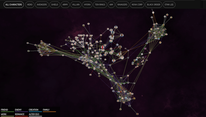
The Straits Times visualized the Marvel Cinematic Universe with a 3-D browsable network. Link colors represent type of relationship, and proximity naturally represents commonalities between characters. Click on individual characters for information on each. Turn on the sound for extra dramatics.
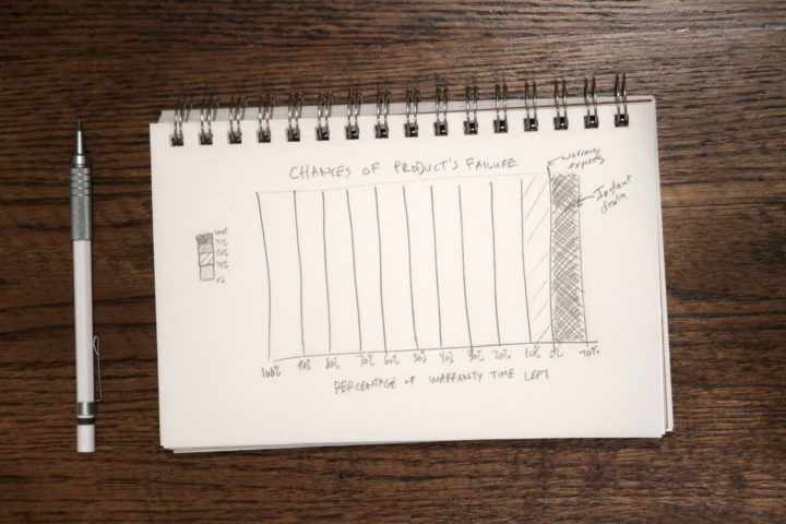
With almost absolute certainty, every product dies a quick death once its warranty runs out. I mean it makes sense, but I never really thought about it until I had to replace all of the chirping smoke detectors at once. And the toilet pumps. And the tires on my car.
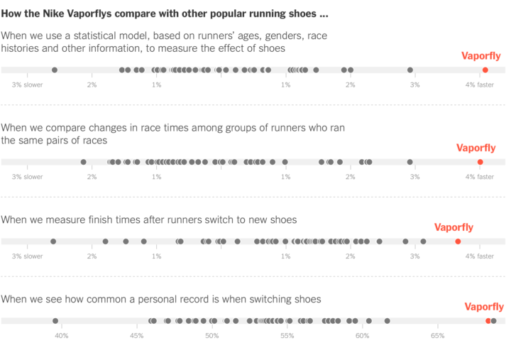
Kevin Quealy and Josh Katz for The Upshot analyzed shoe and running data to see if Nike’s Vaporfly running shoes really helped marathoners achieve faster times. Accounting for a number of confounding factors, the results appear to point to yes.
We found that the difference was not explained by faster runners choosing to wear the shoes, by runners choosing to wear them in easier races or by runners switching to Vaporflys after running more training miles. Instead, the analysis suggests that, in a race between two marathoners of the same ability, a runner wearing Vaporflys would have a real advantage over a competitor not wearing them.
Very statistics-y, even for The Upshot. I like it.
It takes me back to my fourth grade science fair project where I asked: Do Nike’s really make you jump higher? Our results pointed to yes too. Although our sample size of five with no control or statistical rigor might not stand up to more technical standards. My Excel charts were dope though.
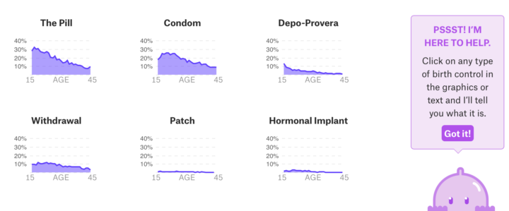
Birth control is one of those topics often saved for private conversations, so people’s views are often anecdotal. Someone knows what their friend, family member, etc used, but not much else. Amber Thomas for The Pudding provides a wider view of birth control using data from the CDC’s ongoing National Survey of Family Growth.
You see what other people use, how the method changes with age, and side effects. There’s a Clippy-like character for added information on the different methods. So there’s a good amount of information there to make the choice that’s right for you.
Sidenote on the NSFG data: I looked at the data a few times. It’s a good, messy dataset to explore if you want some practice.
 Visualize This: The FlowingData Guide to Design, Visualization, and Statistics (2nd Edition)
New tools, refined process.


