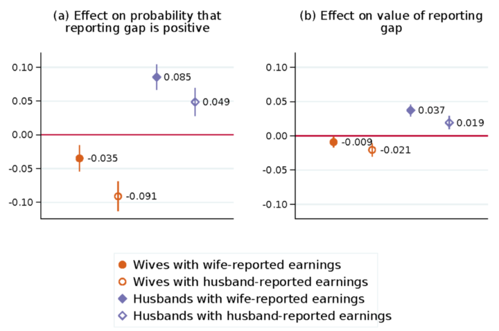
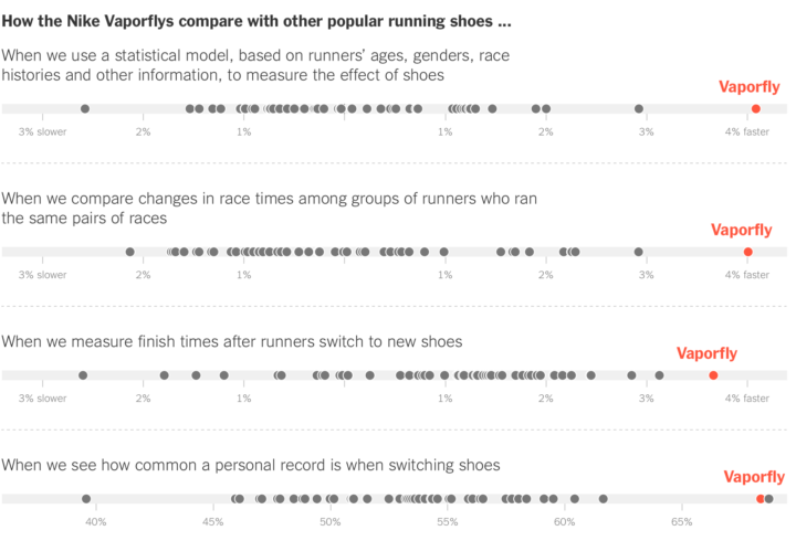
• Membership
  • Newsletter
  • Projects
  • Learning
  • About
  • Member Login
  • Maps show spring arriving earlier

    April 11, 2018

    Topic

    Maps  /  first leaf, global warming, NASA

    From Joshua Stevens at the NASA Earth Observatory:

    But over the longer term, climate change is causing spring to begin earlier and earlier across the United States. These maps reveal just how much earlier spring is arriving in National Parks across the country. The data were published in 2016 by ecologists from the National Park Service, working in collaboration with colleagues at other agencies and institutions.

    Griddy.

    Limited to only national parks, the view still provides a good idea. For a model-based view at higher granularity, check out the USA National Phenology Network.

  • The Moon in 4k resolution

    April 10, 2018

    Topic

    Maps  /  high resolution, moon, NASA, space

    Based on data gathered by the Lunar Reconnaissance Orbiter, NASA pieced together this high-resolution tour of the moon. At the two-minute mark they zoom in on a boulder in the middle of a 100-million-year-old crater, and it blew my mind.

    [arve url=”https://youtu.be/nr5Pj6GQL2o” /]

  • Datasets for teaching data science

    April 9, 2018

    Topic

    Data Sources  /  R, teaching

    Rafael Irizarry introduces the dslabs package for real-life datasets to teach data science:

    [I] try to avoid using widely used toy examples, such as the mtcars dataset, when I teach data science. However, my experience has been that finding examples that are both realistic, interesting, and appropriate for beginners is not easy. After a few years of teaching I have collected a few datasets that I think fit this criteria. To facilitate their use in introductory classes, I include them in the dslabs package.

  • How to Make Chord Diagrams in R

    Show connections in the circular layout for a more compact presentation.

  • Traveling salesman image drawing

    April 6, 2018

    Topic

    Statistics  /  R, traveling salesman

    This is a fun drawing experiment in R by Antonio Sánchez Chinchón. A simple process: convert an image to black and white, sample the black points, and then solve the Traveling Salesman Problem for those points. Draw the resulting path for something like the above.

    Grab the R code to try it with your own images and settings.

  • Day of the year companies stop paying women

    April 5, 2018

    Topic

    Infographics  /  calendar, Guardian, pay gap

    One way to think about gender pay gap is to imagine women receive the same pay as men each working day until they reach their salary. At some point during the year, women effectively work for free. With a new law that requires companies in Great Britain with 250 or more employees to report pay gap, The Guardian provides a calendar view into the newly reported data that shows the day of the year the free work starts.

    The scroller shows companies as you move down the calendar. The information feels less overwhelming than seeing it all at once, and a running counter keeps track of what you already saw.

    See also The Guardian’s breakdown by sector.

  • Cities like yours

    April 4, 2018

    Topic

    Statistics  /  demographics, jobs, Upshot

    There are many ways to estimate how similar two cities are — weather, demographics, taxes, etc. Jed Kolko from job site Indeed and Josh Katz for The Upshot used the distribution of job offerings. Just enter your city or a nearby metro, and you get something like this:

    I punched in cities I’ve lived in or visited, and the results looked pretty good.

    The analysis is based on job postings on Indeed, but I wonder if this would work with Census data. And can we apply this similarity index or some form of it to, say, individuals? Just think of the possibilities, Match.com.

  • A musical journey in 1939, retold with visualization

    April 3, 2018

    Topic

    Infographics  /  history, music

    In 1939, John and Ruby Lomax traveled through ten southern states in three months. They recorded music by individuals with the belief that the subtleties of music culture is best captured when a person plays for another face-to-face.

    The Texas Folklore Society’s founding members shared with Lomax a sense that their state’s rich folklore needed to be documented and preserved for the analysis of later scholars. Nascent technology such as the radio and the gramophone, it was feared, would end the age-old tradition of transmitting music and lore directly from one person to the next. With professional musicians’ works being piped into homes across the country, the purity of traditional music, its particularities of region, religion and ethnicity, could be lost forever.

    Aditya Jain tells the story of the Lomax’s journey, visualizing the bits they collected and archived along the way. [via @blprnt]

  • Tracking her boyfriend on Strava

    April 2, 2018

    Topic

    Data Sharing  /  relationships, Strava, Wired

    Elizabeth Barber was in a long-distance relationship, and Strava was a way for her to connect with him. It became a point of anxiety when her boyfriend cycled with someone else more and more often.

    I was curious, and Strava is a joyless data bank for the insecure. When The Washington Post reported in January that US military bases are visible in the GPS shadows of uniformed Stravites, I was not shocked. I had performed equally fastidious forensics on the cyclist’s Strava maps. Tracing her routes on that anxious morning and days to come, I could see where she lived, where she drank beer and got coffee. I knew how many calories she burned working out, and how often. I knew when and where and with whom she spent time (increasingly, my boyfriend).

    Data without much context: enough to drive anyone a little nutty.

  • Understanding animated transitions in data visualization

    April 2, 2018

    Topic

    Design  /  animation, transitions

    Alec Barrett for TWO-N describes the benefits and some of the intricacies of animated transitions in data visualization.

    This visual essay is inspired by the question: What is happening conceptually between the start and end of a transition? I look at reasons for using animated transitions (besides “it looks cool”) and at the kinds of variables that can be transitioned. I conclude that we can think of animated transitions in two categories: those where the space between the start and end states consists of real/realistic data and grammatically valid states for that visualization, and those where it does not.

    The essay by the way was published on Observable, a new-ish way to publish “interactive notebooks for data analysis, visualization, and exploration.” Worth a look if you’re into publishing and sharing code.

  • SimCity-like views using satellite imagery

    March 30, 2018

    Topic

    Maps  /  perspective, satellite

    Maps typically show a view from straight above, which is good for navigation and to see regional patterns over large areas. However, missing out on the extra dimension of height can mean missing out on context. Robert Simmon for Planet Labs shows off some work in getting the less abstract perspective at a large scale.

  • Facebook logs calls and text messages

    March 29, 2018

    Topic

    Data Sharing  /  facebook, Guardian, privacy

    Woo. Woo. Alex Hern reporting for The Guardian:

    In at least one previous version of the Messenger app, Facebook only told users that the setting would enable them to “send and receive SMS in Messenger”, and presented the option to users without an obvious way to opt out: the prompt offered a big blue button reading “OK”, and a much smaller grey link to “settings”.

    Nowhere in the opt-in dialogue was it made clear that text histories would be uploaded to Facebook’s servers and stored indefinitely.

    This was only on Android devices, as iOS devices don’t provide developers such access.

  • What Facebook and Google know about you

    March 29, 2018

    Topic

    Data Sharing  /  facebook, Google, Guardian, privacy

    Facebook and Google (among other companies) know a lot about you through the services you use. Dylan Curran for The Guardian provides a rundown:

    This information has millions of nefarious uses. You say you’re not a terrorist. Then how come you were googling Isis? Work at Google and you’re suspicious of your wife? Perfect, just look up her location and search history for the last 10 years. Manage to gain access to someone’s Google account? Perfect, you have a chronological diary of everything that person has done for the last 10 years.

    This is one of the craziest things about the modern age. We would never let the government or a corporation put cameras/microphones in our homes or location trackers on us. But we just went ahead and did it ourselves because – to hell with it! – I want to watch cute dog videos.

    We knew this, right? But it’s weird that it took a government-related impetus to bring privacy concerns in social media back into the light. It feels different this time.

  • Steve Jobs on data privacy

    March 29, 2018

    Topic

    Data Sharing  /  privacy, Steve Jobs

    From 2010, Steve Jobs on data privacy:

    [arve url=”https://www.youtube.com/watch?v=39iKLwlUqBo” /]

  • Income mobility for different groups

    March 29, 2018

    Topic

    Statistical Visualization  /  demographics, income, Upshot

    Building on their previous visualization work on black boys dropping income levels in adulthood, The Upshot adds the option to change demographic groups. See income mobility for different races, genders, and income starting points.

  • Choropleth map design considerations

    March 28, 2018

    Topic

    Design  /  choropleth, color, Lisa Charlotte Rost

    Lisa Charlotte Rost for Datawrapper provides guidance for designing choropleth maps that most fairly represent your data:

    Maps are not objective, but a version of reality. When creating them, lots of choices are made: What to map, how to map and whether or not to use a map in the first place. Here we’ll try to find guidelines to all of these questions, for a specific subset of maps: Choropleth maps (the ones in which each region is filled with a color that represents a value).

    Rost’s other guides (line charts, area charts, pie charts, and more) are also full of practical advice. Highly recommended.

  • Data Underload  /  age, work

    Most Common Occupation by Age

    As we get older, job options shift — along with experience, education, and wear on our bodies.

    Read More
  • Citizenship question returning to Census

    March 27, 2018

    Topic

    Statistics  /  census, citizenship, immigration

    Emily Baumgaertner reporting for The New York Times:

    But critics of the change and experts in the Census Bureau itself have said that, amid a fiery immigration debate, the inclusion of a citizenship question could prompt immigrants who are in the country illegally not to respond. That would result in a severe undercount of the population — and, in turn, faulty data for government agencies and outside groups that rely on the census. The effects would also bleed into the redistricting of the House and state legislatures in the next decade.

    Welp.

    Justin Elliot reporting for ProPublica:

    The full census, however, hasn’t included questions about citizenship since 1950. The Census Bureau has gathered such data in other surveys. The bureau switched the method of those surveys after the 2000 census. Today, it conducts the American Community Survey every year, which includes questions about citizenship, along with many other questions. The survey covers a sample of residents of the United States.

    Experts said the Justice Department’s letter was misleading. And they questioned the Justice Department’s explanation in the letter, noting that the American Community Survey produces data on citizenship that has been used in Section 2 cases.

    Welp.

    WELP.

  • Altair for visualization in Python

    March 26, 2018

    Topic

    Software  /  Python

    Vega-Lite is a grammar for interactive graphics primarily used for analysis. Altair is a visualization library in Python that is based on this grammar.

    With Altair, you can spend more time understanding your data and its meaning. Altair’s API is simple, friendly and consistent and built on top of the powerful Vega-Lite visualization grammar. This elegant simplicity produces beautiful and effective visualizations with a minimal amount of code.

    Jim Vallandingham just put up a useful introduction to the library if you’re looking to get your feet wet.

    I do very little visualization-wise with Python since my current toolset typically covers my bases, but this has me curious.

  • Average first leaf appearance, as animated map

    March 23, 2018

    Topic

    Maps  /  first leaf, New York Times, weather

    The USA National Phenology Network uses a computer model to estimate heat build-up and the “first leaf” appearance across the country. Jeremy White for The New York Times animated it.

  • Page 145 of 392
  • <
  • 1
  • ...
  • 142
  • 143
  • 144
  • 145
  • 146
  • 147
  • ...
  • 392
  • >

Analyze, visualize, and communicate data usefully, beyond the defaults.

Become a member →

Recently for Members

May 8, 2025
When the data is not what it seems

May 1, 2025
Finding the Right Charts

April 24, 2025
Visualization Tools, Datasets, and Resources – April 2025 Roundup

April 17, 2025
Breaking Out of Chart Software Defaults

April 15, 2025
Line Chart with Decorative Neon Accents

Browse by Chart Type See All →

Network Graph Histogram Calendar Step Chart Scatter Plot Mosaic Plot Stacked Area Chart Spiral Chart Difference Chart

Browse By Topic

  • Visualization

    Seeing data

  • Maps

    Seeing geographic data

  • Infographics

    Explaining data

  • Networks

    Connecting data

  • Statistics

    Analyzing data

  • Software

    Working with data

  • Sources

    Getting data

  • Design

    Making data readable

Get the Book

Visualize This: The FlowingData Guide to Design, Visualization, and Statistics

Available now.

Order: Amazon / Bookshop

Made by FlowingData

  • The Process

  • Data Underload

  • Chart Everything

  • Guides

  • Books

  • Shop

  • About
  • Contact
  • Newsletter
  • LinkedIn
  • Instagram
  • Bluesky
  • RSS
Copyright © 2007-Present FlowingData. All rights reserved.