• Membership
  • Newsletter
  • Projects
  • Learning
  • About
  • Member Login
  • Analysis of street network orientation in cities

    September 25, 2019

    Topic

    Statistical Visualization  /  directions, Geoff Boeing, streets

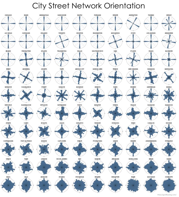
    Continuing his analysis of street grid-iness in cities around the world, Geoff Boeing sorted cities by the amount of order in their street networks:

    Across these study sites, US/Canadian cities have an average orientation-order nearly thirteen-times greater than that of European cities, alongside nearly double the average proportion of four-way intersections. Meanwhile, these European cities’ streets on average are 42% more circuitous than those of the US/Canadian cities. North American cities are far more grid-like than cities in the rest of the world and exhibit far less orientation entropy and street circuity.

    Chicago is all grid. Charlotte not so much.

    See the detailed study that Boeing published in Applied Network Science.

  • Statistical fallacies in the news

    September 25, 2019

    Topic

    Statistics  /  fallacies, news, trust

    For UnHerd, Tom Chivers, talks about David Spiegelhalter’s new book and why every statistical headline deserves a grain of salt. One way to make sure things check out:

    As a non-mathematician, I have a few shortcuts for working out whether a statistic is worth believing, which seem to have done all right for me so far. One, which Spiegelhalter stresses, is that often the best statistical analysis you can do is simply visualising the data. There was a bit of a recent kerfuffle about suicides among girls and young women going up 83% since 2012; but simply looking at the ONS chart showed that the numbers were small, the data was noisy, and the only way you got the 83% figure was by choosing the lowest year on record. (It’s an old trick.)

    See also: common statistical fallacies.

  • Jewelry based on your GPS traces

    September 24, 2019

    Topic

    Data Art  /  GPS, jewelry, Rachel Binx

    GPX Jewelry by Rachel Binx lets you turn your GPS traces into jewelry. Just upload a GPX file from, say, your fitness app or Apple Watch, choose your finish, and you’ve got yourself a personalized pendant. Nice.

  • AI-generated faces as stock photos

    September 23, 2019

    Topic

    Statistics  /  AI, faces, photos

    The Generated Photos project is a work in progress to provide realistic AI-generated faces for use in things like presentations or user interface design. “Copyrights, distribution rights, and infringement claims will soon be things of the past.”

    An API is in the works so that you can generate the kind of faces that you want, but for now, a set of 100k images are available.

    Cool? Slightly creepy?

  • History of Tetris randomizers

    September 23, 2019

    Topic

    Statistics  /  randomness, Tetris

    Tetris is a game with foundations in randomness. Pieces are distributed randomly to players and they have to figure out the best spot for each piece. That randomness though has changed over the years as different versions of the game came out. Simon Laroche catalogued the significant changes to the Tetris randomizer.

    On the very first Tetris game:

    The first and original version of Tetris released had an unbiased randomizer. No opinion to which piece should come next, just pick one and give it to the player.

    With an unbiased randomizer, there are situations where the player receives a sequence of the same piece (called floods) or a sequence omitting a certain piece (called a drought). We’ll see how the designers of Tetris games tried to solve these problems in a little bit.

    While an unbiased randomizer offers the greatest pure puzzle challenge to players, it is unstable, and can actually result in an unbeatable sequence (PDF). This however can not happen in a real game, as computers don’t use true random number generators. Pseudo random number generators try to mimic real randomness, but don’t have the properties required to deal out 70,000 Z-pieces in a row.

  • AI-generated voice used to fake phone call and steal money

    September 20, 2019

    Topic

    Statistics  /  artificial intelligence, crime, ethics, fake, Washington Post

    Reporting for The Washington Post, Drew Harwell describes the case of the fake voice used for bad things:

    Thieves used voice-mimicking software to imitate a company executive’s speech and dupe his subordinate into sending hundreds of thousands of dollars to a secret account, the company’s insurer said, in a remarkable case that some researchers are calling one of the world’s first publicly reported artificial-intelligence heists.

    The managing director of a British energy company, believing his boss was on the phone, followed orders one Friday afternoon in March to wire more than $240,000 to an account in Hungary, said representatives from the French insurance giant Euler Hermes, which declined to name the company.

    Publicly available software that makes it straightforward to impersonate others digitally: what could go wrong?

  • Members Only

    Reddit Follow-up; Chart Like Nobody’s Looking (The Process #57)

    September 19, 2019

    Topic

    The Process  /  attention, audience, Reddit

    Consider your audience. Yes. But at some point in the visualization creation process, you have to disregard all of the feature requests and design suggestions.

  • How well players drafted in fantasy football

    September 19, 2019

    Topic

    Statistical Visualization  /  fantasy, football, Kevin Quealy, Upshot

    For The Upshot, Kevin Quealy used a heatmap to visualize fantasy football draft picks:

    This variance is widest for quarterbacks, whose pick patterns are so distinct you don’t even need to read their names to know they’re a quarterback. Chiefs quarterback Patrick Mahomes, named the N.F.L.’s most valuable player last season, represents the most obvious example of this pattern, with a roughly equal likelihood of being drafted in any of the first 40 picks in the draft, including No. 1 over all.

  • Who owns the most land in the U.S.

    September 18, 2019

    Topic

    Maps  /  Bloomberg, land

    Bloomberg News mapped the land owned by the largest owners:

    The 100 largest owners of private property in the U.S., newcomers and old-timers together, have 40 million acres, or approximately 2% of the country’s land mass, according to data from the Land Report and reporting by Bloomberg News. Ten years ago, the top 100 had fewer than 30 million acres.

    It may not seem like much—all told, just about the size of Florida. But land is an often-overlooked repository of wealth, one of those quiet assets, such as artworks or trusts, that make up so much of the country’s unexamined riches as inequality widens.

    Just one state’s worth of land? I mean, I guess that’s a lot.

  • Sprawling flood waters across the Midwest and South

    September 17, 2019

    Topic

    Maps  /  climate change, flood, New York Times

    The New York Times mapped the slow, wide-reaching flood waters this year so far:

    To measure the scope of the spring floods, The New York Times analyzed satellite data from the Joint Polar Satellite System using software, developed by government and academic researchers for flood detection, that is frequently used in disaster response.

    The data covers the period from Jan. 15 to June 30 and shows an interconnected catastrophe along the Missouri, Mississippi and Arkansas Rivers, a system that drains more than 40 percent of the landmass of the continental United States.

    Be sure to look at the piece on NYT. It tours you through the significant flooding areas as you scroll, which provides a step-by-step along with a sense of scale.

  • School diversity visualized with moving bubbles

    September 16, 2019

    Topic

    Infographics  /  diversity, school, Washington Post

    The Washington Post visualized 13,000 school districts to show the change in diversity between 1995 and 2017. Each bubble represents a district and the size represents number of students. The bubbles transition to diverse, undiverse, and extremely undiverse. It’s an important topic and worth the read.

    But right now, all I can think about is that I need to up my moving bubble game.

  • Data Underload  /  sleep, time use

    Sleep Schedule, From the Inconsistent Teenage Years to Retirement

    From the teenage years to college to adulthood through retirement, sleep is all over the place at first but then converges towards consistency.

    Read More
  • Members Only

    That Time My Chart Was on the Reddit Front Page and Everyone Hated It (The Process #56)

    September 12, 2019

    Topic

    The Process  /  criticism, Reddit

    Something I made was on the front page of Reddit. Cool. The problem: thousands of people downvoted it. Here’s what I learned.

  • Stacking Apple apps in the App Store

    September 12, 2019

    Topic

    Infographics  /  app store, Apple, iphone, New York Times

    For The New York Times, Jack Nicas and Keith Collins stack up app rankings in the App Store. Apple’s apps appear to find their way to the top of searches, perhaps more often than you might expect.

    I like how the graphics navigate through the stacked bars. It starts with a realistic view of scrolling through apps on an iPhone, and then zooms out on each section until you’re looking at the overall trends.

  • Statistical uncertainty as certainty

    September 11, 2019

    Topic

    Statistics  /  Mark Rober, uncertainty

    Mark Rober, who is having a good run of science and engineering videos on YouTube, posted a short note on how he embraces statistical uncertainty:

    As humans we are really good at using hindsight bias to convince ourselves we are more in control of things than we really are. For example, if you give 1024 people a coin and give them 10 tries to get as many tails as possible, it’s a statistical certainty that one of them will flip 10 tails in a row (and some unlucky chap will get 10 heads in a row). And yet at that point the media will swoop in and analyze his wrist motion and dissect his training regime and he’ll write books about his life story and how it all prepared him for that moment of greatness. Pretty much all situations in life are a roll of the dice. You can/should do as much as possible to weight the dice but there is always a dice roll.

    […]

    I always do everything I can to stack the dice in my favor but truly internalizing that some big part of what happens is out of my control gives me permission to just feel grateful for the experiences I’ve had and not beat myself up when things don’t go as I hoped. I can still feel happy about life even if the views aren’t what they used to be and at the same time I get to feel stoked for the person that will inevitably take my place… just hopefully later than sooner ;)

  • NOAA chief scientist highlights the forecast contradiction

    September 10, 2019

    Topic

    Mistaken Data  /  accuracy, NOAA, NWS

    In regards to the press release that seemed to contradict the National Weather Service forecast, Craig N. McLean, chief scientist of NOAA:

    During the course of the storm, as I am sure you are aware, there were routine and exceptional expert forecasts, the best possible, issued by the NWS Forecasters. These are remarkable colleagues of ours, who receive our products, use them well, and provide the benefit of their own experience in announcing accurate forecasts accompanied by the distinction of all credible scientists—they sign their work. As I’m sure you also know, there was a complex issue involving the President commenting on the path of the hurricane. The NWS Forecaster(s) corrected any public misunderstanding in an expert and timely way, as they should. There followed, last Friday, an unsigned press release from “NOAA” that inappropriately and incorrectly contradicted the NWS forecaster. My understanding is that this intervention to contradict the forecaster was not based on science but on external factors including reputation and appearance, or simply put, political.

    It’s gross that such a letter was even necessary, but I’m glad McLean published it.

  • A sim to show self-driving car challenges

    September 10, 2019

    Topic

    Infographics  /  game, self-driving, simulation, Washington Post

    On the surface, driving a car might seem fairly straightforward. Follow the rules of the road, don’t crash, and watch out for others. So why not just let a computer do all of the work? The Washington Post provides an interactive simulator to put you in the passenger seat and see for yourself.

  • All of the plastic bottles purchased in a day, Eiffel Tower for scale

    September 10, 2019

    Topic

    Infographics  /  plastic, Reuters, scale

    Millions of plastic bottles are purchased every day around the world. What does that look like? Simon Scarr and Marco Hernandez for Reuters virtually piled the estimated number of bottles purchased in an hour, day, month, and up to the past 10 years. They used the Eiffel Tower for scale. The above is just one day’s worth.

  • Looking at the Amazon fires wrong

    September 9, 2019

    Topic

    Maps  /  Amazon, fire, Washington Post

    For The Washington Post, Sergio Peçanha and Tim Wallace use maps to show why we need to adjust the common view of the Amazon up in flames. It’s about the fires on the fringes.

  • Quiet Observer

    September 6, 2019

    Topic

    Site News  /  eyeo, talk

    I’ve always been a quiet person who prefers to observe and slowly think things through. At Eyeo this year, I talked about how these tendencies led to FlowingData.

    [arve url=”https://vimeo.com/354276730″ /]

    Be sure to check out the other talks. There’s a lot of inspiration and information to absorb.

  • Page 118 of 392
  • <
  • 1
  • ...
  • 115
  • 116
  • 117
  • 118
  • 119
  • 120
  • ...
  • 392
  • >

Analyze, visualize, and communicate data usefully, beyond the defaults.

Become a member →

Recently for Members

May 8, 2025
When the data is not what it seems

May 1, 2025
Finding the Right Charts

April 24, 2025
Visualization Tools, Datasets, and Resources – April 2025 Roundup

April 17, 2025
Breaking Out of Chart Software Defaults

April 15, 2025
Line Chart with Decorative Neon Accents

Browse by Chart Type See All →

Step Chart Histogram Word Cloud Pie Chart Grid Map Packed Bubble Chart Moving Bubbles Scatter Plot Line Chart Spike Map

Browse By Topic

  • Visualization

    Seeing data

  • Maps

    Seeing geographic data

  • Infographics

    Explaining data

  • Networks

    Connecting data

  • Statistics

    Analyzing data

  • Software

    Working with data

  • Sources

    Getting data

  • Design

    Making data readable

Get the Book

Visualize This: The FlowingData Guide to Design, Visualization, and Statistics

Available now.

Order: Amazon / Bookshop

Made by FlowingData

  • The Process

  • Data Underload

  • Chart Everything

  • Guides

  • Books

  • Shop

  • About
  • Contact
  • Newsletter
  • LinkedIn
  • Instagram
  • Bluesky
  • RSS
Copyright © 2007-Present FlowingData. All rights reserved.