Sleep Schedule, From the Inconsistent Teenage Years to Retirement
I made a chart a while back that was mostly subjective, anecdotal, and not based on real data to show changing sleep patterns as we get older:
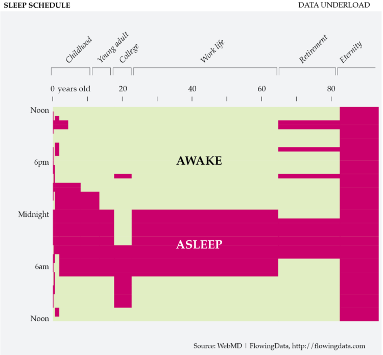
This chart is not based on real data.
There’s real data to analyze our changing sleep patterns though. After looking at sleeplessness, I came back to our old friend that is the American Time Use Survey. I grabbed data for the past five years and plotted the percentage of people who are asleep and awake, over age and time of day. An area is colored yellow if 50 percent or more people were awake. Otherwise, the area is magenta.
One caveat when comparing to the original mock chart: there is only data for those 15 and older. The chart below starts then.
When the Majority Sleeps, by Age
Sleep looks pretty consistent, once we age past the early years.
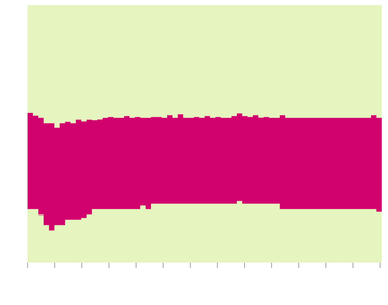
12p
MORE PEOPLE AWAKE
6p
Who needs to sleep early when you’re busy being young?
12a
MORE PEOPLE ASLEEP
6a
Welcome to adulthood.
Retirement. Sleep in. You earned it.
What’s sunrise?
12p
15
20
25
30
35
40
45
50
55
60
65
70
75
80+
YEARS OLD
SOURCE: AMERICAN TIME USE SURVEY
12p
MORE PEOPLE AWAKE
6p
Who needs to sleep early when you’re busy being young?
12a
MORE PEOPLE ASLEEP
6a
Adulthood…
Retirement. Sleep in. You earned it.
What’s sunrise?
12p
15
25
35
45
55
65
80+
YEARS OLD
SOURCE: AMERICAN TIME USE SURVEY
It’s not as dramatic as the mock chart, but you can see subtle dips and rises with, especially around college age and post-retirement.
However, the binary color scheme limits the detail, and there’s of course a good amount of variation in how people sleep. So here’s a wider color scale:
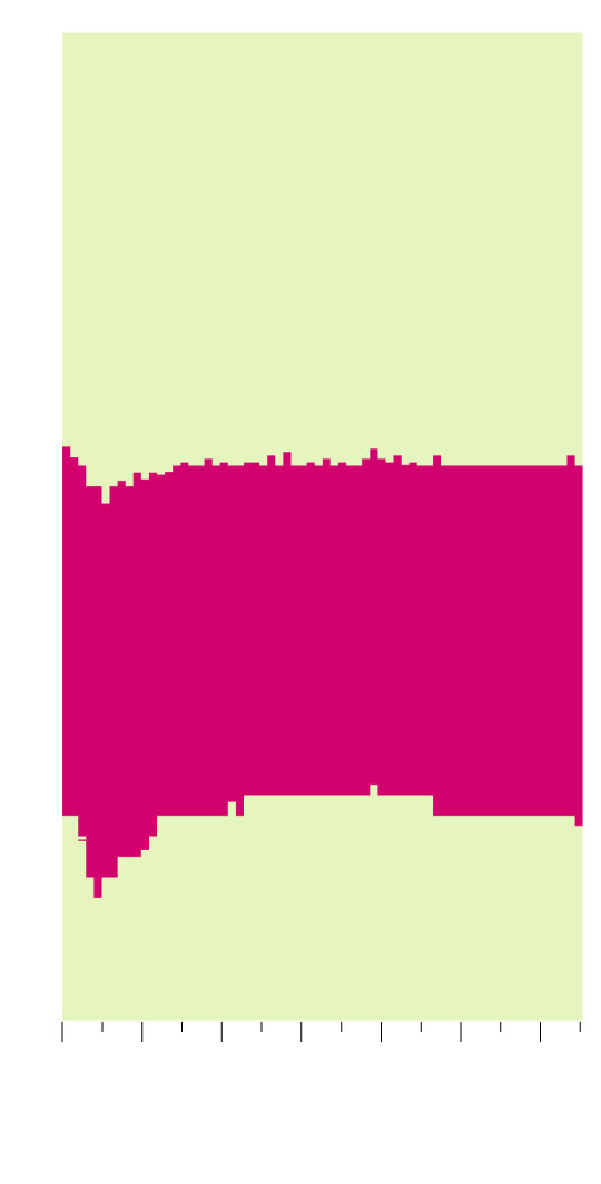
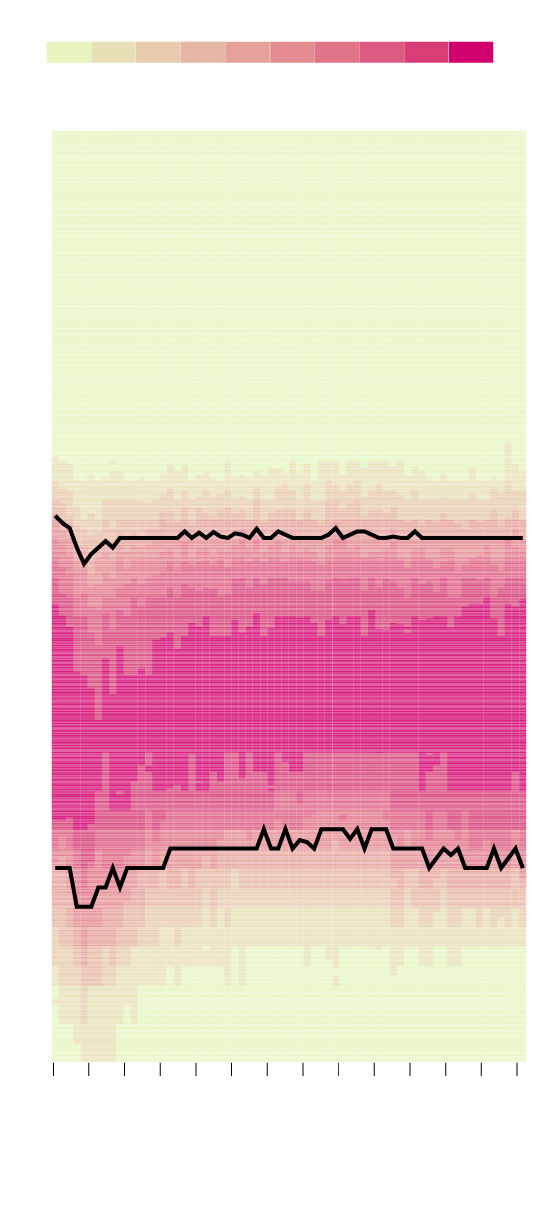
When People Sleep, by Age
Looking at a gradient, we see a more detailed picture of sleep schedules. Although it’s still not as dramatic as my mock chart.
PERCENTAGE OF PEOPLE ASLEEP
0%
20%
40%
60%
80%
100%
Noon
6p
MEDIAN SLEEP TIME
Midnight
Less consistent sleep schedule during the earlier years.
Sleep is more consistent among older people.
6a
MEDIAN WAKEUP TIME
Appreciating the luxury of sleeping in.
Noon
15
20
25
30
35
40
45
50
55
60
65
70
75
80+
YEARS OLD
SOURCE: AMERICAN TIME USE SURVEY
PERCENTAGE OF PEOPLE ASLEEP
0%
20%
40%
60%
80%
100%
12p
6p
MEDIAN SLEEP TIME
Less consistent sleep schedule during the early years.
12a
Sleep is more consistent among older people.
6a
MEDIAN WAKEUP TIME
Appreciating the luxury of sleeping in.
12p
15
25
35
45
55
65
80+
YEARS OLD
SOURCE: AMERICAN TIME USE SURVEY
I was surprised to see the wider bands in the later years, which seem to suggest a more consistent sleeping schedule and later wakeup times. Although I’m not totally convinced yet. Maybe I need to look at napping during the day.
Notes
The data comes from the American Time Use Survey, 2014-2018. I downloaded the data via IPUMS.
Activity data with ATUS is hierarchical. There’s a main category for sleeping, but it can be further classified as sleeping, sleeplessness, and sleeping not elsewhere classified. The calculations above only use the sleeping subcategory i.e does not include sleeplessness or sleeping n.e.c.
I made the charts in R.
Become a member. Support an independent site. Make great charts.
See What You GetFlowingData is made possible by supporting members. Since 2007, I, Nathan Yau, a real person, have been analyzing and visualizing data to help more people understand and appreciate it in their everyday lives.
If you liked this or want to make similar data things, please consider supporting this small corner of the internet. You get unlimited access to visualization courses, tutorials, and extra resources. Thanks. — Nathan
Chart Type Used
