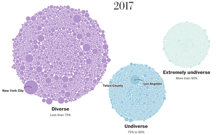
The Washington Post visualized 13,000 school districts to show the change in diversity between 1995 and 2017. Each bubble represents a district and the size represents number of students. The bubbles transition to diverse, undiverse, and extremely undiverse. It’s an important topic and worth the read.
But right now, all I can think about is that I need to up my moving bubble game.


 Visualize This: The FlowingData Guide to Design, Visualization, and Statistics (2nd Edition)