For NYT Opinion, Aaron E. Carroll on doing small things that sum to something bigger:
Too many view protective measures as all or nothing: Either we do everything, or we might as well do none. That’s wrong. Instead, we need to see that all our behavior adds up.
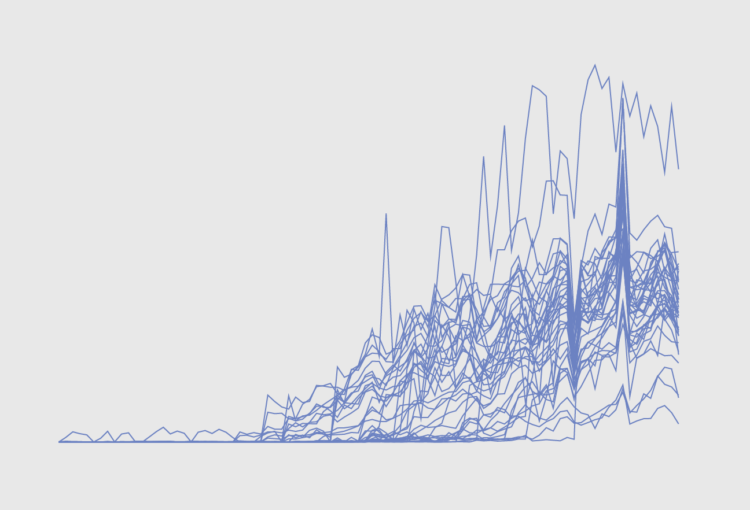
Each decision we make to reduce risk helps. Each time we wear a mask, we’re throwing some safety on the pile. Each time we socialize outside instead of inside, we’re throwing some safety on the pile. Each time we stay six feet away instead of sitting closer together, we’re throwing some safety on the pile. Each time we wash our hands, eat apart and don’t spend time in large gatherings of people, we’re adding to the pile.
A lot of what we do and the choices we make are based on past personal experience. It’s a challenge to look at a dataset that seems beyond us as an individual. So if you’re trying to galvanize a population with numbers, look for all of the ways you could help the individual relate.


 Visualize This: The FlowingData Guide to Design, Visualization, and Statistics (2nd Edition)


