With mail-in ballots looking to be more common than ever this year, NYT’s The Upshot is tracking the mail:
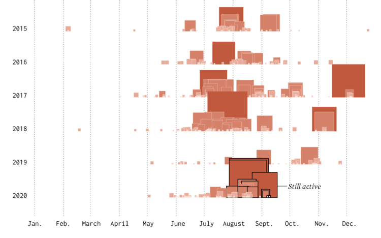
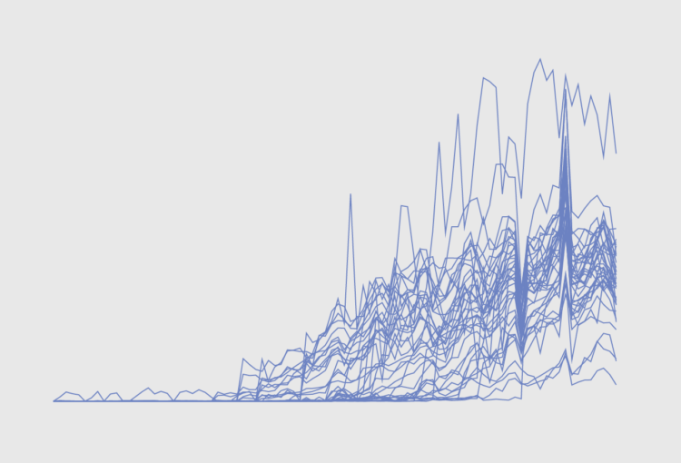
The data here, covering more than 28 million pieces of first-class letters tracked by SnailWorks, shows how on-time delivery declined noticeably in July after the arrival of Louis DeJoy, the Trump-aligned postmaster general, and the start of policies to trim transportation costs. That drop in national performance was more abrupt than during the chaotic period when the coronavirus pandemic began spreading across the country.
“We had a wave of our members, hundreds and hundreds of locals, telling us there were service problems a month ago,” said Jim Sauber, the chief of staff for the National Association for Letter Carriers.
Hm.
I wonder what the distributions for each time frame looks like. Even during non-pandemic times, it looks like a quarter of the mail is counted as late. And it’s at least a little bit comforting that we’re talking in units of days late rather than weeks or months.


 Visualize This: The FlowingData Guide to Design, Visualization, and Statistics (2nd Edition)


