There is no more reason to expect one graph to “tell all” than…
Statistical Visualization
Finding patterns, distributions, and anomalies.
-

Not just one chart
-
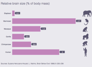
Human brain size compared to animals’
Mosaic provides a simple comparison of brain size in a handful of animals…
-
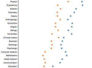
Professor ratings by gender and discipline
Based on about 14 million reviews on RateMyProfessor, this tool by Ben Schmidt…
-
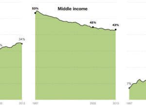
Shrinking middle class
The Upshot has a detailed, chart-filled summary of the shrinking middle class, categorized…
-
Where and why men outnumber women
There are an estimated 60 million more men than women on this planet,…
-
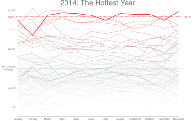
Feeling hot, hot, hot
When you look at overall global temperatures over time, you see a rising…
-
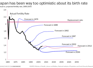
Japan fertility rate forecasts versus reality
It’s hard to predict the future, especially when humans are involved. Oftentimes, there…
-
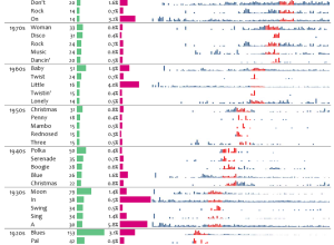
Most decade-specific words in Billboard song titles
David Taylor looked for words in Billboard song titles that appeared during a…
-
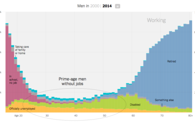
Increasing rates of men who don’t work
Recent data from the Census Bureau suggests the rate of non-working men has…
-
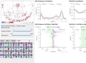
Detailed visualization of NBA shot selection
Sports loves conditional distributions. What does Joe Billy Bob typically do against such…
-
Serial views
Like many, I’ve been listening to Serial every week, but I always just…
-
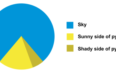
Pie chart pyramid
This pyramid pie chart just might take the pie chart humor crown from…
-
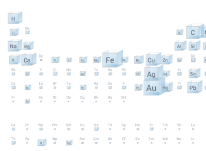
A scaled Periodic Table of Elements
Inspired by a diagram from 1976, the Big Picture group at Google Research…
-
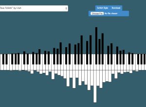
Pianogram
This is what you get when you cross a histogram and piano keys…
-
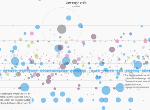
Earth-orbiting satellites, all of them
David Yanofsky and Tim Fernholz for Quartz visualized the satellites orbiting Earth. There’s…
-
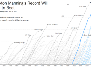
Touchdown passing record
Peyton Manning, quarterback for the Denver Broncos, passed up Brett Favre’s career record…
-
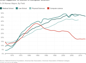
Decline of women in computer science
NPR spent some time on the subject of the decline of women in…
-
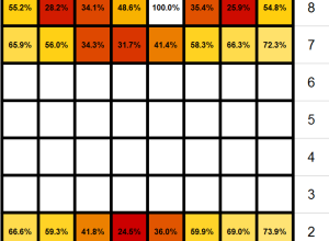
Chess piece survival rates
On Quora, someone asked, “What are the chances of survival of individual chess…
Recently for Members
Second Edition
 Visualize This: The FlowingData Guide to Design, Visualization, and Statistics (2nd Edition)
 Visualize This: The FlowingData Guide to Design, Visualization, and Statistics (2nd Edition)
New tools, refined process.
Browse by Chart Type See All →


