Daily life in cities tends to differ from daily life in small towns,…
Statistical Visualization
Finding patterns, distributions, and anomalies.
-
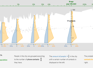
Finding small villages in big cities
-
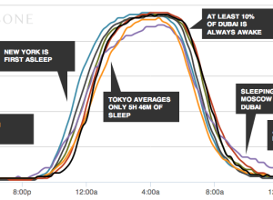
When the world sleeps
An additional hour of sleep can make a huge difference in how you…
-
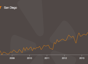
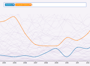
A decade of Yelp review trends →
Yelp released an amusing tool that lets you see how the use of…
-
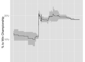
Spiky betting odds during LeBron James decision →
LeBron James decided to head back to Cleveland, so naturally the odds that…
-
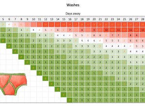
How much underwear to bring on a trip →
Packing underwear for a short trip is easy. You just pack a pair…
-
FoamTree: Visualize hierarchical data with a lot of groups
For small-ish amounts of hierarchical data, most JavaScript libraries can handle the load.…
-
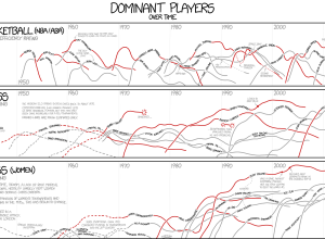
xkcd: Dominant players in chess and basketball →
I’m pretty sure xkcd is the only one who gets away with showing…
-
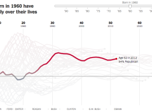
Birth year and political leanings →
A statistical model, from Yair Ghitza of Catalist and Andrew Gelman of Columbia…
-
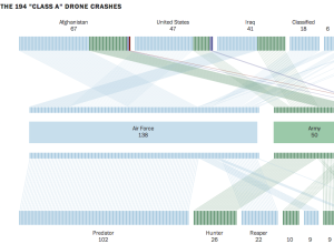
Drone crash database →
Based on data compiled from a combination of military records, Defense Department records,…
-
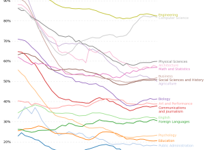
Percentage of degrees conferred to men, by major
Based on estimates from the National Center for Education Statistics, Randy Olson plotted…
-
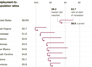
Employment-to-population ratios →
The Upshot posted an interesting chart that shows changing employment rate by state.…
-
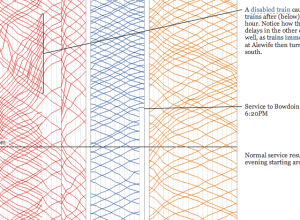
A visual analysis of the Boston subway system
For a graduate project, Michael Barry and Brian Card explored the Boston subway…
-
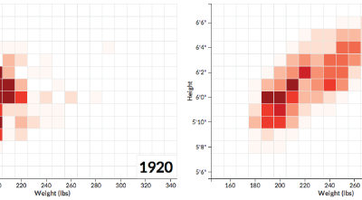
NFL players getting bigger
Football players are getting bigger. Noah Veltman, a developer for the WNYC Data…
-
A decade of college degrees
North by Northwestern looked closer at degrees awarded by their university over the…
-
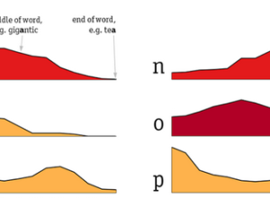
Distribution of letters in the English language
Some letters in the English language appear more often in the beginning of…
-
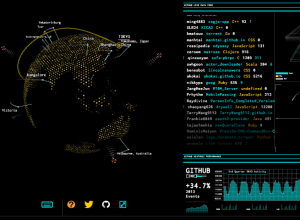
Tron-style dashboard shows Wikipedia and GitHub streams
As a fun learning exercise, Rob Scanlon made a dashboard that shows GitHub…
-
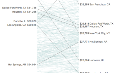
Your income versus what it feels like →
Incomes and the cost of living vary across the country. Some areas might…
-
Alcohol consumption per drinker
We’ve seen rankings for alcohol consumption per capita around the world. These tend…
Recently for Members
Second Edition
 Visualize This: The FlowingData Guide to Design, Visualization, and Statistics (2nd Edition)
 Visualize This: The FlowingData Guide to Design, Visualization, and Statistics (2nd Edition)
New tools, refined process.
Browse by Chart Type See All →


