Willard Cope Brinton is credited as one of the pioneers of information visualization,…
Statistical Visualization
Finding patterns, distributions, and anomalies.
-
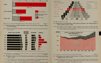
Classic 1939 book on graphs in its entirety
-
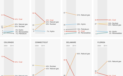
Power sources in each state
A clean and simple set of slope charts to show the change between 2000 and 2014.
-
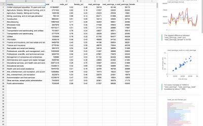
Automatic charts and insights in Google Sheets
So you have your data neat and tidy in a single spreadsheet, and…
-
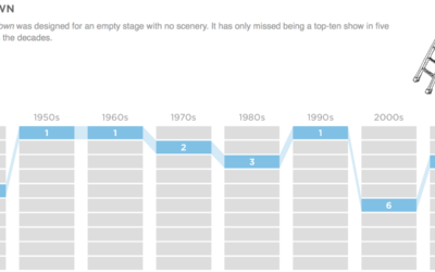
Top high school plays and musicals, by decade
Based on annual high school play and musical rankings from the magazine Dramatics,…
-
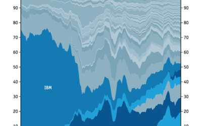
Technology sector, share of market over time
Here’s a straightforward stacked area chart from the Economist that shows shifting market…
-
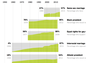
Comparison of shifted public opinion
David Leonhardt and Alicia Parlapiano compared public opinion over time for various social…
-
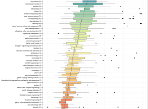
Length of the average master’s thesis
A while back beckmw found the average length of a dissertation for various…
-
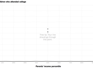
Compare your curve to reality for income versus college attendance
Those who grow up in poorer families are less likely to go to…
-
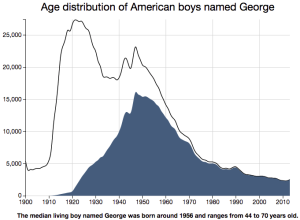
Estimated age based on your name
A while back, Nate Silver and Allison McCann for FiveThirtyEight estimated age based…
-
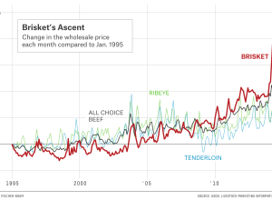
Rising beef prices and cattle theft
Eric Benson for FiveThirtyEight delves into cattle theft, which can cost an owner…
-
Black and White America compared as if they were countries
The Economist made a simple yet effective comparison of Black America and White…
-
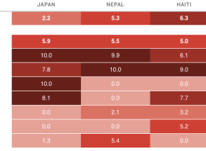
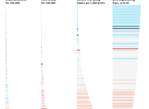
Disaster risk indices estimate impact on people
An earthquake with a magnitude of 7.8 can affect countries differently, depending on…
-
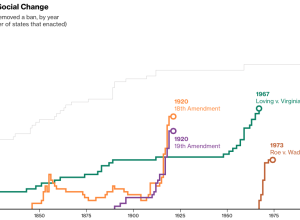
Quick change of mind on social issues
As Supreme Court hearings for same-sex marriage start today, Alex Tribou and Keith…
-

Why exploring big data is hard
The talks from OpenVisConf 2015 went up, so I’m slowly making my way…
-
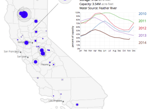
Emptied reservoirs in California
Winter is over and it’s shorts weather these days in California. This is…
-
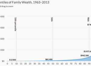
Wealth inequality explained in charts
Wealth inequality is a real thing that is complex and a result of…
-
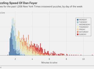
Speedy crossword solvers
Oliver Roeder for FiveThirtyEight covered this year’s American Crossword Puzzle Tournament and the…
-
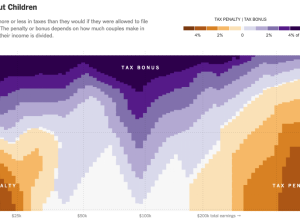
Married couple tax bonuses and penalties
Using calculations by Nick Kasprak from the Center on Budget and Policy Priorities…
Recently for Members
Second Edition
 Visualize This: The FlowingData Guide to Design, Visualization, and Statistics (2nd Edition)
 Visualize This: The FlowingData Guide to Design, Visualization, and Statistics (2nd Edition)
New tools, refined process.
Browse by Chart Type See All →


