There are an estimated 60 million more men than women on this planet, based on data from World Bank. David Bauer takes a look at the places where the male majority is largest.
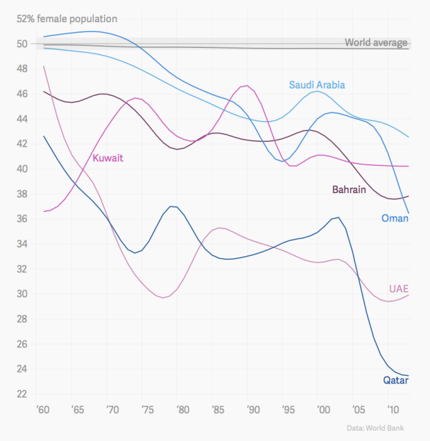
Although China and India are responsible for a significant portion of the disparity, there are several other countries of interest. The time series above shows the effect of migrant workers on the Arabian Peninsula.
The most gender imbalanced states in 2013 were all found on the Arabian Peninsula, Qatar being the most extreme. Less than one quarter of all people who lived in Qatar in 2013 were women. Those countries have attracted a lot of migrant workers for male-dominated industries, especially after oil prices started rising in the 1970s and the industry grew. Millions of men, mostly from South Asia, came to work on the Arabian Peninsula, but weren’t allowed to bring their spouses and children with them, thus throwing gender ratios off balance.
Find out about other areas or compare countries yourself with the chart at the end of the article.
Sidenote: I’ve used World Bank data before, but it just occurred to me that they don’t provide any values for margin of error on the site or in the downloads. Seems especially important in this case, when looking at such small percentage differences that account for millions of people.
 Visualize This: The FlowingData Guide to Design, Visualization, and Statistics (2nd Edition)