An earthquake with a magnitude of 7.8 can affect countries differently, depending on…
Statistical Visualization
Finding patterns, distributions, and anomalies.
-
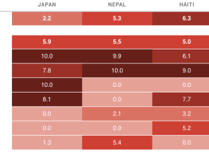
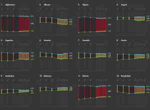
Disaster risk indices estimate impact on people
-
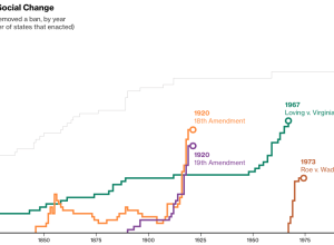
Quick change of mind on social issues
As Supreme Court hearings for same-sex marriage start today, Alex Tribou and Keith…
-

Why exploring big data is hard
The talks from OpenVisConf 2015 went up, so I’m slowly making my way…
-
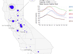
Emptied reservoirs in California
Winter is over and it’s shorts weather these days in California. This is…
-
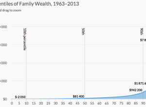
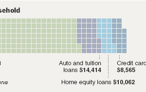
Wealth inequality explained in charts
Wealth inequality is a real thing that is complex and a result of…
-
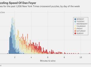
Speedy crossword solvers
Oliver Roeder for FiveThirtyEight covered this year’s American Crossword Puzzle Tournament and the…
-
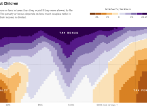
Married couple tax bonuses and penalties
Using calculations by Nick Kasprak from the Center on Budget and Policy Priorities…
-
Color use in paintings, by year
Martin Bellander saw some projects that extracted color from movie posters and trailers,…
-
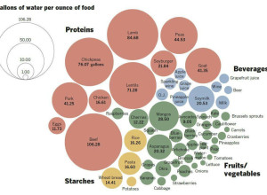
Gallons of water to produce foods
With all the talk recently about how much water it takes to grow…
-
Gender gaps around the world
Ri Liu provides an exploratory view of gender gaps around the world through…
-
Link
Making waffle charts in R →
An alternative to the pie chart to show proportions.
-
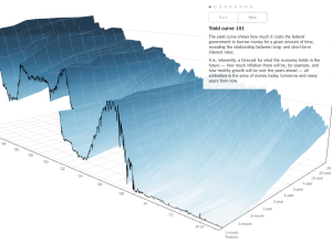
3-D chart for economy’s future
People like to poke fun at 3-D charts, mostly because they don’t work…
-
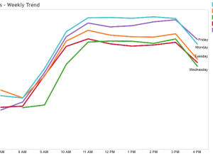
Best time to visit DMV
I think there are people who still go to the Department of Motor…
-
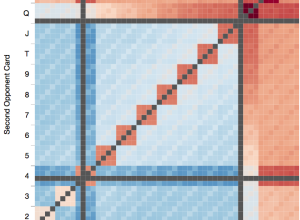
Texas hold ’em win probabilities
Software engineer Chris Beaumont visualized the strength of opponent hands in Texas hold…
-
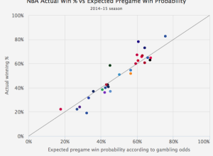
Gambler’s perspective on sports team win probabilities
Michael Beuoy’s win probability model plotted on FiveThirtyEight starts all NBA teams at…
-
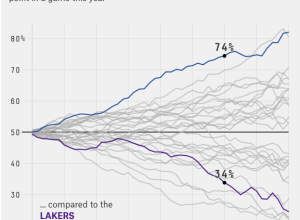
Every NBA team’s chances of winning, by game minute
Michael Beuoy made a win probability model for NBA teams and games, based…
-
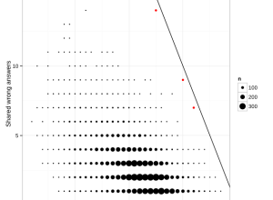
Identifying cheaters in test results, a simple method
Jonathan Dushoff had issues with students in his population biology class cheating on…
-
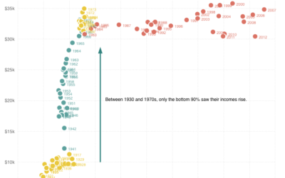
Top 1% earners versus bottom 90%
Quoctrung Bui for Planet Money plotted average income for the top one percent…
Recently for Members
Second Edition
 Visualize This: The FlowingData Guide to Design, Visualization, and Statistics (2nd Edition)
 Visualize This: The FlowingData Guide to Design, Visualization, and Statistics (2nd Edition)
New tools, refined process.
Browse by Chart Type See All →


