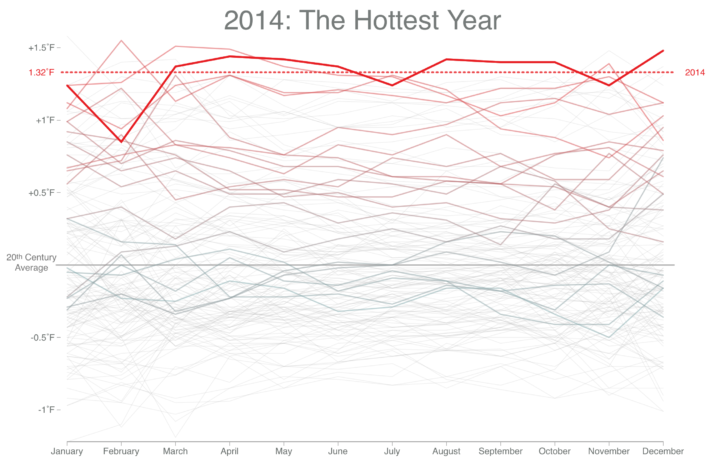
When you look at overall global temperatures over time, you see a rising line and new heat records set. Instead of just one line though, Tom Randall and Blacki Migliozzi for Bloomberg split up the time series by year and animated it.
Each year is overlaid on top of the other with a new time series in each frame. The dotted line rises too as new records are set, and as time passes, the older time series lines fade to the background.
You still get the rising effect as you would with a single time series over the past 135 years, but this view provides more focus to the increase, closer to present time.


 Visualize This: The FlowingData Guide to Design, Visualization, and Statistics (2nd Edition)
