This pyramid pie chart just might take the pie chart humor crown from the amount-of-pie-eaten pie chart. (Who made this?)
Pie chart pyramid
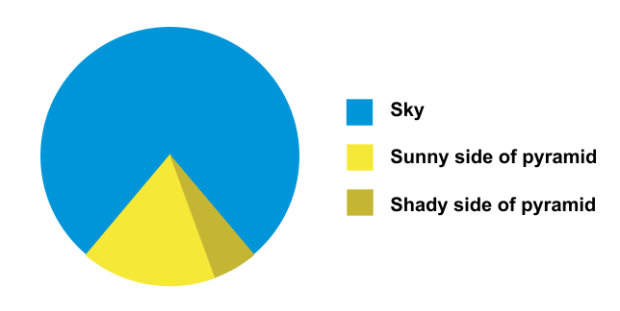
Chart Type Used

Second Edition
 Visualize This: The FlowingData Guide to Design, Visualization, and Statistics (2nd Edition)
 Visualize This: The FlowingData Guide to Design, Visualization, and Statistics (2nd Edition)
New tools, refined process.