Many hate pie charts. Others love them. I think they’re useful but have…
Statistical Visualization
Finding patterns, distributions, and anomalies.
-
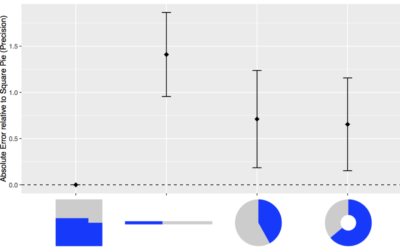
Square pie chart beats out the rest in perception study
-
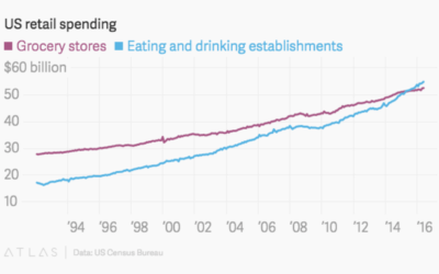
We spend more at restaurants than at grocery stores
For decades, Americans spent more money at the grocery store than at eating…
-
U.S. gun deaths rate is an outlier
If you look at gun death rates for other western countries and adjust…
-
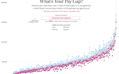
Gender pay gaps for major U.S. occupations
As we all know these days, there exists a gender pay gap across…
-
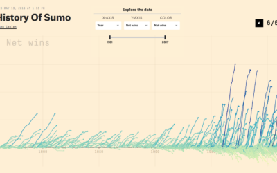
History of Sumo charted
Sumo has a long history that goes back centuries. Unlike most things that…
-
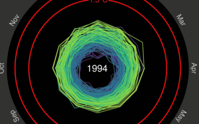
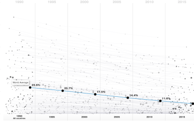
Spiraling global temperature chart
Global temperature is on the rise, as most of us know. Ed Hawkins…
-
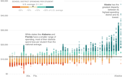
School district spending, against national average
Wrapping up their week-long School Money project, NPR asks: Is there a better…
-
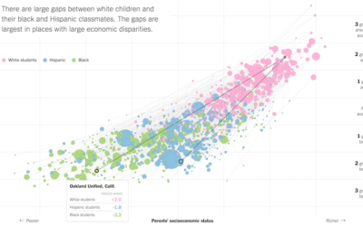
Lower socioeconomic status linked to lower education attainment
The Upshot highlights research from the Stanford Center for Education Policy Analysis that…
-
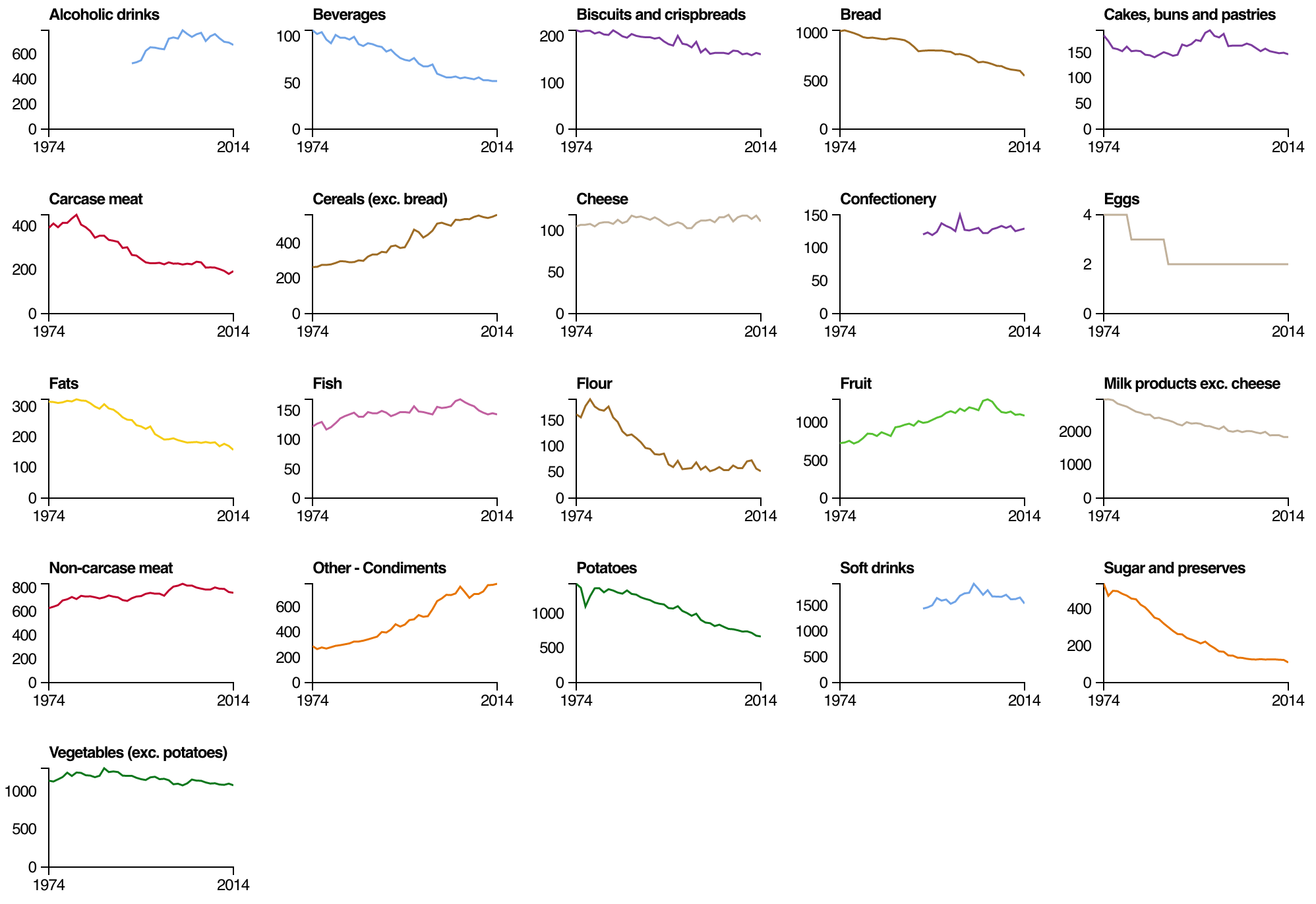
Change in the British diet, since 1974
From the Open Data Institute, an interactive looking at diet data made available…
-
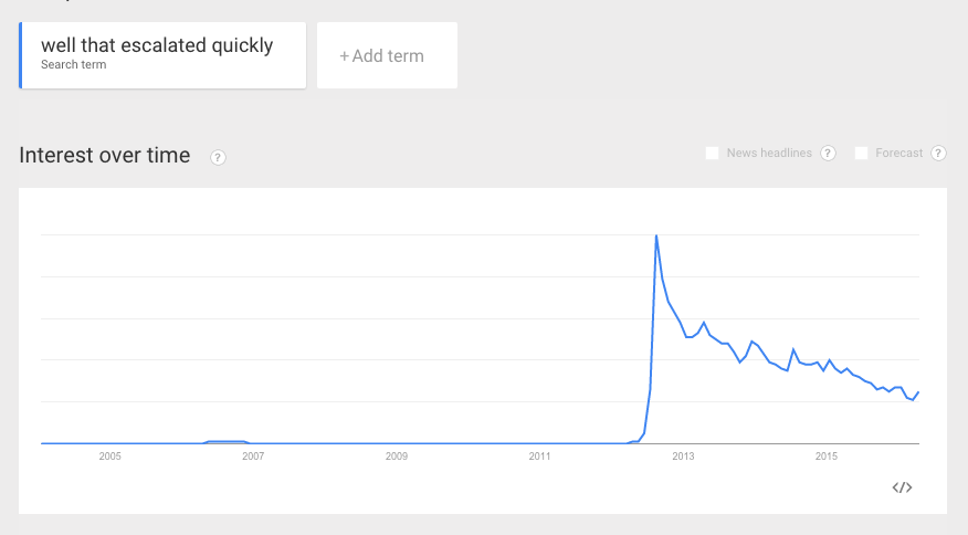
“Well that escalated quickly.”
This is the trend line from Google Trends for “Well that escalated quickly.”…
-
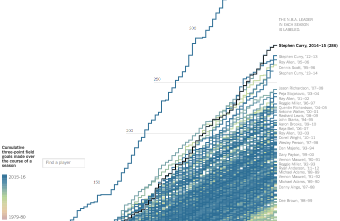
Stephen Curry 3-point record ridiculousness
Stephen Curry made 402 three-pointers this regular season, which is ridiculous. Gregor Aisch…
-
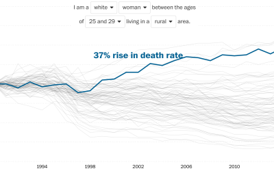
Rising death rates for white women
Overall life expectancy continues to increase, but looking at it from the other…
-
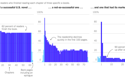
How people read books
Jellybooks is an analytics company that evaluates how people read book, in a…
-
Greater access to clean water
National Geographic, in collaboration with Bestiario, looks at the improving accessibility to clean…
-
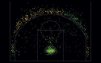
Basketball shot charts, make your own
Based on data from the NBA stats API and using the visual layout…
-
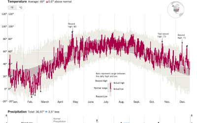
How much warmer your city was in 2015
It was hotter in 2015 than any other year ever. K. K. Rebecca…
-
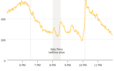
Taxi ride volume during Super Bowl key moments
A high percentage of Americans are glued to the television or party sample…
-
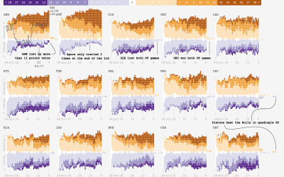
Small multiples for NBA game differentials
Adam Pearce charted minute-by-minute point differentials for NBA games during the 2014-15 season.…
Recently for Members
Second Edition
 Visualize This: The FlowingData Guide to Design, Visualization, and Statistics (2nd Edition)
 Visualize This: The FlowingData Guide to Design, Visualization, and Statistics (2nd Edition)
New tools, refined process.
Browse by Chart Type See All →


