Anna Vital, in collaboration with the Google News Lab, shows the search popularity…
Statistical Visualization
Finding patterns, distributions, and anomalies.
-
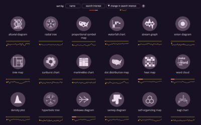
Chart search popularity
-
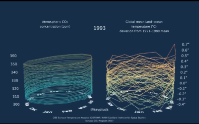
3-D tube chart of global CO2 concentration and temperature
Because you can never have enough time series charts that show increases of…
-
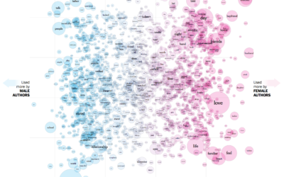
The words used by men and women to write about love
Josh Katz, Claire Cain Miller, and Kathleen A. Flynn for The Upshot plotted…
-
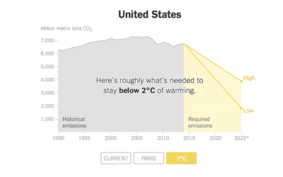
Carbon emissions goals vs. current paths
Brad Plumer and Nadja Popovich reporting for The New York Times:
Under the… -
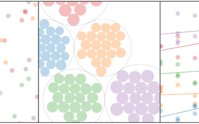
Visual explainer for hierarchical modeling
Hierarchical models, or multilevel models, are used to represent data that might vary…
-
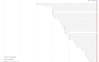
Charts show time between assaults and public allegations
As the list of sexual assault allegations grows for Harvey Weinstein (and many…
-

Sorting algorithms visualized with animated color palette
I bet you woke up this morning thinking, “I haven’t seen a good…
-
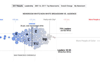
Statistical diversity in US newsrooms
If a news organization wants to talk about the world in a fair…
-
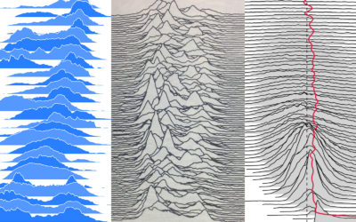
Frequency trails chart explainer
Frequency trails, or currently better known as joyplots, is a visualization method to…
-
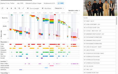
Visualizing nonlinear stories
Many stories don’t follow a linear format. There are flashbacks, or multiple timelines…
-

Triangulate a picture
Triangulate, a fun tool made by Michael Freeman, lets you upload a picture…
-
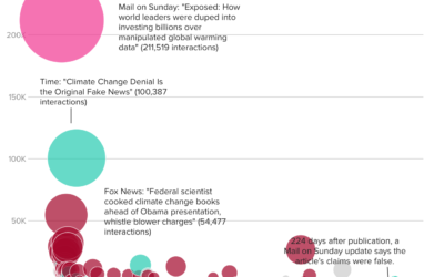
How fake data goes viral
BuzzFeed describes how an article on Daily Mail — that falsely reported claims…
-

Nine rounds a second sonified
The New York Times used sonification along with a dot plot to demonstrate…
-
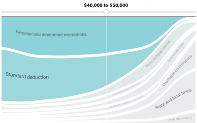
Given your income, most beneficial tax breaks
With the release of the Republican proposed tax plan, Reuben Fischer-Baum and Kevin…
-
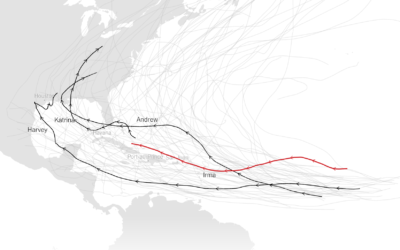
Comparing the strength of Hurricane Irma against previous hurricanes
For perspective, The New York Times compares the strength of Hurricane Irma to…
-
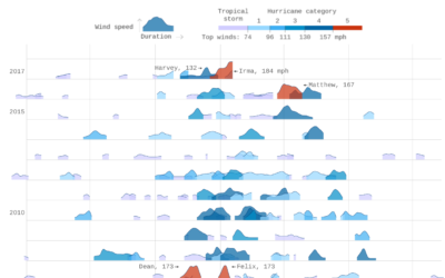
Thirty years of hurricanes
After their graphic for thirty years of floods, Axios follows up with thirty…
-
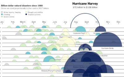
Cost of Hurricane Harvey
Kevin Quealy for The Upshot charted the estimated cost of Hurricane Harvey, along…
-

Using an audience’s own data to highlight both play and security
This is great. Daniel Goddemeyer and Dominikus Baur made Data Futures, which collects…
Recently for Members
Second Edition
 Visualize This: The FlowingData Guide to Design, Visualization, and Statistics (2nd Edition)
 Visualize This: The FlowingData Guide to Design, Visualization, and Statistics (2nd Edition)
New tools, refined process.
Browse by Chart Type See All →


