In screenplays, there are directions that tell actors and actresses what to do…
Statistical Visualization
Finding patterns, distributions, and anomalies.
-
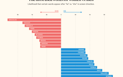
He vs. She in film screenplay direction
-
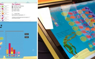
C’est la vis, teaching kids how to visualize data
By adulthood, it’s expected that we can read charts to some degree. You’re…
-
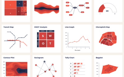
Catalog of visualization types to find the one that fits your dataset
There are a lot of visualization methods to choose from, and it can…
-
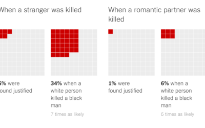
Killings of blacks by whites ruled “justified”
In a collaboration between The Marshall Project and The Upshot, Daniel Lathrop and…
-
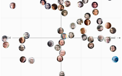
Game of Thrones character chart, you decide
I’ve never seen this Game of Thrones show, but I suspect this will…
-

Voronoi diagram of people in the park
From Rod Bogart, a Voronoi diagram of people sitting in Bryant Park. It’s…
-
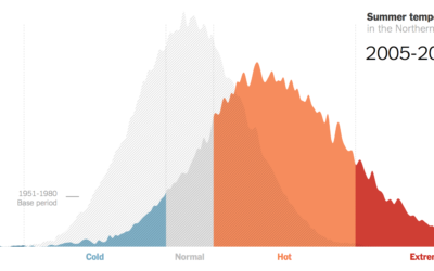
Hotter and hotter summers, extremely hot
Climate scientist James Hansen and team looked at summer temperatures over several decades.…
-
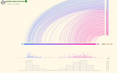
An interactive to explain histograms, for normal people
Histograms require some statistical knowledge to grasp, and without the tidbits, the distribution…
-
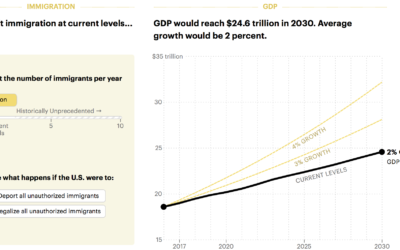
Boost economy with immigration
Want to increase the GDP? Easy. Let more immigrants in. Lena Groeger for…
-
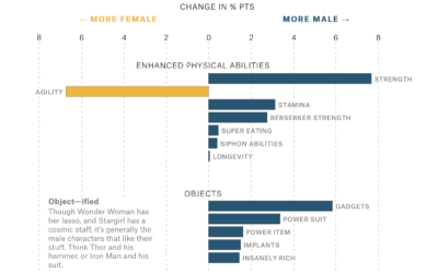
Gender representation in comic books
Amanda Shendruk for The Pudding analyzed how genders are represented differently in comic…
-
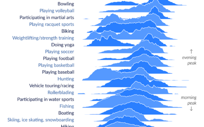
Peak times for leisure and sports
The American Time Use Survey asks people what they do during the day.…
-

Temperature simulation near the Earth’s core
Researchers are building models to simulate the Earth’s core. From CNRS News:
Take… -
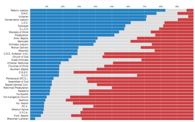
Politics of religious leaders
Kevin Quealy for The Upshot looks at political party registration of religious leaders,…
-
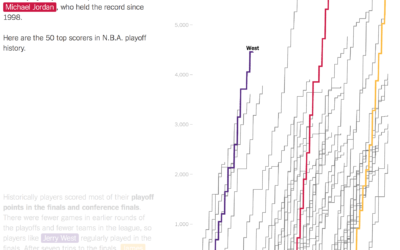
LeBron James passed Michael Jordan in playoff points
As a Golden State Warriors fan, I am obligated to dislike LeBron James,…
-
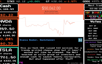
Multiplayer stock market game with real money
Twitch launched Stock Stream, which is a multiplayer stock market game that uses…
-
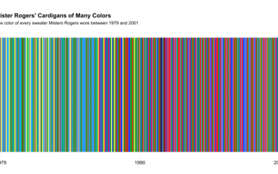
All of Mister Rogers’ cardigan colors
While watching a Mister Rogers’ Neighborhood marathon, Owen Phillips for The Awl wondered…
-

Most popular colors used by most popular sites
Paul Hebert was curious about the colors used on the web’s larger sites,…
-
YouTube plays for ‘It’s Gonna Be May’
It’s that time of year again. Turn up the volume and blast It’s…
Recently for Members
Second Edition
 Visualize This: The FlowingData Guide to Design, Visualization, and Statistics (2nd Edition)
 Visualize This: The FlowingData Guide to Design, Visualization, and Statistics (2nd Edition)
New tools, refined process.
Browse by Chart Type See All →


