Atomic Agents is a JavaScript library by Graham McNeill that can help simulate…
Nathan Yau
-
Agent-based modeling in JavaScript
-
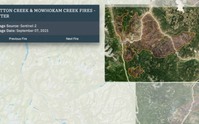
Wildfires and floods, a geographic before and after
In 2021, a large portion of North America was stuck in a heat…
-
Scraping public data ruled legal
For TechCrunch, Zack Whittaker reporting:
In its second ruling on Monday, the Ninth… -
Redrafting the NBA, based on past player performance
With the NBA playoffs underway, it can be fun to watch the best…
-
Tax services want your data
Taxes are due today in the U.S. (yay). Geoffrey A. Fowler for The…
-
Ross Ihaka, co-creator of R, reflects on the language
NZ Herald talked to Ross Ihaka, one of the creators of R:
Today,… -
Tonga shockwave around the world
Earlier this year, an underwater volcano erupted in the island nation of Tonga.…
-
Members Only
Manually
Manually editing charts is worthwhile, despite the possibility of manually making mistakes.
-
Comparing rich people incomes and the taxes they pay
Based on leaked IRS data for the 400 wealthiest Americans, ProPublica provides a…
-
Social Media Usage by Age
Here’s the breakdown by age for American adults in 2021, based on data from the Pew Research Center.
-
When people eat dinner in Europe
This map by @loverofgeography shows the usual dinner times for countries in Europe.…
-
Jeff Bezos wealth to scale
Jeff Bezos’ wealth is difficult to understand conceptually, because the scale is just…
-
More gender-neutral names
Georgios Karamanis plotted the ratio of girls-to-boys over time for all the names…
-
Members Only
Overlapping Lines
More lines can mean more patterns, more cycles, and more context.
-
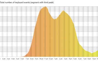
Working the triple peak
Microsoft researchers analyzed keystrokes by time of day, for a sample of Microsoft…
-
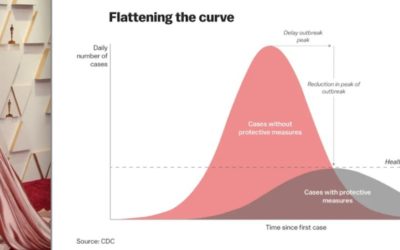
Oscar outfits as public health graphs
The 2022 Oscars came and went, and it was like all anyone could…
-
Lessons learned from making covid dashboards
For Nature, Lynne Peeples spoke to the people behind many of the popular…
-
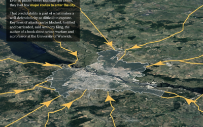
Ukraine’s defense in Kyiv
The New York Times shows how Russia has tried to take over and…
-
Literacy Scores by Country, in Reading, Math, and Science
See how your country compares.
-
1950 Census released by U.S. National Archives
For privacy reasons, there’s a 72-year restriction on individual Census records, which include…


 Visualize This: The FlowingData Guide to Design, Visualization, and Statistics (2nd Edition)


