In celebration of the most romantic day of the year that is sometimes…
Nathan Yau
-
Tour of romantic comedies through the decades
-
Growth of Target, an Animated Map
Watch the growth strategy behind Target stores, starting with the first location in 1962 in Minnesota.
-
Sources and attribution for AI-generated images
AI-based image generation take bits and pieces from existing people-made images and tries…
-
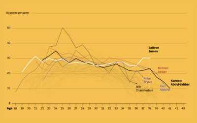
LeBron James’ longevity
Okay, one more LeBron James thing, mostly because I like seeing different looks…
-
Search and rescue after an earthquake, illustrated
After a big earthquake, such as the 7.8 that hit Turkey and Syria,…
-
Members Only
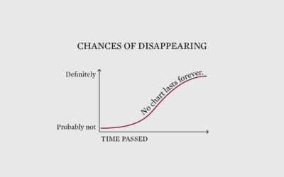
Preserving Visualization Work that Will Probably Break or Disappear
Not everything has to be permanent, but it would be nice if the best visualization projects were still available many years from now.
-
Inferring the scale of China’s Covid spike through obituaries
China reported 80,000 Covid deaths since lifting restrictions in early December 2022. But…
-
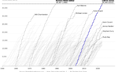
Cumulative points scored by LeBron James and other top scorers
Never fear, Sopan Deb, K.K. Rebecca Lai, and Eve Washington, for The New…
-
All of LeBron James’ career points, animated by season
All The King’s Buckets. pic.twitter.com/lzIultYSee
— Kirk Goldsberry (@kirkgoldsberry) February 8, 2023LeBron…
-
Pele greatness illustrated
For South China Morning Post, Victor Sanjinez and Dennis Wong used a visual…
-
Where Else You Can Work
If you’re searching for a new job, it’s worth looking in different industries instead of doing more of the same elsewhere.
-
Scale of the Chinese balloon
I wasn’t paying much attention to the Chinese balloon that the U.S. shot…
-
Objects in space headed towards Earth
NASA’s Center for Near Earth Object Studies tracks large objects, such as asteroids,…
-
Wonders of Google Street View
You know those funny or weird screenshots from Google Street View that enter…
-
Members Only
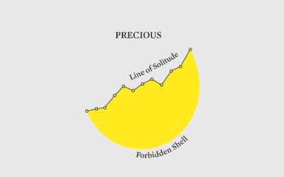
Eggtastic Graph
It is okay to fill the void with something fun.
-
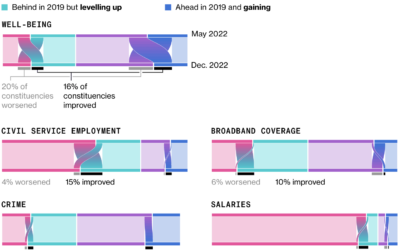
Sankey diagrams to show change in opinion
For Bloomberg, Joe Mayes, Andre Tartar, and Demetrios Pogkas show shifts in public…
-
Shifts in time on the Doomsday Clock
The Doomsday Clock is a metaphorical clock that symbolizes a catastrophic end to…
-
Evolution of George Santos’ biography
George Santos, currently a U.S. representative, seems to lie about his background and…
-
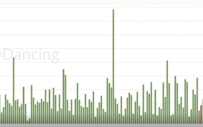
Stripper earnings tracked over four years
Reddit user nerdydancing tracked her earnings on each shift for four years. If…
-
Battling plant extinction
In a story about how scientists are using drones to fight plant extinction,…













 Visualize This: The FlowingData Guide to Design, Visualization, and Statistics (2nd Edition)


