In the Very Expensive Maps podcast, cartographer Evan Applegate interviews other cartographers about…
Nathan Yau
-
Very Expensive Maps
-
Tattoos and impulsiveness dataset
For their research on tattoos and choice, Bradley Ruffle and Anne Wilson provide…
-
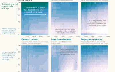
Shifting causes of death over the decades
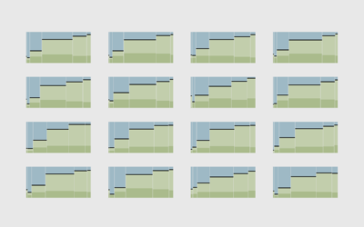
Saloni Dattani, for Our World in Data, used a set of heatmaps to…
-
Are we back yet?
In 2020, our everyday routines shifted dramatically, but over the past few years, it’s felt like things are getting back to where they were. How back are we?
-
Members Only
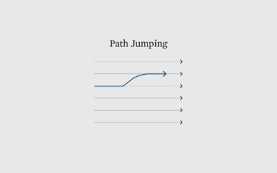
Chart Options for When the Scale is Squished by the Full Range of Data
Welcome to The Process, where we look closer at how the charts get…
-
Flawed Rotten Tomatoes ratings
Rotten Tomatoes aggregates movie reviews to spit out a freshness score for each…
-
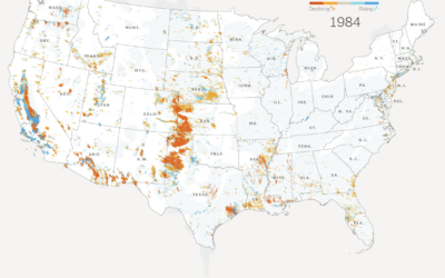
Declining groundwater
The New York Times analyzed water levels across the country since 1920. In…
-
Looking for the best pizza for different styles in different places
Locating the best pizza depends on where you are and what kind of…
-
Clock plays a song with the current time in its title
For The Pudding, Russell Samora pulled songs via the Spotify API and made…
-
Members Only
Visualization Tools and Learning Resources, August 2023 Roundup
Here’s the good stuff for August.
-
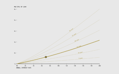
When the Cost of a Mortgage is a Multiple of the Original Loan
Use this chart to see how many times over you’ll pay over the original loan amount, given the annual rate and the number of years of paying.
-
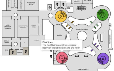
Turn a static SVG into an interactive one, with Flourish
It’s straightforward to share a static SVG online, but maybe you want tooltips…
-
Members Only
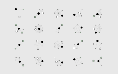
How I Made That: Network Diagrams of All the Household Types
Process the data into a usable format, which makes the visualization part more straightforward.
-
Apple’s global suppliers
Most of Apple’s suppliers and manufacturing happen outside the United States and in…
-
Infinity abstractions
Infinity is an abstraction of endlessness, which seems to suggest that it cannot…
-
Renting vs. Owning a Home, by State
Among households in the United States, 68% are owned and 32% are rented, based on estimates from the American Community Survey in 2021. That breakdown isn’t uniform across the country though.
-
Members Only
Visualization Integration
If you want to maximize fun, a mixed toolbox is still best.
-
Explorable explanation for matrix transformations
Instead of using a bunch of equations to memorize, Yi Zhe Ang visually…
-
Python is coming to Excel
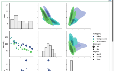
Excel is getting a bump in capabilities with Python integration. From Microsoft:
Excel… -
Using cold lake water to cool buildings
There are buildings in Toronto, Canada that make use of a deep lake…








 Visualize This: The FlowingData Guide to Design, Visualization, and Statistics (2nd Edition)


