How to Make Unit-Based, Variable Width Bar Charts
In a cross between unit charts and variable width bar charts, we can show total counts and relative proportions at the same time.
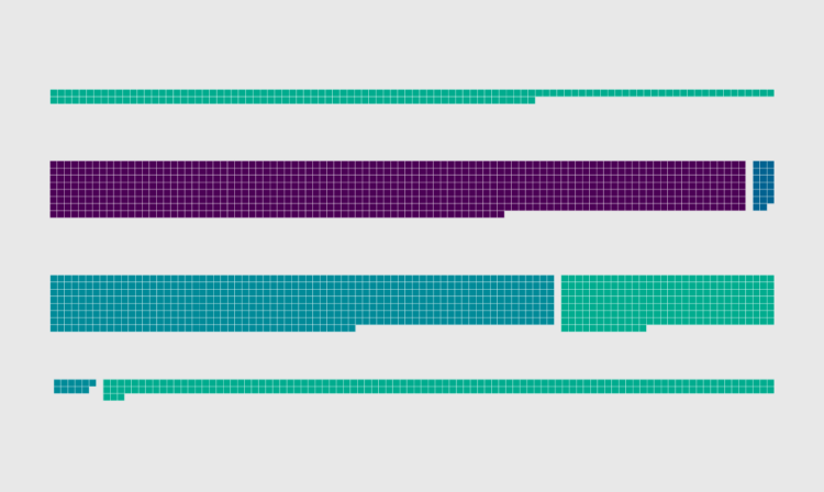
To show income sources for different groups and people, I wanted to show a percentage breakdown between wages, business, and investments, but also show the total amounts.
A while back I showed how people spend their money using a mosaic plot followed by unit charts, so I figured I’d just combine the two, and this is what I got, which shows average income sources by income group.
To access this full tutorial, you must be a member. (If you are already a member, log in here.)
Get instant access to this tutorial and hundreds more, plus courses, guides, and additional resources.
Membership
You will get unlimited access to step-by-step visualization courses and tutorials for insight and presentation — all while supporting an independent site. Files and data are included so that you can more easily apply what you learn in your own work.
Learn to make great charts that are beautiful and useful.
Members also receive a weekly newsletter, The Process. Keep up-to-date on visualization tools, the rules, and the guidelines and how they all work together in practice.
See samples of everything you gain access to:
About the Author
Nathan Yau is a statistician who works primarily with visualization. He earned his PhD in statistics from UCLA, is the author of two best-selling books — Data Points and Visualize This — and runs FlowingData. Introvert. Likes food. Likes beer.