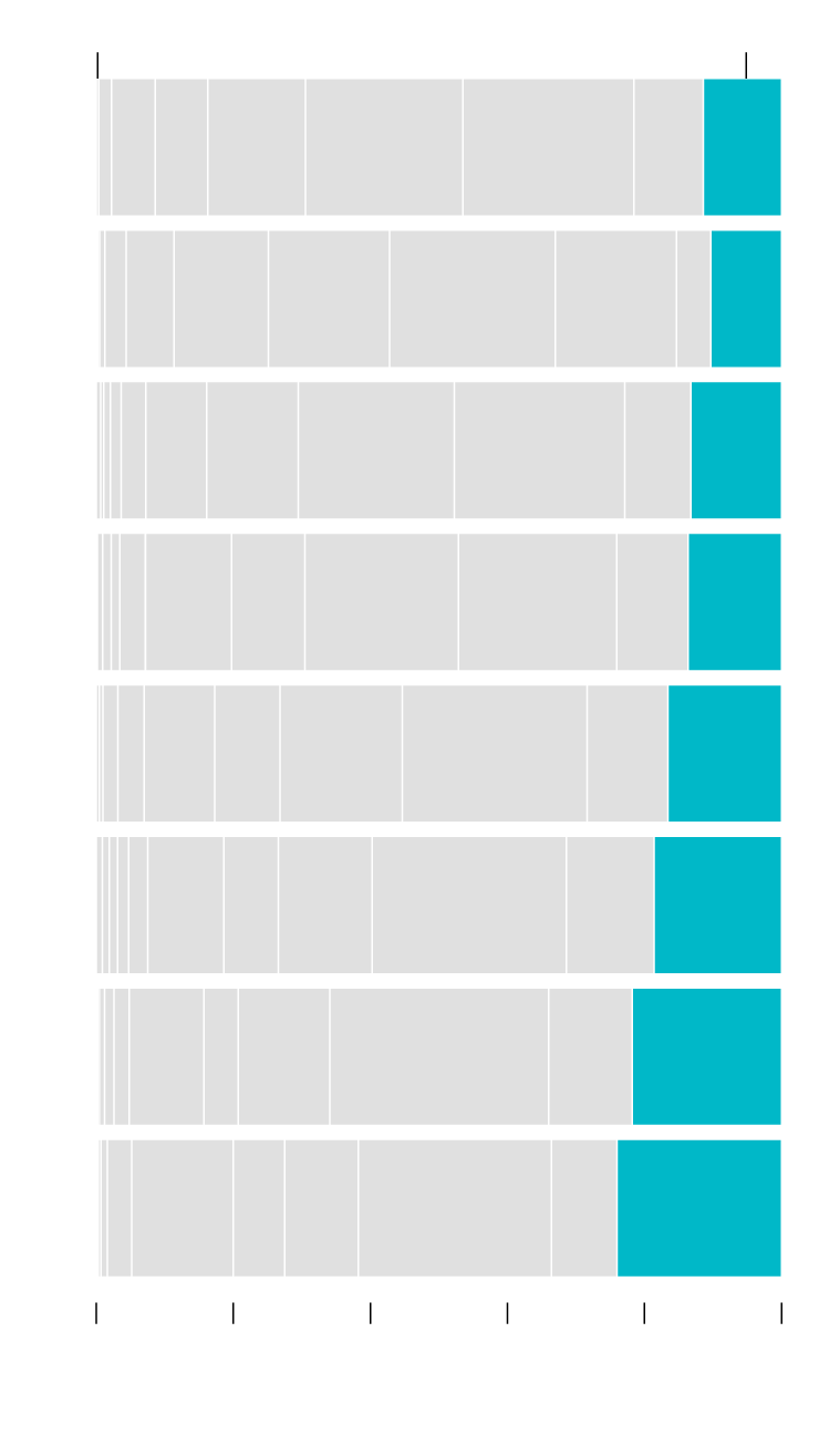
Best Possible Life More Common with Age
People scored their current life from 0 to 10, where 0 is their worst possible life and 10 is their best possible life. The older they were, the more likely they were to say they were living their best.

Worst possible life
Best possible life
AGE
15 to 19
11%
years
20 to 29
10%
30 to 39
13%
40 to 49
14%
17%
50 to 59
19%
60 to 69
22%
70 to 79
24%
80 to 85
0%
20%
40%
60%
80%
100%
SOURCE: Bureau of Labor Statistics / BY: FlowingData
Worst possible life
Best possible life
AGE
15 to 19
11%
years
20 to 29
10%
30 to 39
13%
40 to 49
14%
17%
50 to 59
19%
60 to 69
22%
70 to 79
24%
80 to 85
0%
20%
40%
60%
80%
100%
SOURCE: Bureau of Labor Statistics / BY: FlowingData
This is based on answers from the 2021 American Time Use Survey.
The percentage increase is kind of comforting with the possibility that the best is ahead. Or, if you’re more of a glass-half-empty kind of person, I guess it could be there are fewer years ahead as you get older, so there’s not much chance of things in your life improving. Either-or.
The stacked bar chart was made in R and Adobe Illustrator. The 2021 American Time Use Survey (ATUS) data was downloaded via IPUMS and prepared in R.
Become a member. Support an independent site. Make great charts.
See What You GetFlowingData is made possible by supporting members. Since 2007, I, Nathan Yau, a real person, have been analyzing and visualizing data to help more people understand and appreciate it in their everyday lives.
If you liked this or want to make similar data things, please consider supporting this small corner of the internet. You get unlimited access to visualization courses, tutorials, and extra resources. Thanks. — Nathan
Chart Type Used
