Anyone who uses a social music service like Rdio or last.fm has probably…
Nathan Yau
-
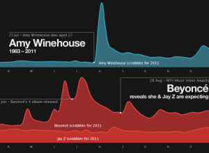
Music listening trends and the news in 2011
-
Link
How citizen mapmakers are changing the story of our lives →
“The map user has now become the map creator.”
-
Link
Golan Levin at Eyeo →
gestural interfaces and information visualization together
-
Link
Data Swims Upstream →
one of my favorite data visualization firms, Periscopic, interviewed for Print Magazine on their work and process
-
Link
Recursive Google Image search →
starts with a transparent PNG, to the universe, and beyond, and then back again
-
Link
D3 Path Transitions →
moving time series, plus smooth scrolling
-
Link
What is Data Science? →
detailed article on the budding field
-
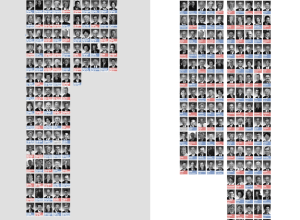
SOPA opposition surges
ProPublica has been tracking members of Congress who oppose and support SOPA. You…
-
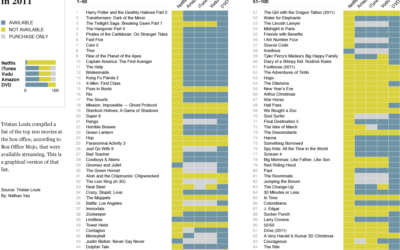
Where are the biggest box office movies (not) streaming?
After seeing Tristan Louis’ list that tallied the streaming availability of 2011’s top 100 box office hits, I was curious what it looked like graphically.
-
Link
Introduction to Probability →
Lecture videos and materials for Statistics 110, offered at Harvard, on iTunes U for free
-
Members Only
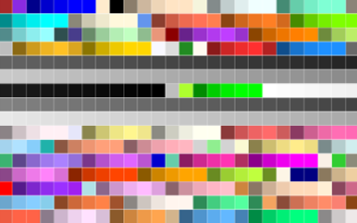
Using Color Scales and Palettes in R
Color can drastically change how a chart reads and what you see in your data, so don’t leave it up to chance with defaults.
-
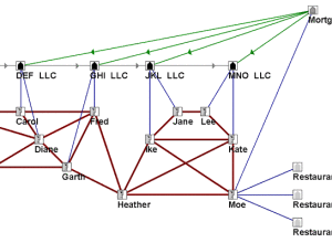
Social network analysis used to convict slumlords
In working with tenants to help their city attorney convict a group of…
-
Link
Stamen Projects 2011 →
One of the best in the business look back at all of last year’s map work
-
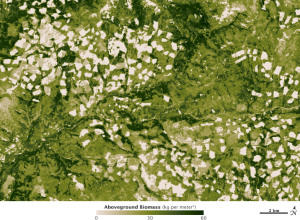
High resolution biomass map, at management scale
In 2010, NASA released a map that shows world forest heights. Robert Simmon,…
-
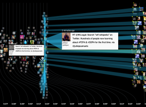
Watching ‘wtf Wikipedia’ as SOPA/PIPA blackout begins
While SOPA and PIPA are no laughing matter (join the strike), the reaction…
-
Link
Teaching stat as though it were math →
Ranty post on why stat isn’t math
-
Link
R jumps from 25 to 19 →
and statisticians rejoiced, although never satisfied until R is at the top
-
Link
Where the 0.05% Live →
Inverse population density
-
Link
Empowering Citizen Cartographers →
“Today, in the Age of Participation, it’s crowds, not scholars, who are charting their own New World.”
-
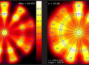
Optimized dart throwing and other games
If you play darts just trying to hit the bullseye, you aren’t playing…
Recently for Members
Second Edition
 Visualize This: The FlowingData Guide to Design, Visualization, and Statistics (2nd Edition)
 Visualize This: The FlowingData Guide to Design, Visualization, and Statistics (2nd Edition)
New tools, refined process.
Browse by Chart Type See All →