Companies collect and aggregate location data from millions of people’s phones. Then that…
Nathan Yau
-
Your location for sale
-
Members Only
Backwards Visualization Critique – The Process 159
At least it gave us something to look forward to.
-
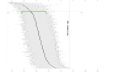
Age and Occupation
Whether it’s because of experience, physical ability, or education level, some jobs tend towards a certain age of worker more than others.
-
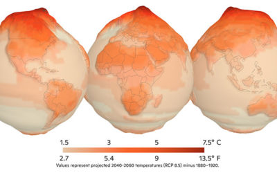
Mapping climate change in the Arctic
UnstableGround is a project from the Woodwell Climate Research Center that focuses on…
-
A Succinct Intro to R
Before you get into analysis and visualizing data with R, you need to…
-

This is a good Venn diagram.
[via]…
-
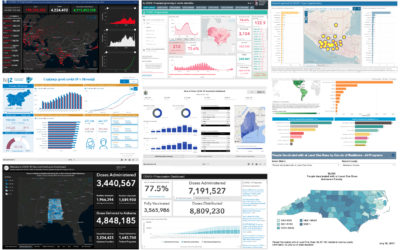
Assessment of the Covid-19 dashboards
Researchers evaluated 158 Covid-19 dashboards, assessing design, implementation, and usefulness. Marie Patino for…
-
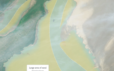
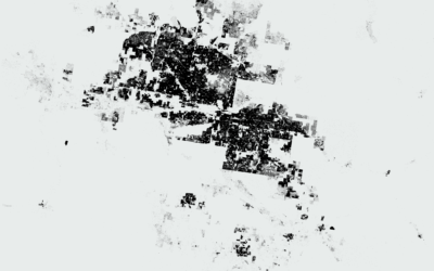
Sand mining viewed from above
Poyang Lake is China’s largest freshwater lake, but sand mining has changed its…
-
Members Only
Visualization Tools and Learning Resources, September 2021 Roundup
Here’s the good stuff for September.
-

SVG pattern repository
For when you want to fill SVG polygons with patterns instead of or…
-
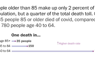
Americans are dying too much
Derek Thompson for The Atlantic highlights recent research comparing mortality in America against…
-

A flag planted for every Covid-19 death
In fall 2020, Suzanne Brennan Firstenberg planted a flag for each American who…
-
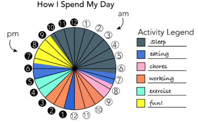
How Men and Women Spend Their Days (2020)
Using an oldie but goodie visualization format to look at time use between different groups.
-
Using rates for more relatable Covid-19 numbers
With millions of Covid-19 deaths worldwide, and hundreds of thousands in the US,…
-
Data visualization activities for kids
Nightingale has a kid’s section with printable visualization activities. Get the kids started…
-
Members Only
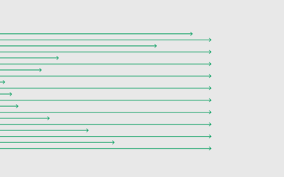
Dot Patterns – The Process 157
The only limit is your imagination.
-
Humorous charts to organize thoughts
When I’m feeling confused about what’s going on around me, I gravitate towards…
-
Beautiful News, a book charting the good things in the world
From David McCandless and team, who you might know from such books as…
-
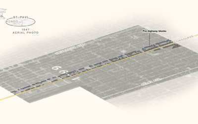
Black neighborhoods split by highways
Rachael Dottle, Laura Bliss and Pablo Robles for Bloomberg on how urban highways…
-
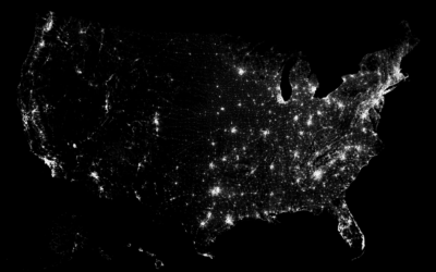
Where Americans Live
Everyone gets a dot. You get a dot. And you get a dot. And you.
Recently for Members
Second Edition
 Visualize This: The FlowingData Guide to Design, Visualization, and Statistics (2nd Edition)
 Visualize This: The FlowingData Guide to Design, Visualization, and Statistics (2nd Edition)
New tools, refined process.
Browse by Chart Type See All →


