For Bloomberg, Rachael Dottle and Leslie Kaufman go with the combo stacked area…
2023
-
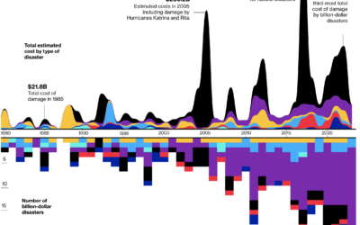
Billion dollar natural disasters
-
Visual explanation of menstrual cycle length and variability
For the Apple Women’s Health Study, which uses cycle tracking data from iPhones…
-
How Cause of Death Shifted with Age and Time in America
As we get older, our life expectancy declines. But when and how quickly the decline happens and how it happens has changed over the years.
-
Members Only
Visualization Tools and Learning Resources, September 2023 Roundup
Every month I collect tools and resources to help you make better charts. Here’s the good stuff for September.
-

Search the text in historical maps
The David Rumsey Map Collection has been home to tens of thousands of…
-

Loneliness, life satisfaction, and time
For The Pudding, Alvin Chang examines loneliness through the lens of individual responses…
-
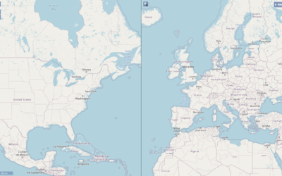
Two maps with the same scale
When you compare two areas on a single map, it can be a…
-
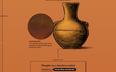
Evolution of beer
Beer dates back thousands of centuries, but it was not the beer we…
-
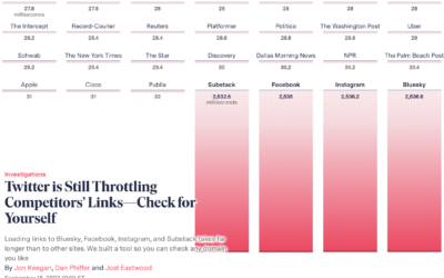
Twitter slows competitor links
When you click a link on Twitter, you go through a Twitter shortlink…
-
Members Only
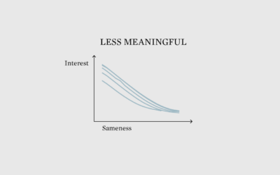
Calming Data
Chart-making provides a perspective that’s beyond my own, which can be calming.
-
Crows might understand probabilities
Researchers at the University of Tübingen are studying crows’ abilities to understand statistical…
-
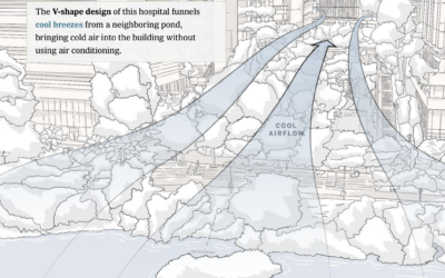
Cooling a city
Tall buildings in dense cities can trap heat and restrict air flow, which…
-
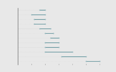
Life Expectancy of Pets
When looking into getting a pet, it’s important to consider life expectancy. You probably don’t want to accidentally sign up for a twenty-year commitment with an impulse adoption at the pet store.
-
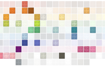
Evolution of Lego brick colors
Lego started with five brick colors: red, yellow, blue, white, and clear. The…
-
Oldest and Youngest, by State
States aren’t uniformly young and old. Well, other than Maine. This is the breakdown by age group and regions.
-
Members Only
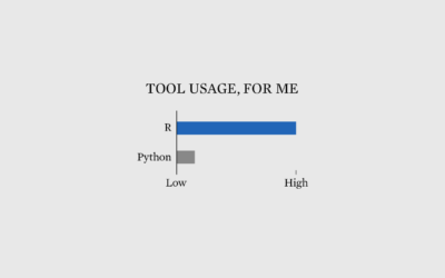
Why I Use R More than Python
Debates about which is best are useless. Go with what works for you, and never mind the rest.
-
Visualization to better see true values in data
For Scientific American, Jack Murtagh describes the importance of visualization in understanding the…
-

Very Expensive Maps
In the Very Expensive Maps podcast, cartographer Evan Applegate interviews other cartographers about…
-
Tattoos and impulsiveness dataset
For their research on tattoos and choice, Bradley Ruffle and Anne Wilson provide…
-
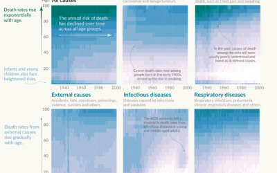
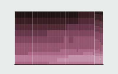
Shifting causes of death over the decades
Saloni Dattani, for Our World in Data, used a set of heatmaps to…
Recently for Members
Second Edition
 Visualize This: The FlowingData Guide to Design, Visualization, and Statistics (2nd Edition)
 Visualize This: The FlowingData Guide to Design, Visualization, and Statistics (2nd Edition)
New tools, refined process.
Browse by Chart Type See All →


