Life Expectancy of Pets
When getting a pet, you probably don’t want to accidentally sign up for a twenty-year commitment with an impulse adoption. That’s a bad deal for you and the animal. Consider how long potential companions will be around.
Like people, individual life spans can vary based on environment and health, but you can at least get an idea.
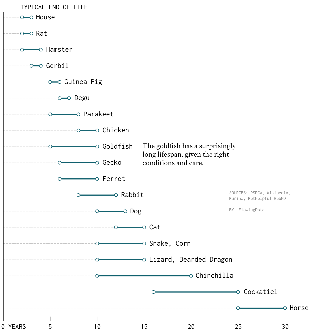
Life Expectancy Ranges for Selected House Pets
A pet mouse lives 2 to 3 years, whereas a horse lives 25 to 30 years.
The average life spans above are generalized. There is also variation within species. For example, some studies estimate bulldogs live for six years while labradors live for 10 to 12 years.
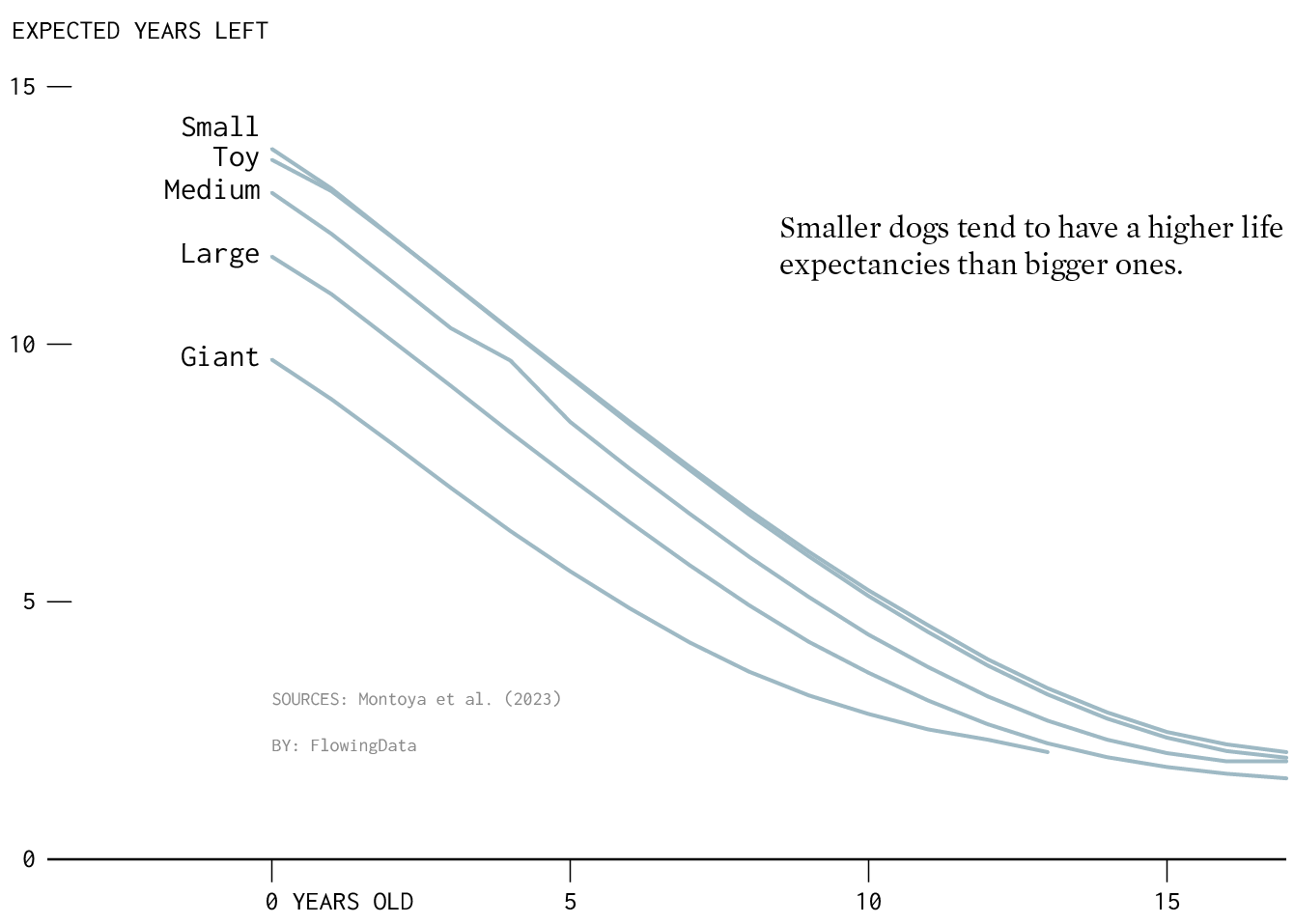
Research published in Frontiers in Veterinary Science studied dog life expectancy by size.
Dog Life Expectancy, Given Age
Overall, dogs usually live between 10 and 13 years, but it varies by size.
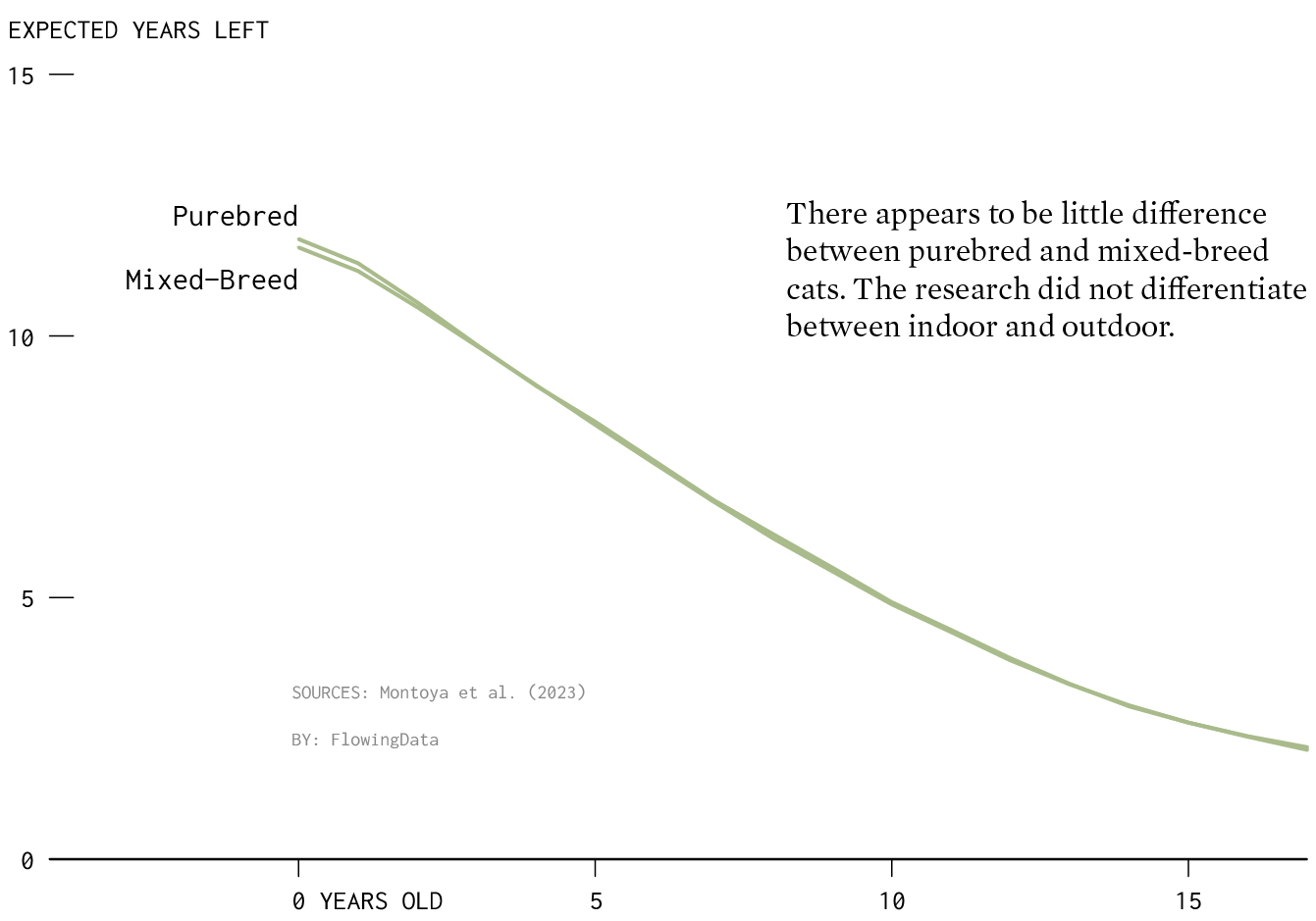
The same study looked at purebred and mixed-breed cats. I wish they looked at indoor versus indoor cats, because that seems to be where the biggest different is.
Cat Life Expectancy, Given Age
Purebred is a little bit higher at birth. Otherwise, life expectancies for purebred and mixed-breed cats look similar.
So if you’re not sure about the time commitment, maybe go with a mouse. For long-term, go with a cockatiel, or, if you’re in the right type of area, a horse.
Chart Types Used


Become a member. Support an independent site. Get extra visualization goodness.
See What You Get