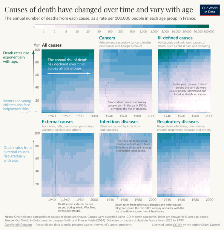
Saloni Dattani, for Our World in Data, used a set of heatmaps to show how causes of death changed by time (on the horizontal axis) and age (on the vertical axis) in France. Each panel represents a cause category.
The code is on GitHub, in case you want to make similar charts for your own country.

 Visualize This: The FlowingData Guide to Design, Visualization, and Statistics (2nd Edition)