Best Data Visualization Projects of 2022

Every year I pick my favorite data visualization projects, which tend to cover a wide range of purposes, but generally speaking, are typically for presentation. Here are my favorites for 2022.
Best Book Series About Historical Figures in Visualization
Information Graphic Visionaries
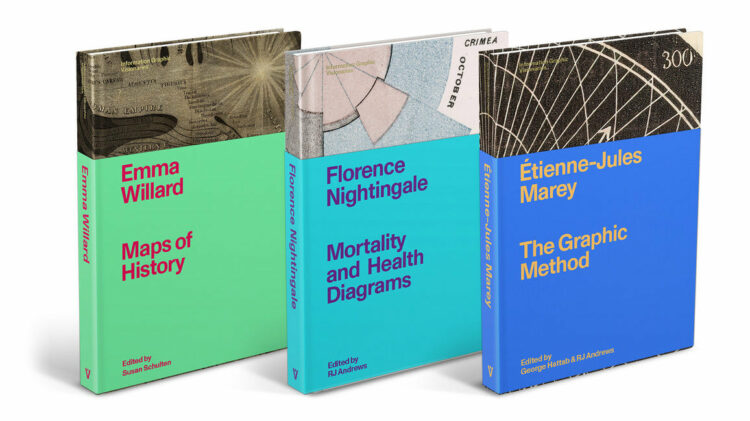
The book series, completed over the past couple of years no less, is a great showcase of visualization history. [See the Project / On FlowingData]
Best Self-Referencing Text to Explain Itself
What makes writing more readable?
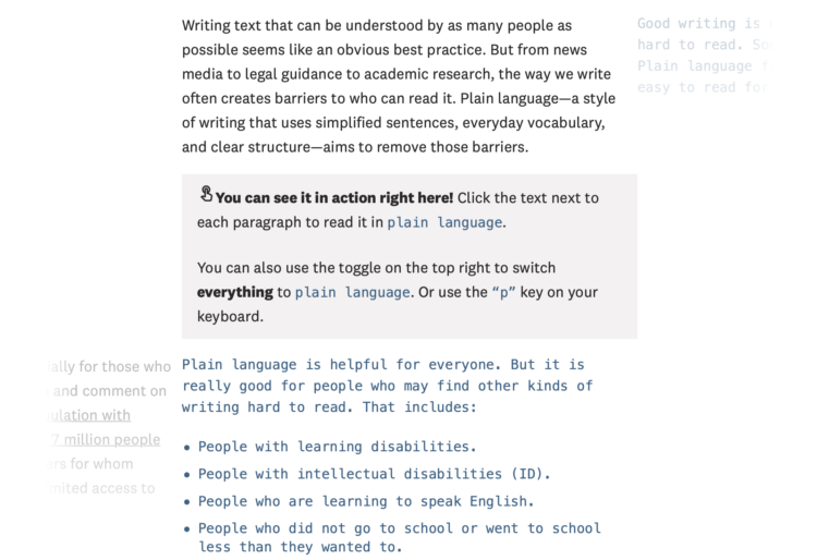
By Rebecca Monteleone, Jamie Brew, and Michelle McGhee for The Pudding, the text changes to demonstrate what it just described. [See the Project / On FlowingData]
Best Mashup of a Recurring Dataset and a Standard Globe for Something New
Hub and Spoke
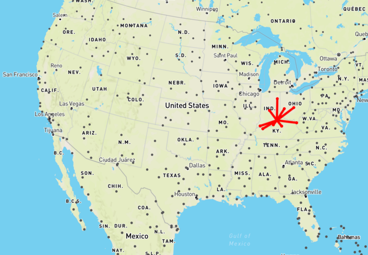
William B. Davis made a map that makes it look like a creature walking around, grasping on to the nearest airports. [See the Project / On FlowingData]
Best Revealing of Patterns with Many Shapes
How America Lost One Million People
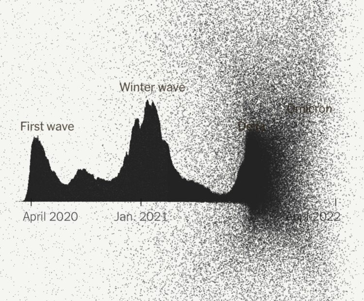
The New York Times marked one million Covid deaths. A grim topic, but the dots give weight to individuals and shift to show wider views. [See the Project / On FlowingData]
Best Dumb Charts About Nothing
Pie Graphs of Dogs
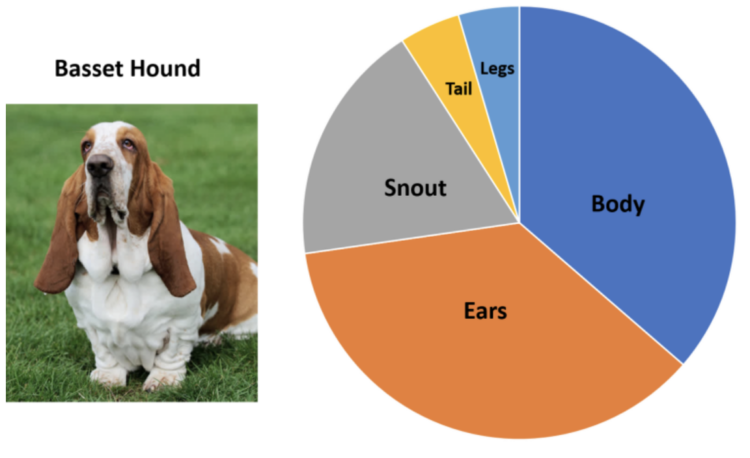
I welcome all dumb charts into my timeline. [See the Project / On FlowingData]
Runner-up — “Oscar Outfits as Public Health Graphs” by William Lopez [See the Project / On FlowingData]
Best Blend of Old and New
Why Arctic fires are releasing more carbon than ever
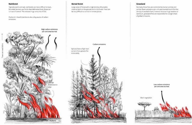
I appreciate Reuters Graphics’ illustrations to make data and classifications less abstract. [See the Project / On FlowingData]
Best Game of Miniature Golf to Talk About Gerrymandering
Play mini golf to see how
politicians tilt elections using maps
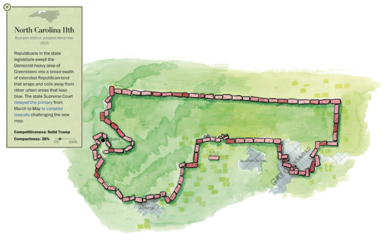
Gerrymandering has gotten out of hand, but it’ll keep going until people care. For The Washington Post, Dylan Moriarty and Joe Fox made a miniature golf game to demonstrate the increasingly odd borders. [See the Project / On FlowingData]
Runner-up — “Can You Gerrymander Your Party to Power?” by Ella Koeze, Denise Lu and Charlie Smart for The New York Times [See the Project / On FlowingData]
Best Depiction of Sound with Illustrations
You may have hearing loss and not know it. Here’s what it sounds like.
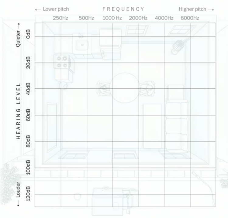
Amanda Morris and Aaron Steckelberg, for The Washington Post, complemented an audiogram with an illustration of a room to demonstrate the spectrum of hearing. [See the Project / On FlowingData]
Runner-up — “The Sound of Water” by Mitchell Whitelaw and Skye Wassens [See the Project / On FlowingData]
Best Combination of Polling and Absurdity for Fun On the Internet
Absurd Trolley Problems
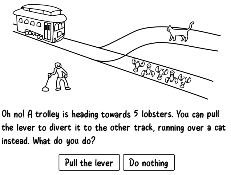
Neal Agarwal makes fun things for the internet. Along with the trolley project, Agarwal also provided a place to review everything on Earth, a scientifically accurate asteroid simulator, and polling to settle all the internet debates. [See the Project / On FlowingData]
Best Enthusiasm for Answering Statistics Questions from Random People
Statistician Answers Stats Questions From Twitter
The clear explanations and enthusiasm from Jeffrey Rosenthal make this Q&A from Wired an entertaining sixteen minutes. [See the Project / On FlowingData]
Hoping for more quirk and randomness in 2023.
Picks from previous years: 2008, 2009, 2010, 2011, 2013, 2014, 2015, 2016, 2017, 2018, 2019, 2020, 2021. I still cannot remember why I skipped 2012.
Become a member. Support an independent site. Get extra visualization goodness.
See What You Get