When you compare the price of things today against prices one year ago,…
2021
-
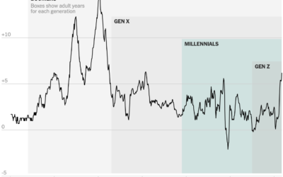
Inflation in the context of age generations
-
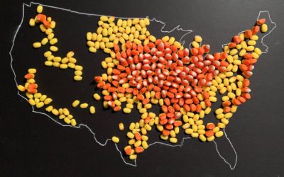
Map made of candy corn to show corn production
With candy corn as her medium, Jill Hubley mapped corn production in the…
-
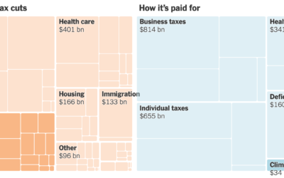
All the provisions in the Build Back Better bill
For NYT’s The Upshot, Alicia Parlapiano and Quoctrung Bui outlined all of the…
-

Calculating where you should live
Choosing a place to live is always full of trade-offs, but it’d be…
-
Most Common Daily Routines
We all have our routines, but from person-to-person, the daily schedule changes a lot depending on your responsibilities.
-
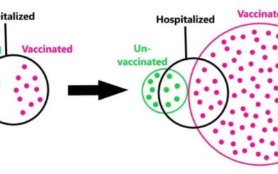
Euler diagram to illustrate base rate fallacy
Some people point out that vaccinated people are still hospitalized as a defense…
-
Communicating effectiveness of boosters
Statisticians David Spiegelhalter and Anthony Masters for The Guardian on reframing risk estimates:…
-
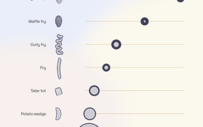
3-D modeling the french fry universe
What is the best french fry shape? Curly of course. But Chris Williams…
-
Members Only
Connecting Data to Practicality – The Process 166
It’s a shift from answering “What is this data?” to “So what?”
-
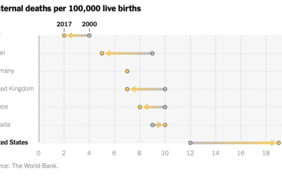
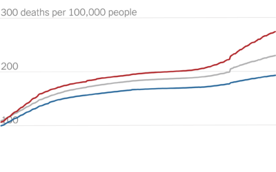
Increased maternal death in the United States
While still relatively rare, maternal mortality in the United States increased over the…
-
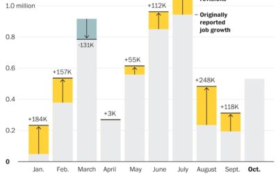
Job growth was underestimated
Andrew Van Dam for The Washington Post used a bar chart with corrections…
-

Census Mapper, a tool to visualize population and racial shifts
Pitch Interactive and the Census 2020 Data Co-op, supported by the Google News…
-
Partisan gap in Covid death counts
David Leonhardt for The New York Times looked at the partisan gap for…
-

Map of highway signs
This is a fun map by Matt Dzugan. Search for a city, and…
-
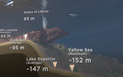
Scale of ocean depths
[arve url=”https://www.youtube.com/watch?v=Q5C7sqVe2Vg” loop=”no” muted=”no” /]
We know the oceans are deep, but it’s… -
Optimizing retail spaces
Patrick Sisson for The New York Times reports on the growing popularity of…
-
Members Only
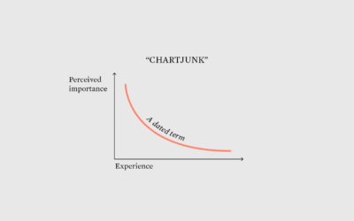
Goodbye, Chartjunk – The Process 164
A term to indicate that visual elements add nothing meaningful has itself become nonessential to making and discussing charts.
-
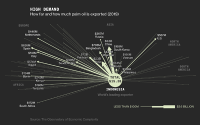
Palm oils and rainforest destruction
Palm oil is in our food, cosmetics, cleaning supplies, and biofuels, but it…
-
Commuting calculator
Sergio Peçanha and Yan Wu for The Washington Post made a calculator that…
-
How Much Women and Men Work
This chart shows the shifts since 1960.
Recently for Members
Browse by Chart Type See All →


Browse By Topic
Get the Book
 Visualize This: The FlowingData Guide to Design, Visualization, and Statistics
 Visualize This: The FlowingData Guide to Design, Visualization, and Statistics
Available now.