The effects of climate change can be seen around the world, in the…
2021
-

Climate change postcards from every country
-

Leland Wilkinson, creator of The Grammar of Graphics, passed away
Leland Wilkinson passed away on Friday, according to his daughter Amie. In visualization…
-
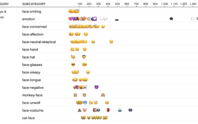
Most used emoji for the year
I am told people use these things called emoji in their messages to…
-
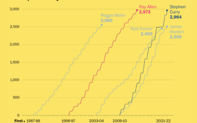
Stephen Curry career threes compared to other players
Stephen Curry is about to break the record for number of three-pointers made…
-
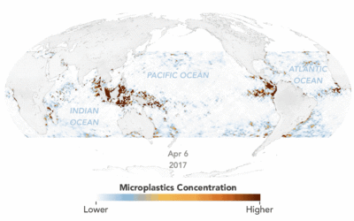
Animated map of microplastics in the ocean
Using estimates based on satellite data, Joshua Stevens for NASA Earth Observatory mapped…
-
Members Only

Get Input – The Process 168
What happens when you spend too much time with a dataset.
-
What People Spend Most of Their Money On, By Income Group, Relatively Speaking
More money on average means bigger houses, more expensive cars, and fancier restaurants. But what if you look at relative spending instead of total dollars?
-

Clock shows percentage of life lived so far
Shortlife is a clock by artist Dries Depoorter that simply shows the percentage…
-
TikTok algorithms work because of a lot of data
Ben Smith for The New York Times got an internal document that outlines…
-
Family safety app sells location data to third parties
Life360 is a service that lets families keep track of where members are…
-

AI-powered artwork app
Wombo Dream is a fun app that lets you enter some words to…
-
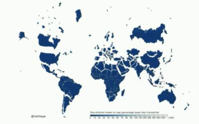
Shrinking the Mercator projection to equal area
It’s been a while since we got our regular reminder that the Mercator…
-
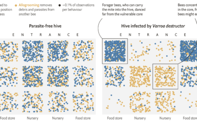
Bees use social distancing
Research by M. Pusceddu et al. shows that honeybees use social distancing when…
-
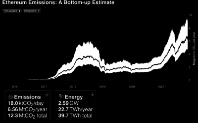
Emissions and energy usage from Ethereum network
It seems clear that Ethereum (and other cryptocurrencies) in its current state is…
-

FlowingData Shop is Open
I’m opening the print shop for a few days. Get your order in,…
-
Members Only
Visualization Tools and Resources, November 2021 Roundup
Here’s the good stuff for November.
-
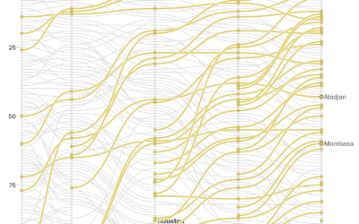
Rapidly growing African cities
In a multi-faceted piece, The Washington Post described the rapidly growing cities in…
-
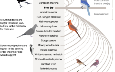
Bird power rankings
Using data from Project FeederWatch, which is a community tracking project to count…
-
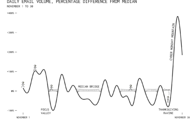
Thanksgiving Ravine
I scraped my inbox when I got a bunch of emails on Cyber…
-
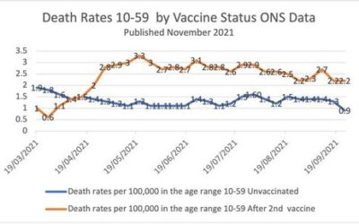
Simpson’s Paradox in vaccination data
This chart, made by someone who is against vaccinations, shows a higher mortality…
Recently for Members
Browse by Chart Type See All →


Browse By Topic
Get the Book
 Visualize This: The FlowingData Guide to Design, Visualization, and Statistics
 Visualize This: The FlowingData Guide to Design, Visualization, and Statistics
Available now.